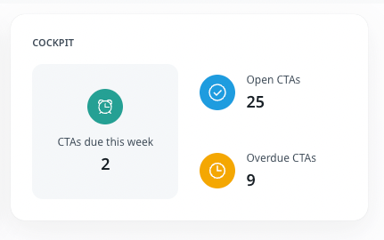
I like the concept of being able to quickly click thru and see Open, Overdue and CTAs due this week, but the implementation isn’t as useful as it could be.
- Four columns max is too limiting (especially as it relates to #3 below). At a minimum we need to see the CTA Name, Status, Company, Due Date AND Owner. I realize this is a summary, but those are all the key details a user needs to see at a glance.
- Changes to the column order revert back when you leave the click-thru. Allow user to choose if they want changes to the column order be sticky.
- It shows ALL CTAs for an account to which the filtered user is associated, but doesn’t allow for the ability to only view CTAs they own. Need a checkbox or something a user can select to “show only CTAs I own”
- LINK TO THE CTA. What is the point in showing the CTAs if there is no way to click-thru directly to it?
- For the love of Pete: BE MINDFUL OF WHITE SPACE. This is just embarrassing:

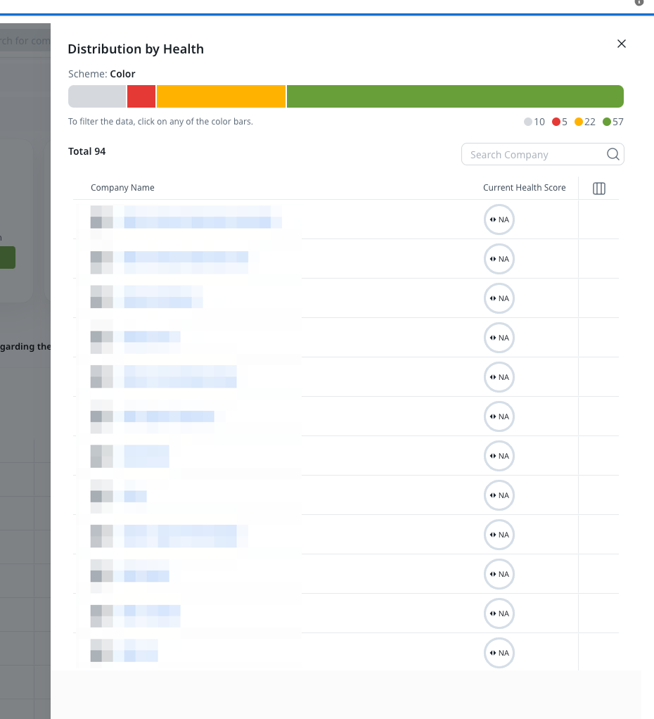
This is all in addition to the fact that when you click on the Distribution by Health widget, it does not show the scores (see below) which is clearly a bug for which I’ve opened a support ticket.
I’m sure I’ll find additional items to add here.