I think some of the changes made to the Scorecard Mass Edit visualization in Horizon Analytics are great, particularly the combining of setting the score and logging a timeline entry in a single action.
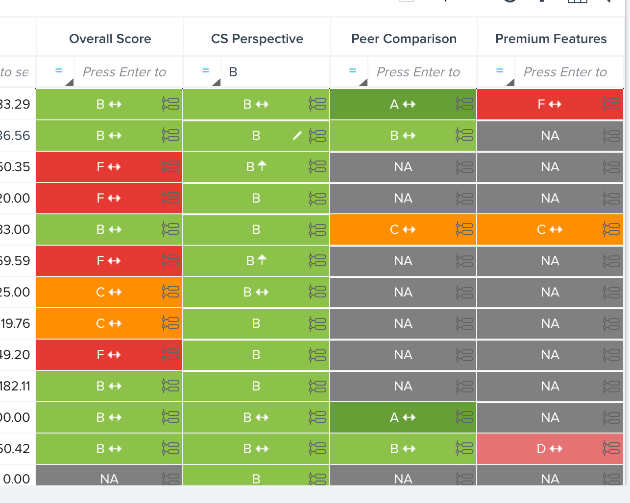
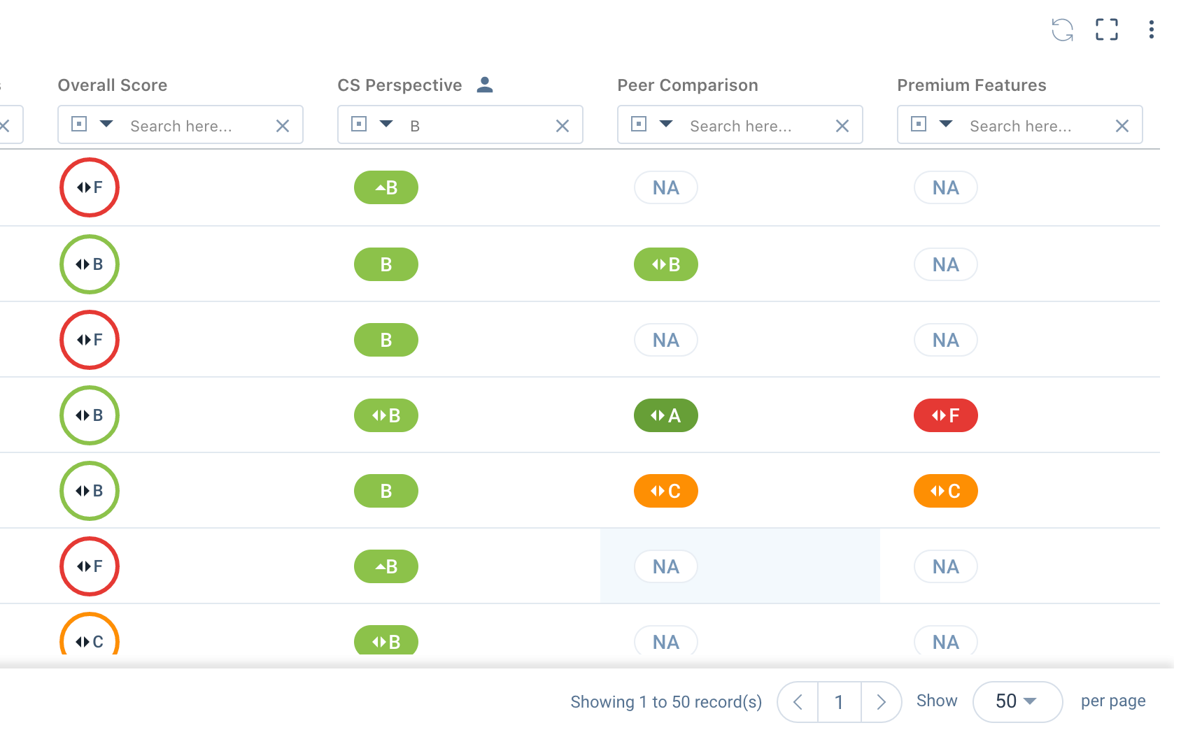
The changes to the score display (captured below), however, is not eliciting much favor from the users with whom we shared this yet.
It was easier to compare columns side by side at a quick glance because the format was the same and there wasn't any wasted/white space.
From an internal leader: “I understand the idea behind a ‘streamlined / minimalist’ design, but this particular feature used to benefit from "at a glance" visibility into how a customer was doing. This reduced footprint for the health score color means I have to physically trace across the customer and can no longer benefit from ‘at a glance’ sense of the business. White space does not add value.”
Hoping others out there share this sentiment and that GS will provided a restored view that shows the blocked colors but retains the functionality of setting a manual score/Timeline entry in the same action.