New Idea

Horizon Cockpit: Improve CTA creation UX

Related products:None
  • March 16, 2021
  • 3 replies
  • 38 views

darkknight
Forum|alt.badge.img+5

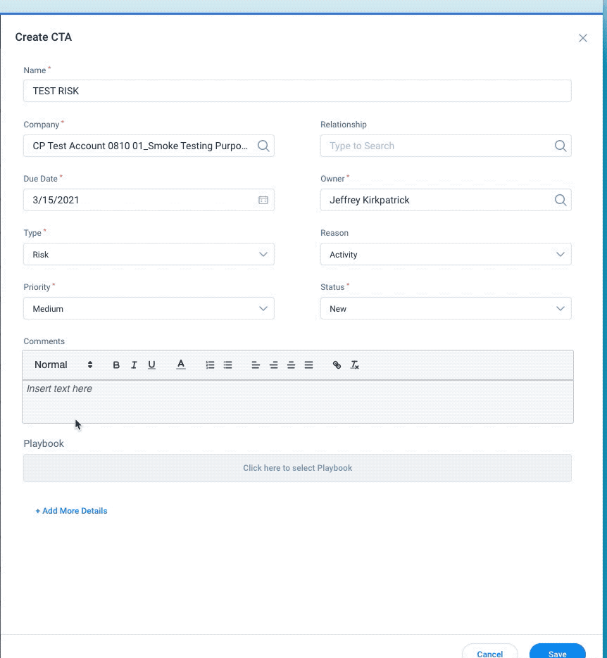
The Create CTA UX could be improved a bit more.

When you have additional fields to have populated, the user has to remember to click the little “Add More Details” link at the bottom of the box.  It’s easy to forget.  This should be expanded by default.

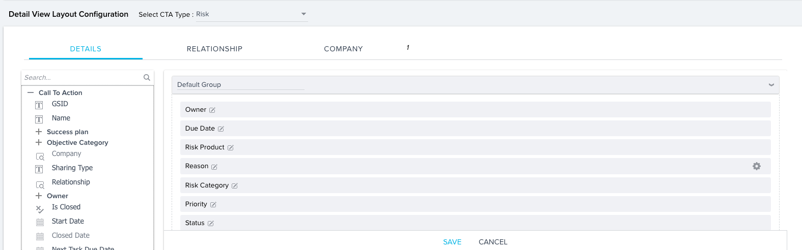
Admins should have more flexibility over the layout of this form. 


3 replies

darkknight
Forum|alt.badge.img+5
  • Author
  • Expert ⭐️
  • March 16, 2021

Additionally, the configuration is a bit misleading because we have all the fields in “Default Group” but they don’t appear that way in the Create CTA screen:


sriram pasupathi

@darkknight Acknowledge the UX problem in CTA detail view. Regarding the admin setting layout, this is something we will definitely address during cockpit Admin revamp planned in medium term.


sai_ram
Forum|alt.badge.img+1
  • Expert ⭐️⭐️
  • April 8, 2021

@darkknight sorry for the delay here. Thanks for sharing the feedback. I am sharing this with the UX team and the product team for more visibility.