Hello,
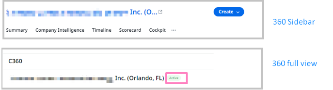
I love the new 360 Sidebar that was just released. I’d like to start a thread of ideas/feedback as it gets enhanced.
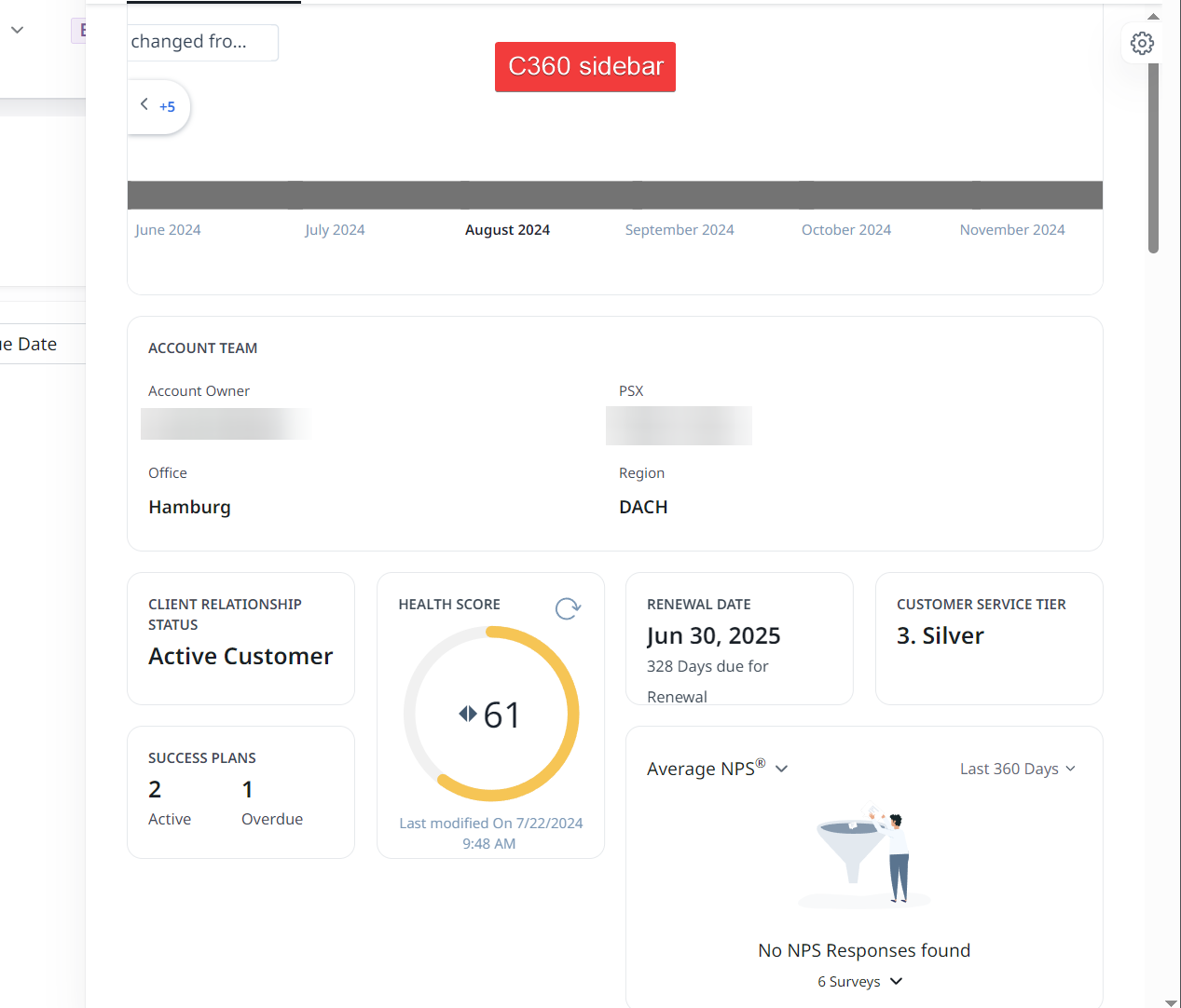
- It would be great if we can customize the view to be different than the actual 360 view. Since you are working with less real estate, we’d like to show different data in the sidebar view.
- Different layouts just like normal 360 layouts have, by company/relationship/user attributes.
- Allow it to not be a global setting, simply for release/training purposes. We may not want to enable it for everyone all at the same time.