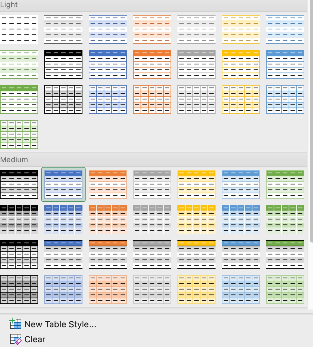
We love tabular reports -- it’s what our users prefer and what managers like to see. So, we use a LOT of tabular reports in our dashboards, through report sharing, etc. It would be great if we could set color themes to these tabular reports, to make our dashboards more colorful and eye-catching, like you can do in Excel.


