
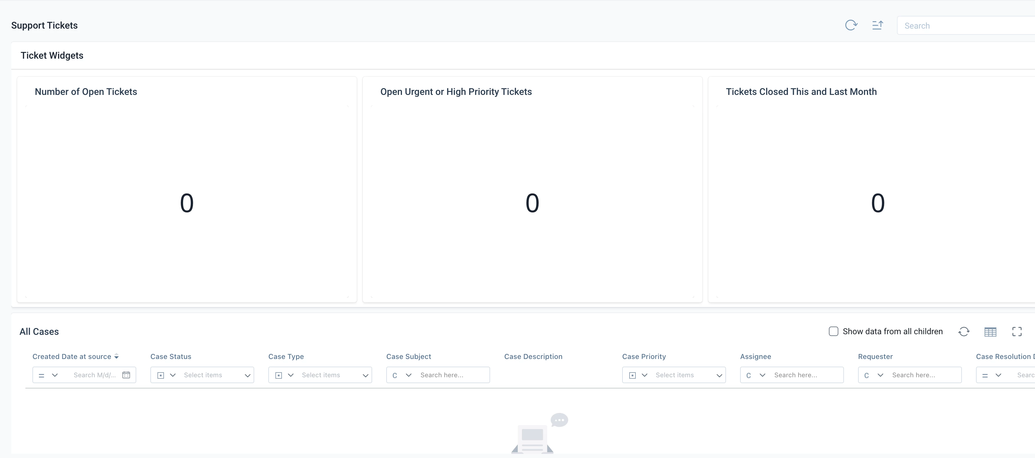
Love the ability with the new horizon related list section to be able to add multiple reports from different objects into the general section.

It would be a better admin and end user experience if we could have the same look/feel & functionality for building a “dashboard” into the C360 that we do with Adoption Explorer.

The new functionality let’s me group reports from similar objects together, but due to minimum sizing req’s I saw on another post, if I only have one widget and the rest are reports, that one widget takes up the entire long top section (not pleasing to look at).

100% agreed.


I have two options if i want to show widgets (which are SUPER handy and users love them):


Option 1: make them huge, take up half the screen so users need to scroll to get to other reports. The actual number in the widget report remains small, so there is significant whitespace.

Option 2: Make the widgets smaller, so the container that fits the widget is appropriate for the size of the number, but then the container for the widgets remains the same size so now it looks silly and still has significant whitespace.


Both options are a poor user experience. Let’s bring in that same customizability we have in dashboards into C360 related list sections.


I agree better flexibility here would be great, though while I think it should have the flexibility of Dashboard builder, please do not make it the dashboard builder experience. The only thing worse than the dashboard builder experience is the C360 layout builder experience…


There’s also a number of similar posts about configurability and whitespace on the widgets, that go back to even before the Beta of the Horizon 360 experience: