Team,
Whenever we have a report visualized in a pie chart, we are unable to add a label or a title to the graph to indicate the actual data being shown. When in the report builder, this is OK as we can see what fields are being shown within the report, but when adding to a dashboard or embedding within a C360 section, we are only left with the title of the report.
It would be nice if we had a chart option to label the chart (or each chart if we are showing more than one pie chart) so that end users fully understand the data being presented.
Thanks!
Josh
Page 1 / 1
Josh, I absolutely agree. Echoing what you said, I would love to be able to add a label or title to a graph in c360.
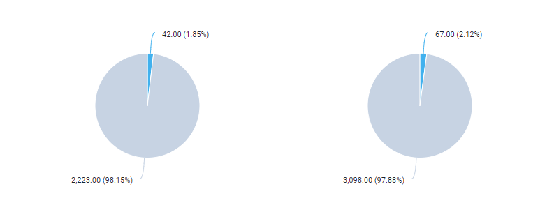
I agree, especially when you have 2 pies in the same chart!
Surprised this wasn’t considered as part of Horizon Analytics…
Sign up
If you ever had a profile with us, there's no need to create another one.
Don't worry if your email address has since changed, or you can't remember your login, just let us know at community@gainsight.com and we'll help you get started from where you left.
Else, please continue with the registration below.
Welcome to the Gainsight Community
Enter your E-mail address. We'll send you an e-mail with instructions to reset your password.