
For easier reporting, we have flattened the Company level scorecard to the company object and use picklist fields for the scores (this makes filtering easier for end users as well).
Because scores are associated with a particular color, our users would like to see that color along with the score label itself. This information is available, given that each value in a picklist has a color associated with it, however, outside of reporting, we don’t have access to display that color.
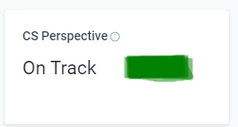
Here is an example use case of where this would be helpful:
On the C360 we have a Field widget that shows a Scorecard Measure Label. We would like to have the option display both the label AND the picklist color:
I’m sure there are other handy applications besides this (on a dashboard, Home somewhere?) but this is an example of how we would like to be able to use it.