
Here’s a nice, basic web design standard one.
In Surveys, we are offered three types of buttons:
- Primary CTA (colored fill)
- Secondary CTA (colored outline, transparent fill)
- Normal Link (colored text
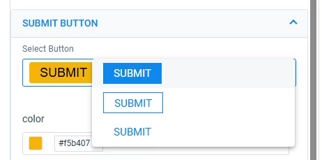
When you select the Primary CTA, you can change:
- Fill color
- Font color
When you select the Secondary CTA, you can change:
- Fill color
- Font color
You cannot change the outline color and if you want something else than Gainsight blue, WHY offer a secondary button style for which you can’t change the outline color, only the fill color?
--
Support (Tier I) has been telling me that this is expected and suggested I change the fill so my button matches the primary button 🙄😶 (Yeah, sure. I want a secondary style button that looks exactly the same as the primary style), and claims that they (support, engineering, product) do not remember a time where we could change the outline color on the secondary button style. I do remember that time, but maybe I fabricated a memory of the only logical and possible approach to this.
According to Support (Tier i), in their AI response, it’s not a bug and I’m mixing things up with email templates features.
Fact is, I can’t see the point of even offering this style if there was never the option to change the outline color, but would be happy to be proven wrong and demonstrated the value of the feature as it stands by the pm in charge (not by Tier II).
If you agree that we should be able to change the outline of the secondary button style (and not the fill), please upvote the hell out of this post !
PS: https://designcourse.com/blog/post/primary-vs-secondary-cta-buttons-in-ui-design, because at the end of the day, a survey is delivered via a web page.
PS2: customer brand guidelines may require outline style buttons regardless of primary or secondary.
