
This is related to my earlier idea about responsive content from 6+ months ago, but slightly different.
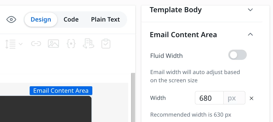
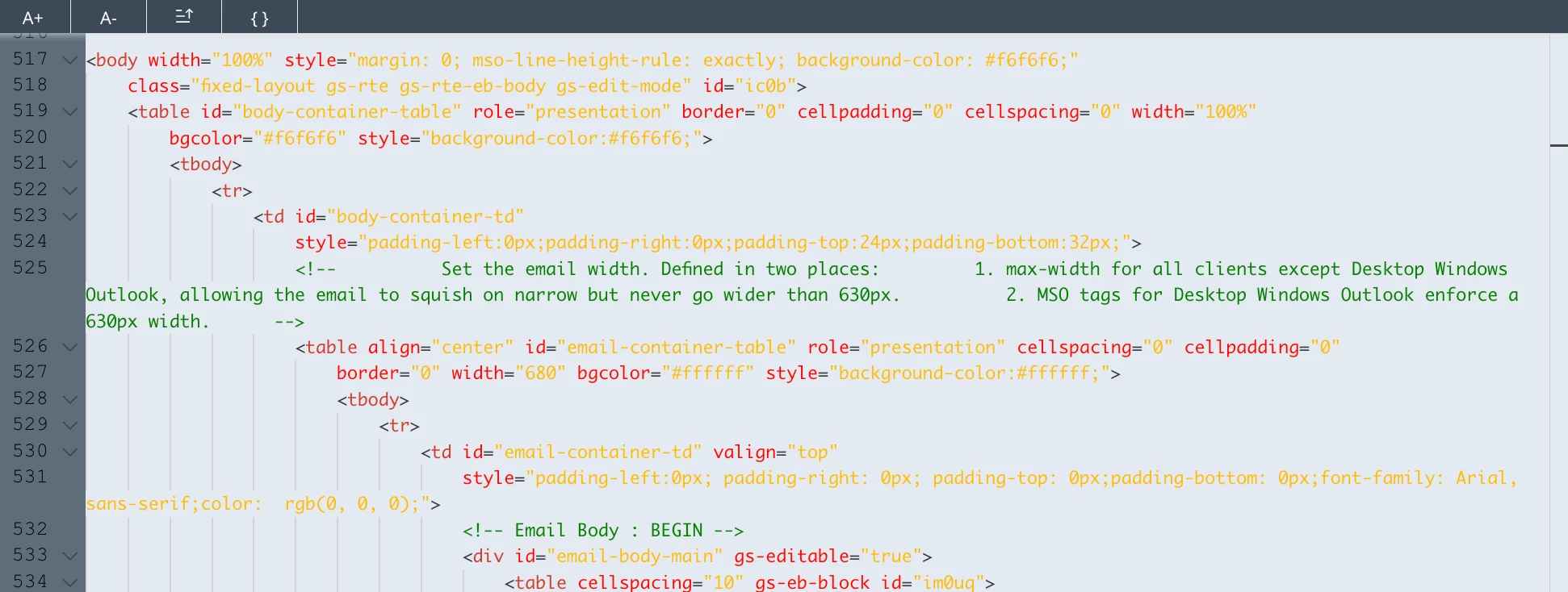
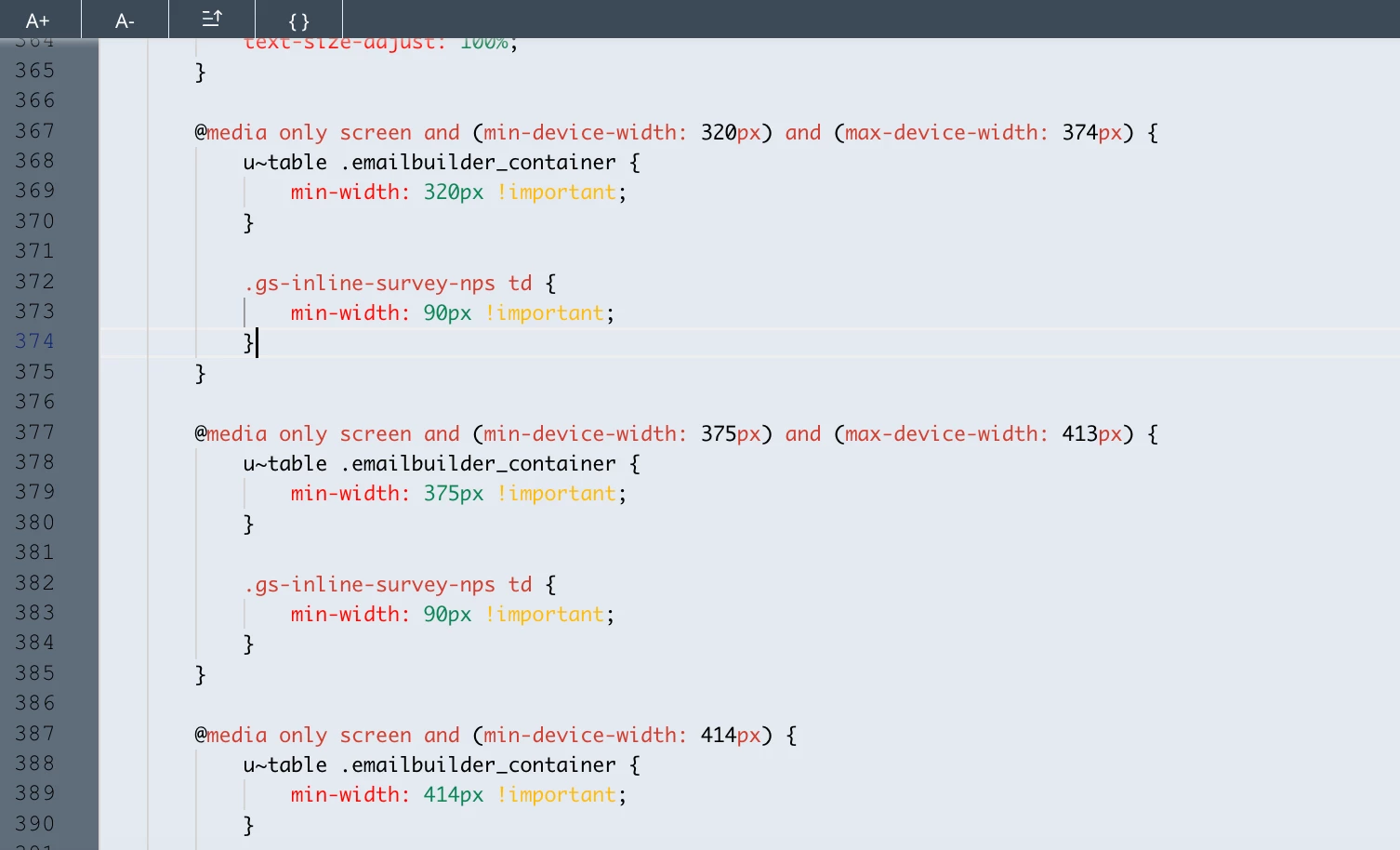
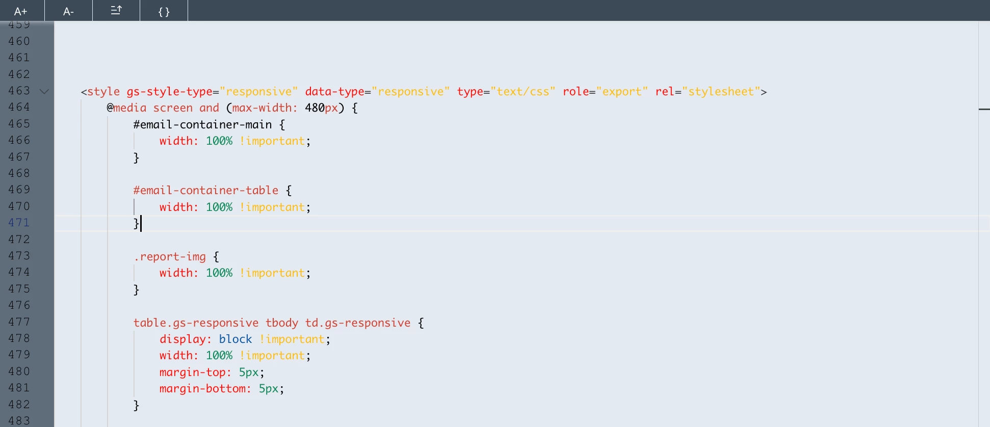
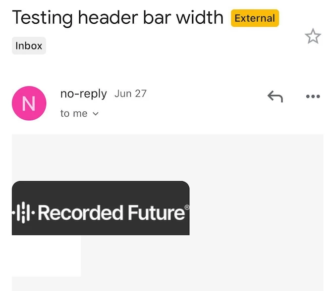
We’re in the process of building out new email templates (one main template), but are running into some issues. I believe they’re related to how the email content area is set to work with the max-device-width and responsive properties in the code.
Essentially, what looks good when testing on desktop looks terrible on mobile.
We’ve specified a 680px width for our emails, and our content blocks are set to 100%, but when testing them on mobile, they don’t preserve that 100% width. Has anyone else been experiencing this?
Idea: Email content area and content block dimensions should carry over between desktop and mobile.