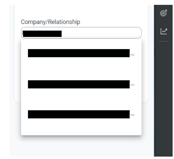
The suggested search results in Gainsight assist is large, double spaced and hides key information from the search.
User feedback : “ the drop down in Gainsight assist the text is really large in the drop down UI and so it is hard for the team to map the interaction to the right thing (eg R360 / C360 etc)”
The suggestion and request is to make it easy to read and see the results when searching/querying
