
This isn’t a huge issue but to me was extremely counter intuitive to most UX I’ve experienced.
Context: You’re building a Gainsight Home layout and you want some widgets locked down so your end users can’t change them and you’re presented with this:
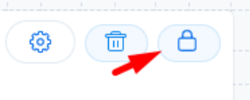
Just by looking at the icon I thought that meant it was locked already, which seemed like a weird default. Then I got the mouseover text that says “Lock Widget”.
So you click it and then it looks like this:
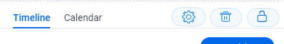
And now it looks unlocked?
I literally had to test this to see what it actually did, because I didn’t know to trust the image or the words.
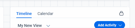
Then you have an experience like this:
Problem: This doesn’t make any sense.
Request: Make it more intuitive?
Usually buttons like this reflect the current state of your thing. Like in Confluence, this locked padlock means there are restrictions:
Or in Google Sheets:
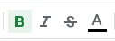
Bold is selected here and your text will be bold. You aren’t seeing the icon selected to know what will happen if you de-select it.
Maybe I’m out of touch but this was a very weird experience.