New Idea

Improve Adding Template to Success Plan UX

Related products:CS Success Plans & Customer Goals
  • July 25, 2025
  • 4 replies
  • 49 views

bradley
Forum|alt.badge.img+8

I’m working on building out a Success Plan template for a new onboarding work stream, and there are some really basic improvements that could be made for this to be a much more pleasant experience.

Part of the issue here, is all the whitespace when a user goes to add a template to a Success Plan:

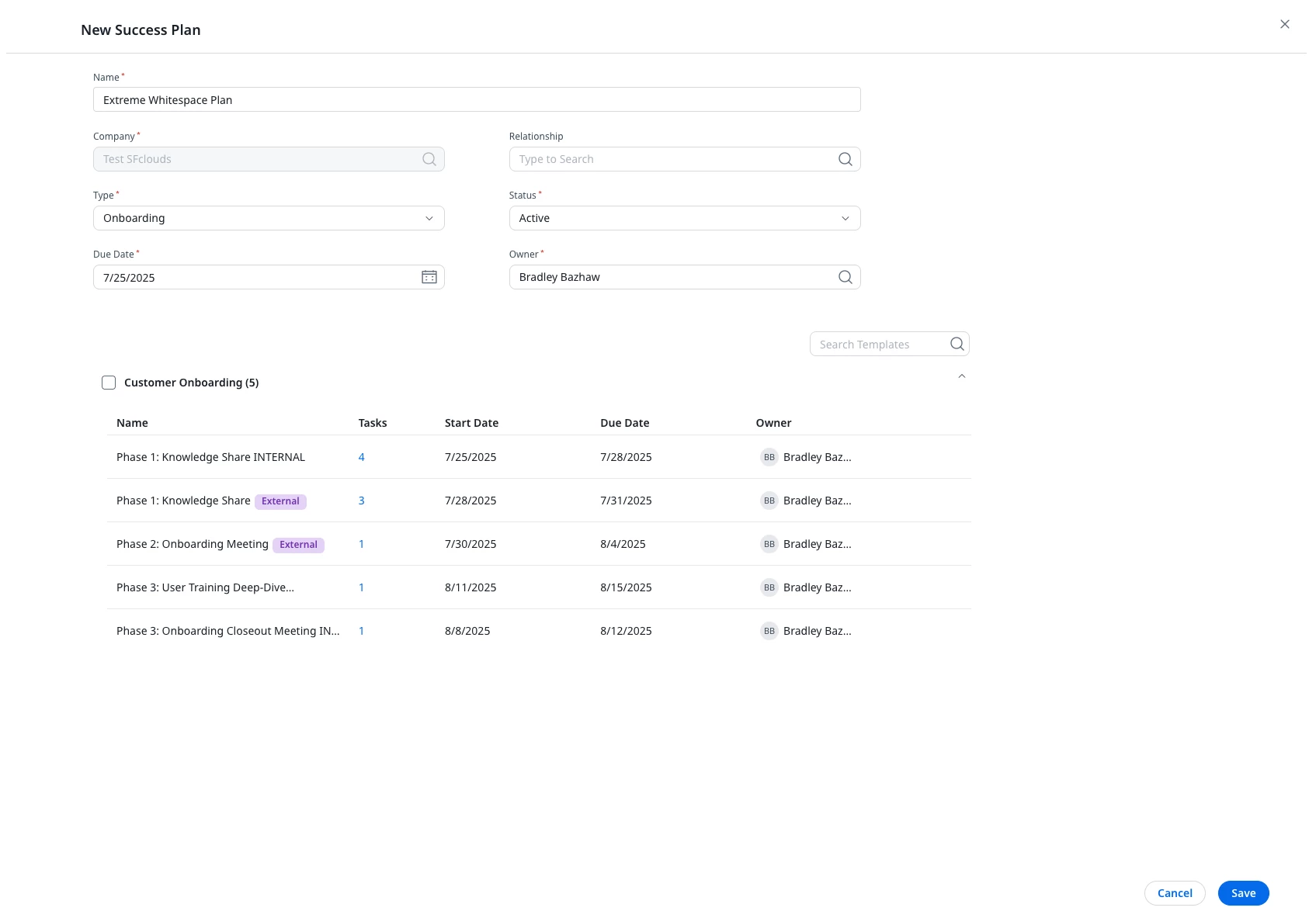
  1. Gratuitous whitespace. My name is cut off, with at least double the space next to it just...empty. CTA names - also cut off. 
  2. Column resizing: Not a thing. Can’t do it. You can’t even move things to look at the other info
  3. Mouseover: So the CTA name isn’t fully visible. You can’t resize the column to see it. You can mouseover to see it….right? Sometimes. For the life of me, I can’t get a mouseover text to appear on the last one.
  4. External marker. Only the first CTA is internal only. There is a 100% chance when CSMs go to add this, or if a leader sees this in a demo, they will be confused and read this as only the 2nd and 3rd being external. Not a good look. See point #3 for another reason why this is a problem.


Please address these issues, please and thank you.

4 replies

alizee
Forum|alt.badge.img+13
  • VIP ⭐️⭐️⭐️⭐️⭐️
  • July 28, 2025

+1


dayn.johnson
Forum|alt.badge.img+7
  • VIP ⭐️⭐️⭐️⭐️⭐️
  • July 28, 2025

Product parity doesn’t even begin to describe what’s wrong here.

Whitespace is a problem throughout, not just here. Resizing columns is a must with current whitespace issues, and not being able to customize our column width so we can work without having to change it on every page refresh is maddening. We need stick, customizable column widths everywhere.

Can’t speak to the bits about the CTAs, but UX needs some attention please! 🙏


romihache
Forum|alt.badge.img+9
  • VIP ⭐️⭐️⭐️⭐️⭐️
  • July 28, 2025

Product parity doesn’t even begin to describe what’s wrong here.

Whitespace is a problem throughout, not just here. Resizing columns is a must with current whitespace issues, and not being able to customize our column width so we can work without having to change it on every page refresh is maddening. We need stick, customizable column widths everywhere.

Can’t speak to the bits about the CTAs, but UX needs some attention please! 🙏


Shamelessly piggybacking to link a related idea:


alizee
Forum|alt.badge.img+13
  • VIP ⭐️⭐️⭐️⭐️⭐️
  • October 30, 2025

It’s the same thing when working on the actual template: 

Column width is arbitrary, no way to resize columns to see what the start date or end date is… amongst other things.