
Hopefully not a repost, though I’m sure I’ve seen similar, and probably made similar.


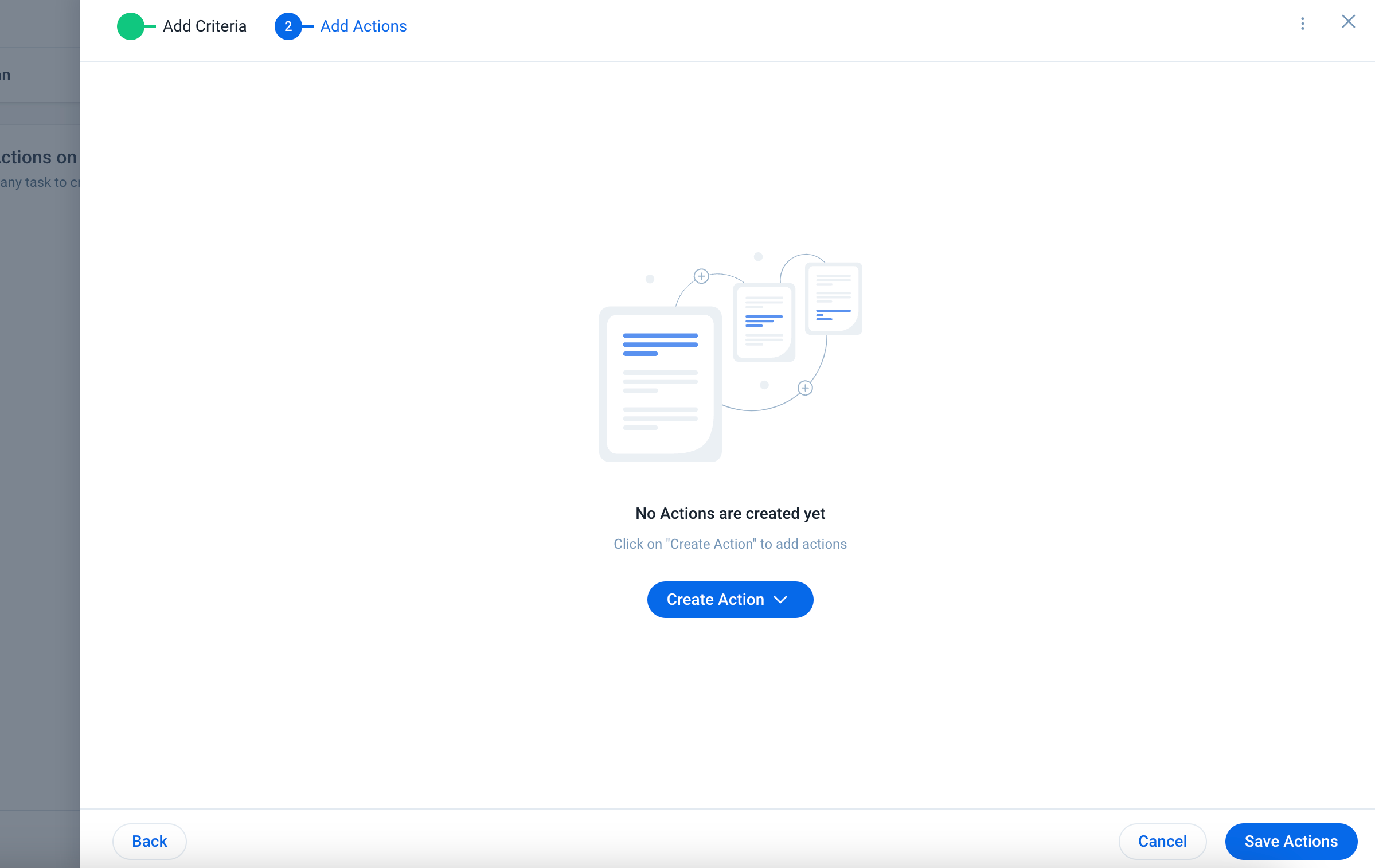
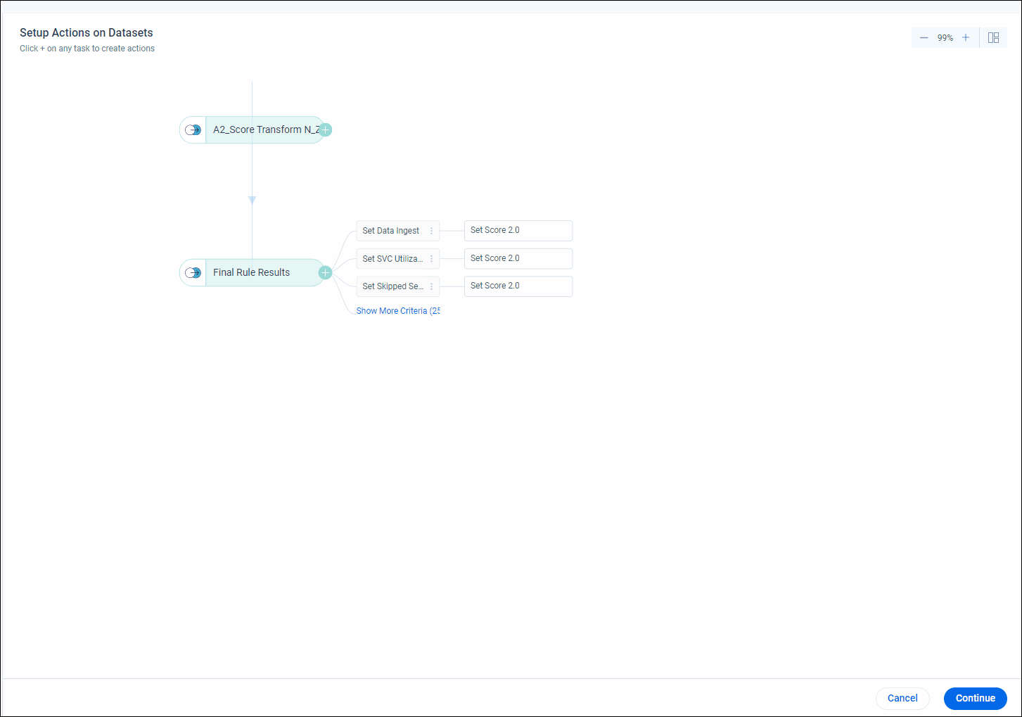
The Setup Action page isn’t great if you have more than three actions:

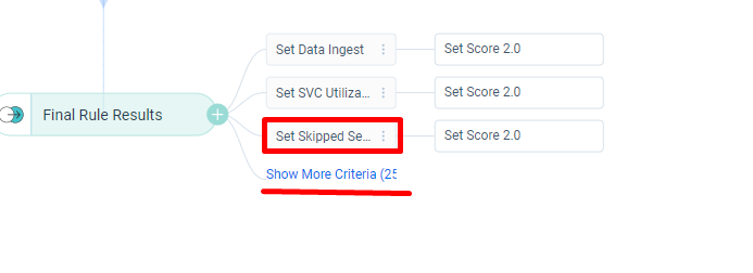
I’m sure I’ve commented already on the criteria getting clipped and the action not having any useful information on it. Here, you can see that the number of additional criteria is barely even visible.


The main issue is the workflow. If I ever want to work on one of these 25 other actions, I have to click show more criteria. When I work on the action, save and close it, I’m not even snapped back to the design. I’m just in empty space. See gif below to embark on a delightful journey with me:


I’d really like to have more show by default or at the very least when I expand the list, have it stay expanded while I’m on the Actions Page unless I collapse it myself.


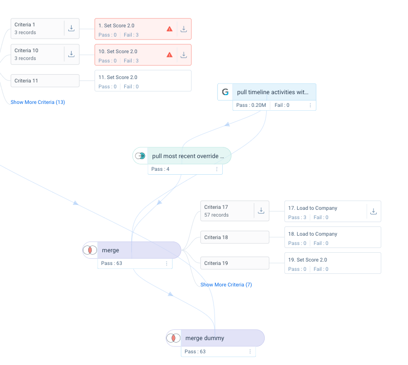
Part of the reason for this is I’d also really like to see which actions are active, which are not, AND have the ability to toggle actions off without having to go into each action individually.

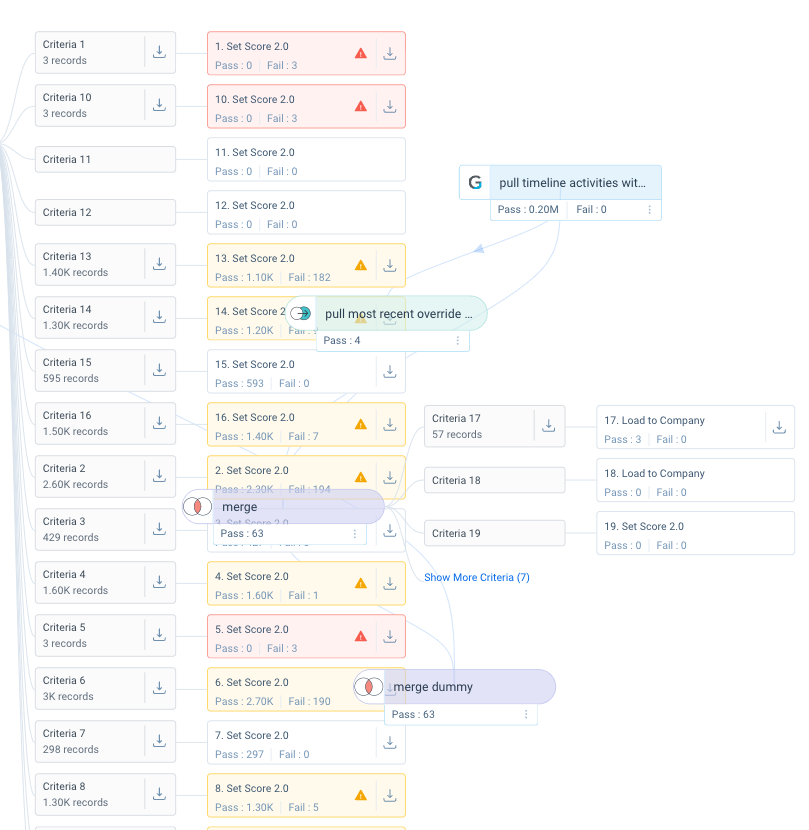
If the actions are all on the same criteria branch, it’s pretty easy to see what is/isn’t active and do the toggling. But for the most part, my actions all have different criteria and, as you can see above, going into each action to toggle it on or off is a nightmare:

  • You have to go through this expand, click, scroll, expand, click, scroll nightmare 25 times.
  • Because of that, and the fact you can’t see if the action you just toggled off is off or not, it’s hard to keep track.

Toggling actions on and off is great for testing, but really hard to manage for larger rules. When I wanted to test this rule, I ended up cloning it, and just deleting everything because it was easier 😞, and even that was a pain.

Agreed! Similar to my post here! https://community.gainsight.com/ideas/horizon-rules-keep-order-of-branch-actions-the-same-between-execution-logs-and-edit-rule-pages-45969


Strongly agree with this - while I am a big advocate for Horizon rules, I do agree that the action setup should be re-visited. We had a few rules that had many actions and the layout was a little challenging to navigate. It could be nice to have the ability to adjust how we want the layout/structure of the actions to appear when there are more than 3. It would also be nice to have the option to show the whole criteria name instead of truncating it (maybe it could be an on/off toggle so those who want to see the full name has the option, and those who prefer it truncated can have this option).


+1 for the “stays expanded” part. Working in a rule with a bunch of actions and having the list auto-collapse every time I leave an Action or Criteria page is a little annoying.


+1000 on the stay expanded. I’ve been migrating some bionic rules to horizon, and as a part of that I’m reviewing all of the actions and naming the criteria. It’s SO FRUSTRATING to have to click on “show more criteria” every single time I want to see more than the first 3. There is plenty of space on the screen, so I don’t know why they need to be hidden.


Adding on to this post because it is somewhat related: 

It would also be nice to show the criteria name once you are in the action step. If you forget which one you clicked and have many similar criteria, you can’t see the name of the one you are in!


AHHHH! THANKS!!!
I’ve been procrastinating on submitting an idea regarding this issue and just had a new clash against a rule and finally came to post and found this one.

Pretty please, leave them expanded! Use the whitespace better, it’s an extremely frustrating experience to work on a rule with more than 3 actions.


No StatusAcknowledged

Hi All,

Acknowledge the problem here. As we think of a solution → What if we do not hide but show all actions upfront with scroll? Does that seem like a better experience? 
cc: @Kritika 


Sounds like a step in the right direction 


Yes, that would be much more appropriate. With an infinite canvas design, everything should be visible by default. We can already scroll, pan, zoom, etc. with this style of interface, so the UI components should work with that approach rather than against it


Hi All,

Acknowledge the problem here. As we think of a solution → What if we do not hide but show all actions upfront with scroll? Does that seem like a better experience? 
cc: @Kritika 


I like the idea in principle, interested in seeing how horizon will handle rules with large numbers of actions (ie how will it handle all these UI elements from colliding).


+1, would love a more streamlined process for adding and updating criteria and actions. Right not it requires way too many clicks. 


Hello Gainsight Product team, are there any updates on this?

I’m working on a rule with more than 30 actions (and I have one more to go) and the time I’m losing after each update, while hoping I’m not missing any branch is making this process extremely cumbersome and frustrating 


Lets not forget how this extends to the burden of execution history as well:


Before expanding: 

After Expanding:


I get overlap, things aren’t in order, trying to work through this is a disaster and I’m sorry to say an utter failure of design. Yes, this rule could probably be optimized to be less complex, but sometimes you just have complicated rules and they just aren’t supported.


@revathimenon can we get an update on this?


I flagged this in a ticket about a different issue, and the response I got was 

Regarding the “Show More” criteria collapsing when closing a rule action:
This behavior is intentional as part of the UX design. The purpose is to ensure that when multiple tasks have several actions, the page does not become excessively long and require extensive scrolling. By collapsing the criteria, the interface remains more user-friendly and manageable.


It was suggested to share my feedback via Community to interact with the Product team, so here I am again (I commented in ‘23 and ‘24) adding my two cents.

While I understand the intent, this design, combined with the shuffled action order (

), it’s a significant pain point during troubleshooting and updating a rule, and has the absolute opposite effect. The current process forces us to repeatedly perform these steps:

1. Click "Show more criteria"
2. Manually match action numbers, which are in a different order 
3. Repeat steps 1 and 2 every time we close the actions screen

When a user takes the time to expand a section, it's because they need to view the full details. The expanded state should stick to support this intent and make the interface truly user-friendly.


I flagged this in a ticket about a different issue, and the response I got was 

By collapsing the criteria, the interface remains more user-friendly and manageable.
 

The audacity of telling you the thing you’re saying is not manageable or user-friendly, is user-friendly and manageable.


In the event that a Gainster reads this at some point, let’s make this super clear: This thread is from your users, and they are telling you it is not user-friendly or manageable and if for some reason you maintain the position that it is, please let me know as I have a bridge to sell you.


I flagged this in a ticket about a different issue, and the response I got was 

By collapsing the criteria, the interface remains more user-friendly and manageable.
 

The audacity of telling you the thing you’re saying is not manageable or user-friendly, is user-friendly and manageable.


💯