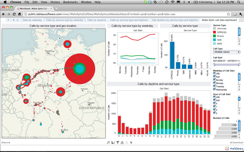
Currently, applying filters is a clunky way to interact with dashboards and especially difficult if using text based values. I would like to design the filtering interface by dashboard to display applied filters and make it easier for users. I've pushed exec dashboards to a separate BI tools previously when GS dashboards didn't have global filters. (May still push to a BI tool). See the example from a Tableau dashboard:
Filtering sections can be labeled, multiselect and picklist options visible, radio buttons for "on/off", etc.
A nice to have: Control over display labels for filter criteria since some CRM data can be kinda unclear or need to be consolidated and mapped to a single value. Say for example, we change our definitions/values for Tier within the same field or used a separate field previously, I'd like to map these values to a single field for display on the dashboard. I suppose this a separate request? I can file one for that too.
Page 1 / 1
Great idea. For this release we have enabled this (somewhat) at the dashboard-level. If there are locked (new in this release) or unlocked filters at dashboard-level they show up in-line at top. Now we still want to get smart for text-based fields so have auto-fill on all etc, but this should be a good start. For report-level we'll look into but given the space constraints it available in popup.
Reply
Sign up
If you ever had a profile with us, there's no need to create another one.
Don't worry if your email address has since changed, or you can't remember your login, just let us know at community@gainsight.com and we'll help you get started from where you left.
Else, please continue with the registration below.
Welcome to the Gainsight Community
Enter your E-mail address. We'll send you an e-mail with instructions to reset your password.
