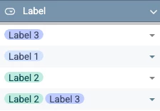
Currently PX Engagement Labels are mostly a grouping mechanism in the Engagements Admin page. They technically “show” on the table rows of engagements, but only as a summary number of labels applied that you see only when hovering over the number. I find this to be mostly unhelpful and the overall utility to be deluded by a cumbersome UX.
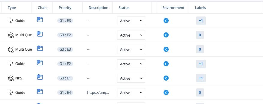
A better experience would be a visual representation of the label that uses the assigned color(s) and Label Name(s). This would provide a clearer visual indicator of what category it falls into within the engagement strategy. It also aligns more to common visual patterns for tables you see in Google Sheets and other project management tools.