Basic User Story: As an end user, I want to be able to see and interact with a Call to Action and its Timeline on the same view, so that reviewing and documenting CTA specific timeline activities is easier.
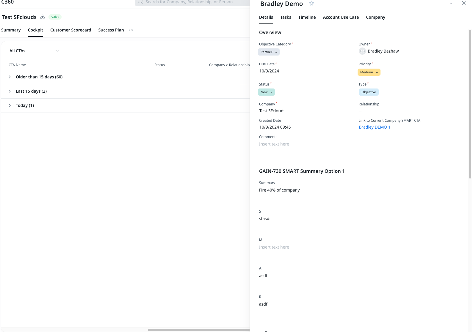
Today, CTAs utilize the third pane concept, meaning that rather than using the full width of your screen to its full potential, you get something like this:

What I would like to see, is better utilization of this space so that when I pull up a CTA, its Timeline isn’t a separate tab, but the activity history is right there, side by side with the details or whatever other CTA related sub-tab I have going on there, as part of the actual CTA layout.
This is a combination/expansion of my Cockpit idea here:
and my general loathing of the amount of whitespace throughout the platform which, in addition to being well documented here in community, is an increasing problem I encounter with my users battling the dearth of information we can present on any single screen in favor of some non-functional “aesthetic”.
The goal, ultimately, is to both make it easier for users to see the activity for a given call to action alongside the details, and create a stronger association between creating a Timeline entry for a particular CTA and the CTA itself.

