jparker
Contributor ⭐️⭐️⭐️⭐️⭐️
April 14, 2022
New Idea

UI improvements for modals and overlays (making better use of available screen space)

  • April 14, 2022
  • 12 replies
  • 249 views

Hi team

There are some small UI improvements that would make my life as an admin less frustrating — particularly around how modal windows and overlays are displayed throughout Gainsight.

Modals and overlays are often restricted in width/height based on fixed arbitrary values which require lots of scrolling — which would be unnecessary if more of the available screen space could be used.

e.g. 
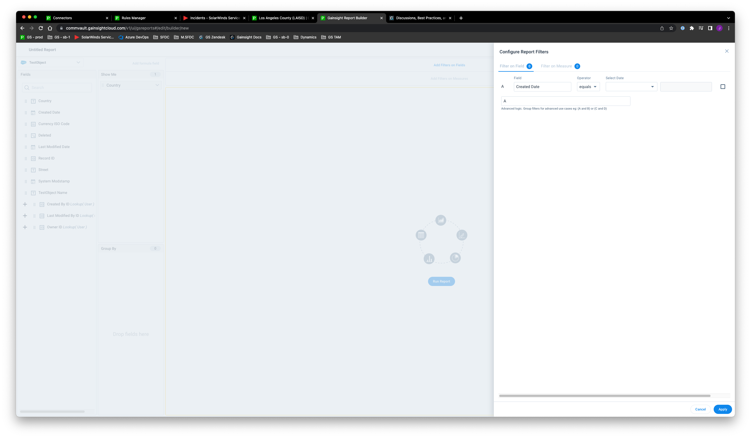
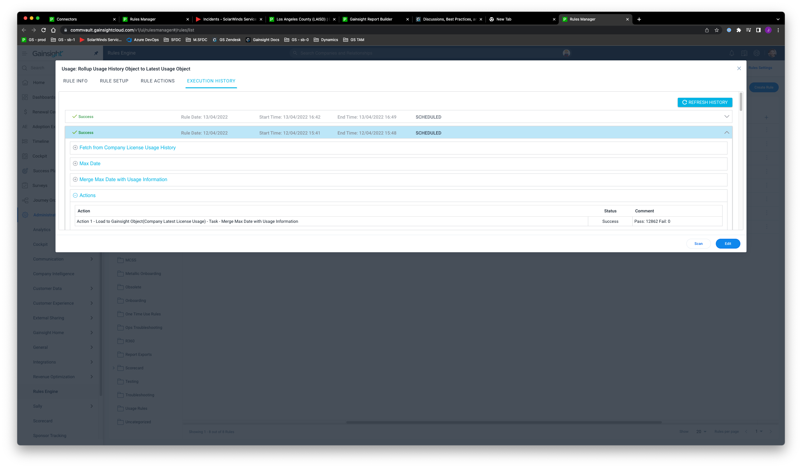
Horizontal scrolling is required when adding filters on date fields, which could be avoided if the overlay was bigger


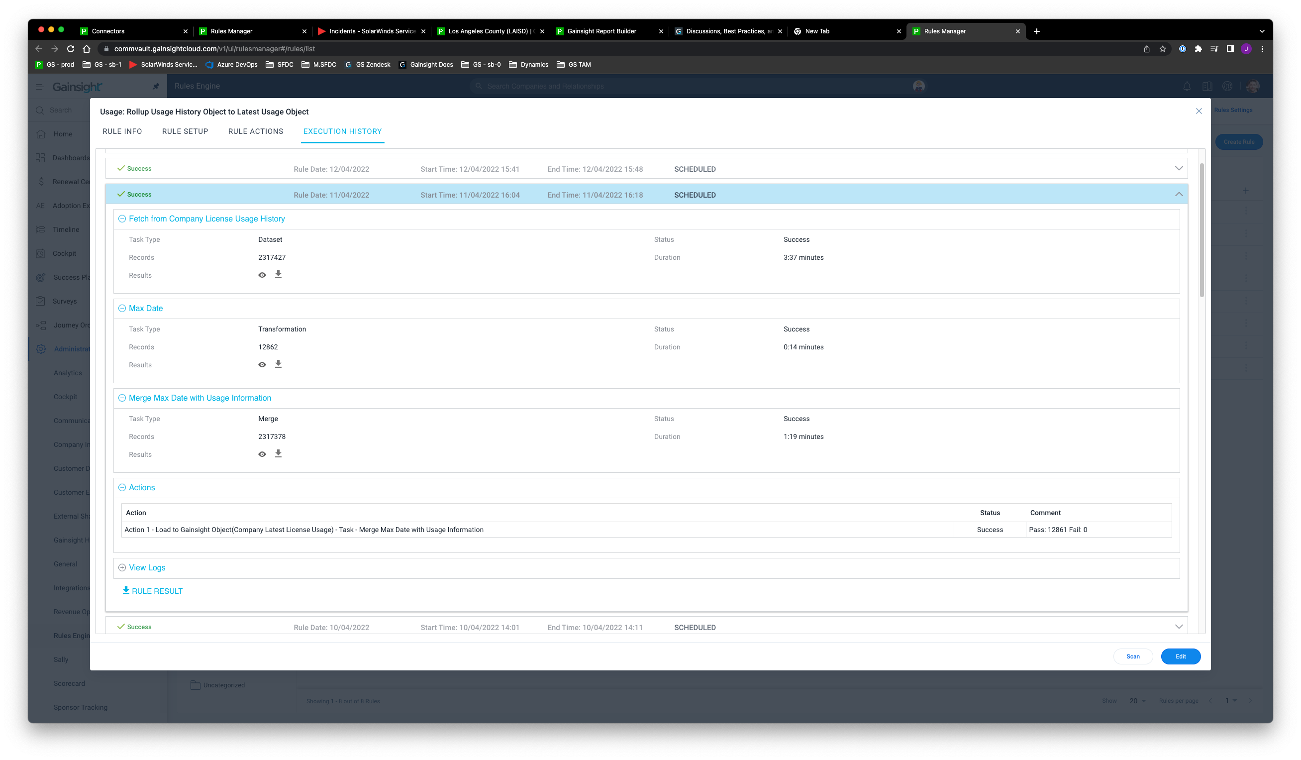
Why is the height of the rule status modal restricted in height — especially with so many nested show/hide sections inside the execution history?


Suggested improvement: It would be so much more user-friendly if the height was just set at a maximum of 90vh, for example, instead of fixed at 65rem:


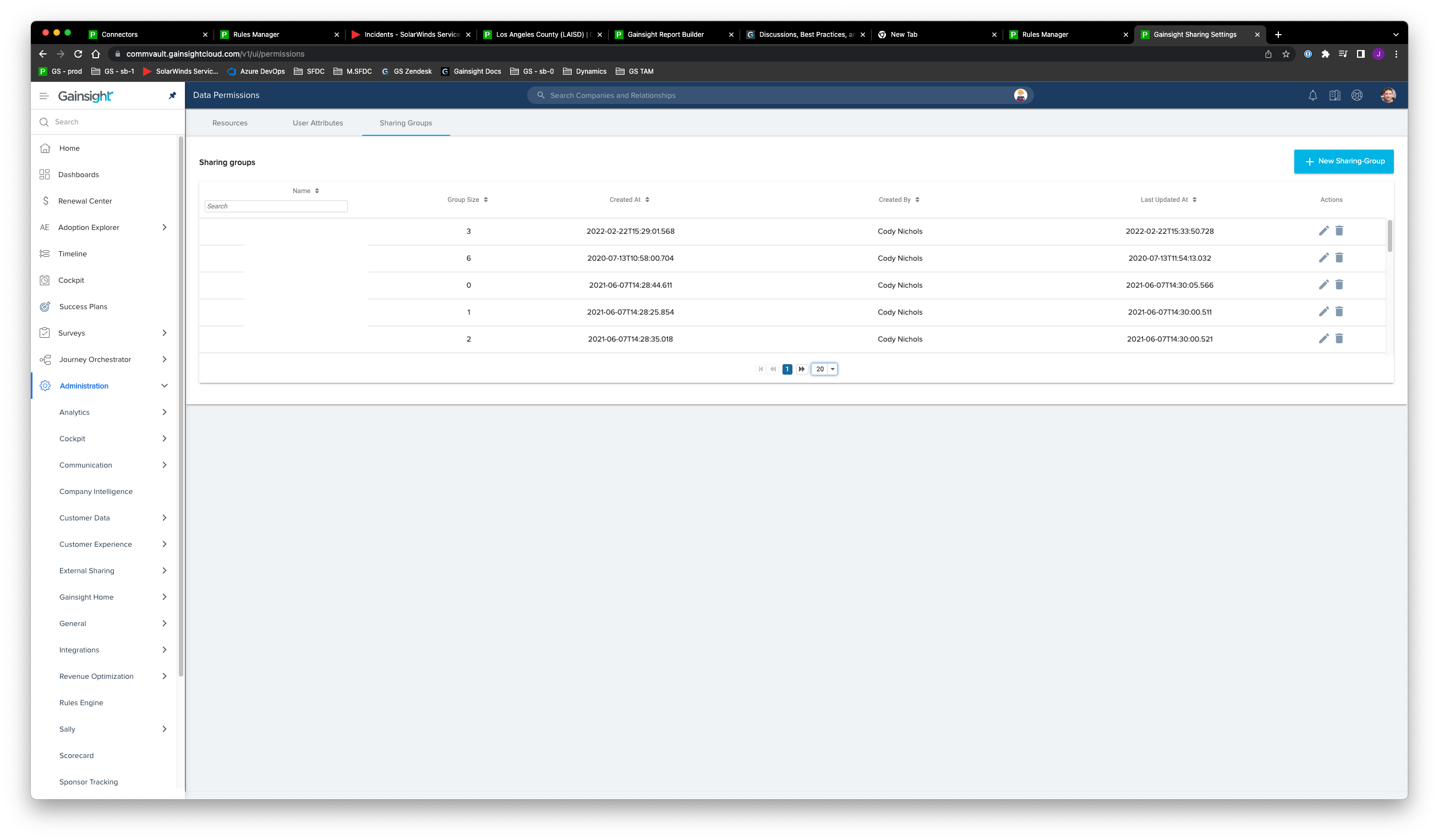
Sharing groups, you can only view 5 rows without scrolling for no apparent reason


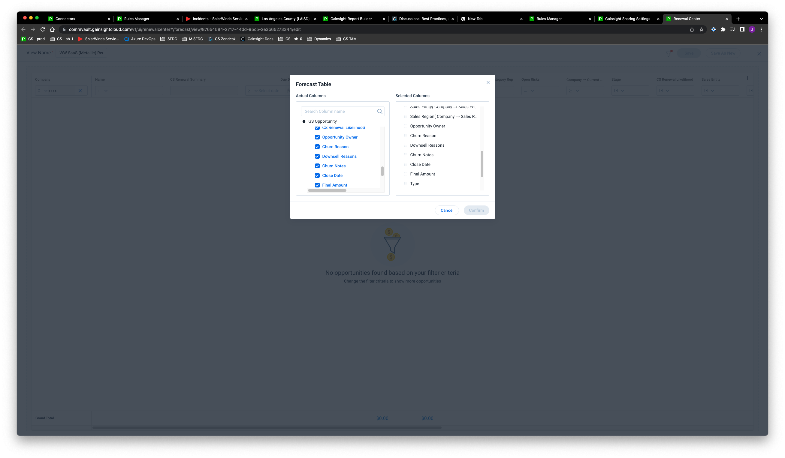
Renewals Centre — another tiny modal requiring horizontal and vertical scrolling

These are just a few examples I can think of but I will add more examples as I come across them.

Thanks!

12 replies

bradley
Expert ⭐️
April 14, 2022

I think “better use of screen space” in general. Cramped window overlays make the already prematurely truncated field value results that much harder to work with too.

romihache
VIP ⭐️⭐️⭐️⭐️⭐️
July 29, 2022

Yes!!! +1 to this!!!
I’ll add to the first one that not only the horizontal scroll is a headache, but what’s worst is that you are not able to see the whole logic at once. I have to use notepad and then paste from there to have a better sense of what I’m doing when using >~10 fields

And this fit issue is present in Data Designer too, e.g;


Continuous improvement is better than delayed perfection
Padolfi
Contributor ⭐️⭐️⭐️⭐️
July 29, 2022

Excelent @jparker!

I was just complaining about this to @romihache and she found it! 

Upvote.

Padolfi
bradley
Expert ⭐️
February 10, 2023

@ophirsw send help :) @anirbandutta 

anirbandutta
Expert ⭐️
February 13, 2023

@siva_kiran_yellapragada, @rishikesh.khumkar … pl take note


It's an opportunity for engagement
Gainsight Employee ⭐️
February 14, 2023

​Thanks for the feedback, @bradley  this is valid feedback. The team is looking into it. 
We might have some updates next time we get to review the UI work in the CS OPS council.
​

alizee
VIP ⭐️⭐️⭐️⭐️⭐️
February 14, 2023

Recently had a moan about the horizontal scrolling in DD/RE so 100%.


Also couldn’t agree more about sharing groups because I didn’t realize there was scrolling and possibly a little stupidly thought that some groups I created were missing. 

I will also add that on laptop screens, data management, and specifically dropdown management, it’s impossible to reorder values because we can view 2.5 values at a time. The list of values should evolve with the viewport size, but not in the way it does here. I’d rather scroll to see the values configuration tab than scroll to view more than 2.5 values. The space that values configuration takes is way too big.


The most expensive part of building is the mistakes. That's true in construction. Not so much in CSOps. So ask questions, make mistakes and learn. All views expressed here are my own.
bradley
Expert ⭐️
February 14, 2023

@alizee you can view 2.5 values in a dropdown? I can only view .5 when on my laptop screen :(

alizee
VIP ⭐️⭐️⭐️⭐️⭐️
February 14, 2023

@bradley And I thought 2.5 was bad😅. Yep, 2.5 on a 14” Dell latitude with a 1920 x 1080 resolution.

The most expensive part of building is the mistakes. That's true in construction. Not so much in CSOps. So ask questions, make mistakes and learn. All views expressed here are my own.
anirbandutta
Expert ⭐️
September 11, 2023
Idea merged into:

All the votes from this idea have been transferred.
It's an opportunity for engagement