jparker
Contributor ⭐️⭐️⭐️⭐️⭐️
April 14, 2022
New Idea

UI improvements for modals and overlays (making better use of available screen space)

  • April 14, 2022
  • 12 replies
  • 249 views

Hi team

There are some small UI improvements that would make my life as an admin less frustrating — particularly around how modal windows and overlays are displayed throughout Gainsight.

Modals and overlays are often restricted in width/height based on fixed arbitrary values which require lots of scrolling — which would be unnecessary if more of the available screen space could be used.

e.g. 
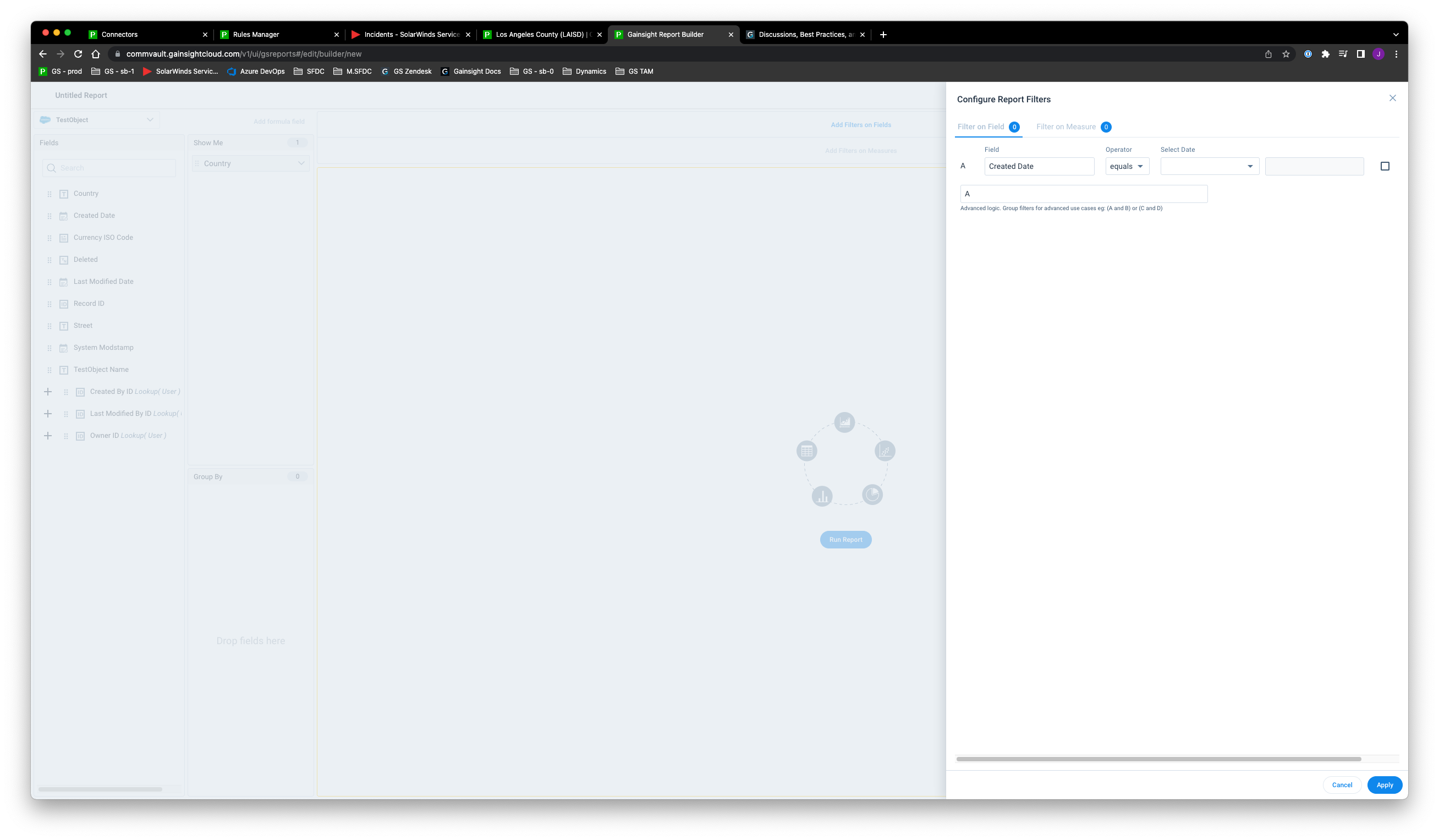
Horizontal scrolling is required when adding filters on date fields, which could be avoided if the overlay was bigger


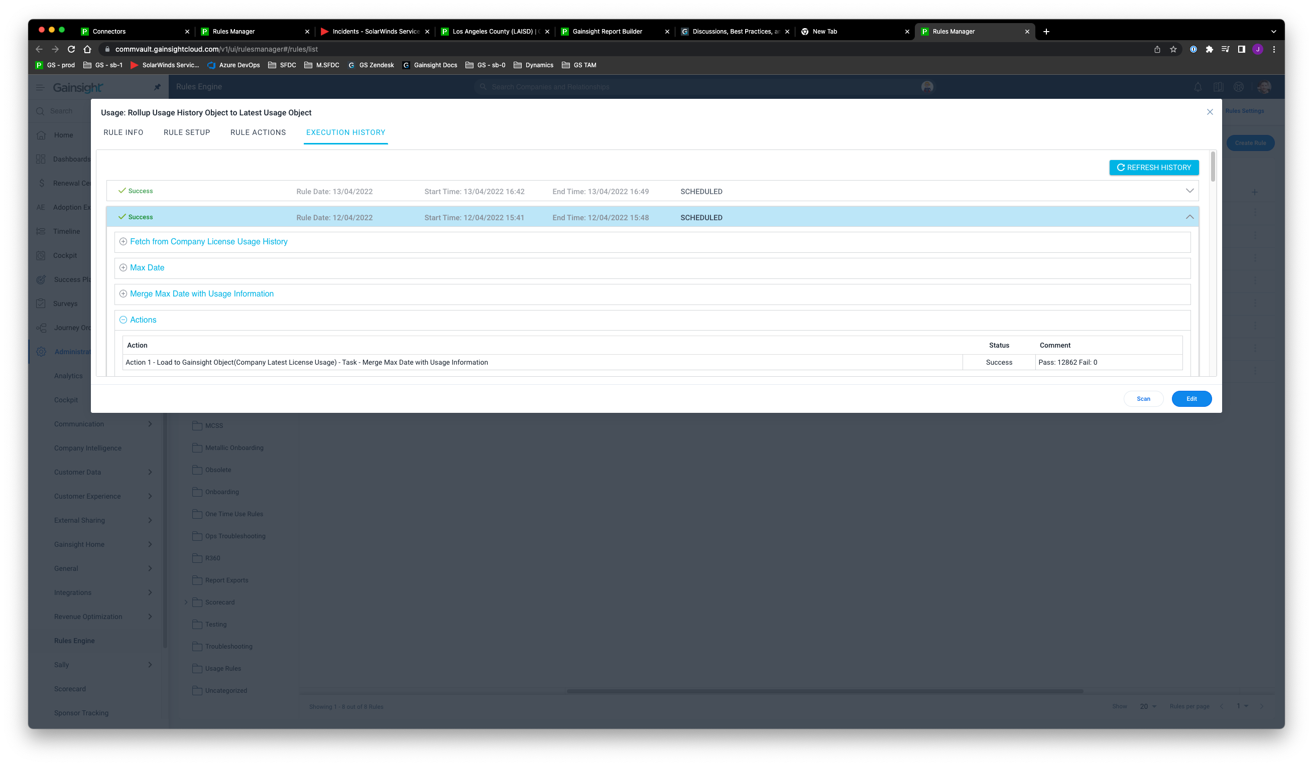
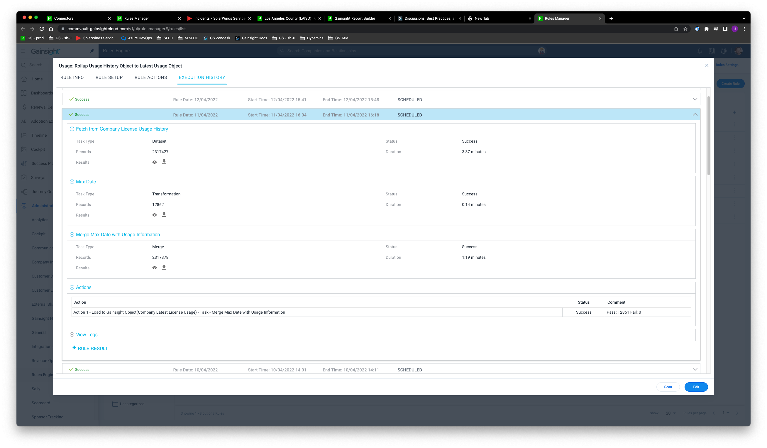
Why is the height of the rule status modal restricted in height — especially with so many nested show/hide sections inside the execution history?


Suggested improvement: It would be so much more user-friendly if the height was just set at a maximum of 90vh, for example, instead of fixed at 65rem:


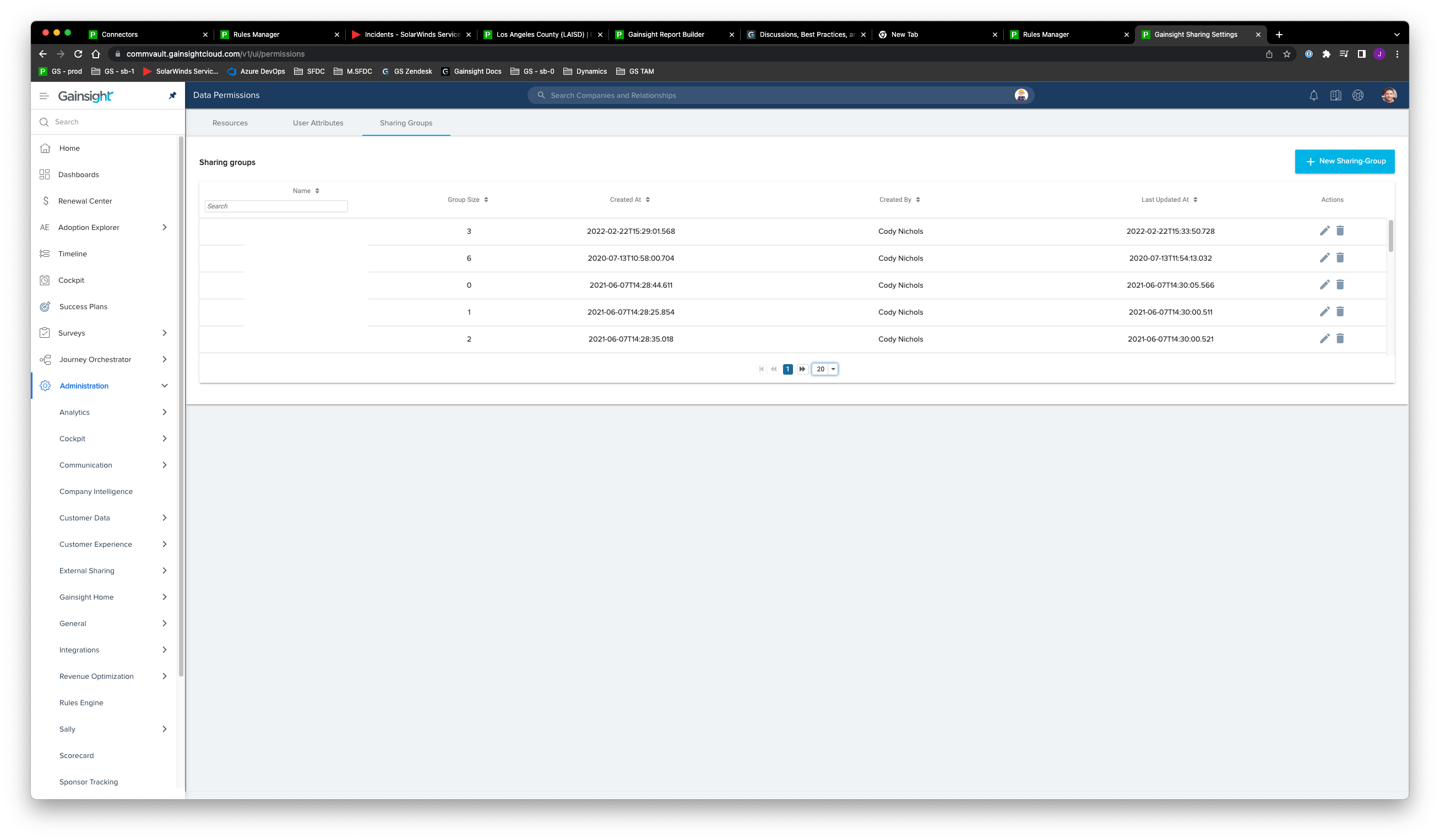
Sharing groups, you can only view 5 rows without scrolling for no apparent reason


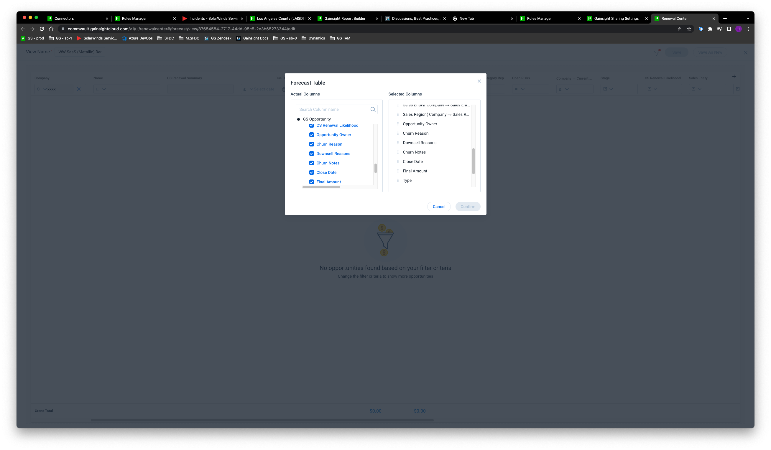
Renewals Centre — another tiny modal requiring horizontal and vertical scrolling

These are just a few examples I can think of but I will add more examples as I come across them.

Thanks!

12 replies

Gainsight Employee ⭐️
September 11, 2023

Fair feedback, all.

We are working on some improvments and hope to share them soon. 

dayn.johnson
VIP ⭐️⭐️⭐️⭐️⭐️
April 24, 2024

@bradley And I thought 2.5 was bad😅. Yep, 2.5 on a 14” Dell latitude with a 1920 x 1080 resolution.

Not gonna lie… I’ve got Chrome set at a 90% zoom almost CONSTANTLY to give myself a bit more window space. And even that doesn’t solve most things.

Staff CS Content & Comms Manager, 2x Gainsight CS Ops Product Council Member