
bradley
Expert ⭐️
February 9, 2023
Discovery

Whitespace Expansion is for Sales, not Design!
Related products:CS Rules Engine
  • February 9, 2023
  • 35 replies
  • 606 views


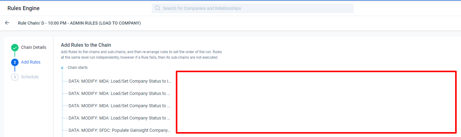
I’m not sure if this is a recent change and it seems that it is, but even if not what possible reason is there to clip the rule names and then have all this blank space next to it?


I use a wide monitor, but this is a window taking up only half my screen. It looks the same on my smaller laptop. This is not a screen resolution problem, this is a design problem.

This kind of design does not seem to indicate the users experience is considered at any point, but instead some arbitrary aesthetic.


@ophirsw I know you’ve seen my various posts on whitespace and I’m sure are thrilled to see another :) I don’t search these things out and I’m not particularly jazzed about writing these but it seems that this issue of gratuitous whitespace at the expense of product usability seems to keep happening. 

Is there a better way we can communicate how inconvenient these changes are? Is there some other method we can employ that will have a substantive impact on the way these changes are considered to better take the user into account before implementing? Not trying to be dramatic, but more and more screens we jump to are getting increasingly irritating to use. 

Thanks :)

35 replies

alizee
VIP ⭐️⭐️⭐️⭐️⭐️
March 24, 2025


The most expensive part of building is the mistakes. That's true in construction. Not so much in CSOps. So ask questions, make mistakes and learn. All views expressed here are my own.
darkknight
Expert ⭐️
February 10, 2026


Jeff Kirkpatrick
dcassidy
Helper ⭐️⭐️
February 11, 2026

I came here to vote, and it turns out I already have. What will it take to get this resolved after years of asking?

HollySimmons
Helper ⭐️
February 20, 2026

It’s really quite a simple request, let us use the whole page for viewing and working within GS….

rrobinson
Contributor ⭐️⭐️⭐️⭐️⭐️
February 24, 2026


+1

The scroll bars, tiny fields and cut off text in many places remind me of too much whitespace every day.

-RR