
bradley
Expert ⭐️
February 9, 2023
Discovery

Whitespace Expansion is for Sales, not Design!
Related products:CS Rules Engine
  • February 9, 2023
  • 35 replies
  • 606 views


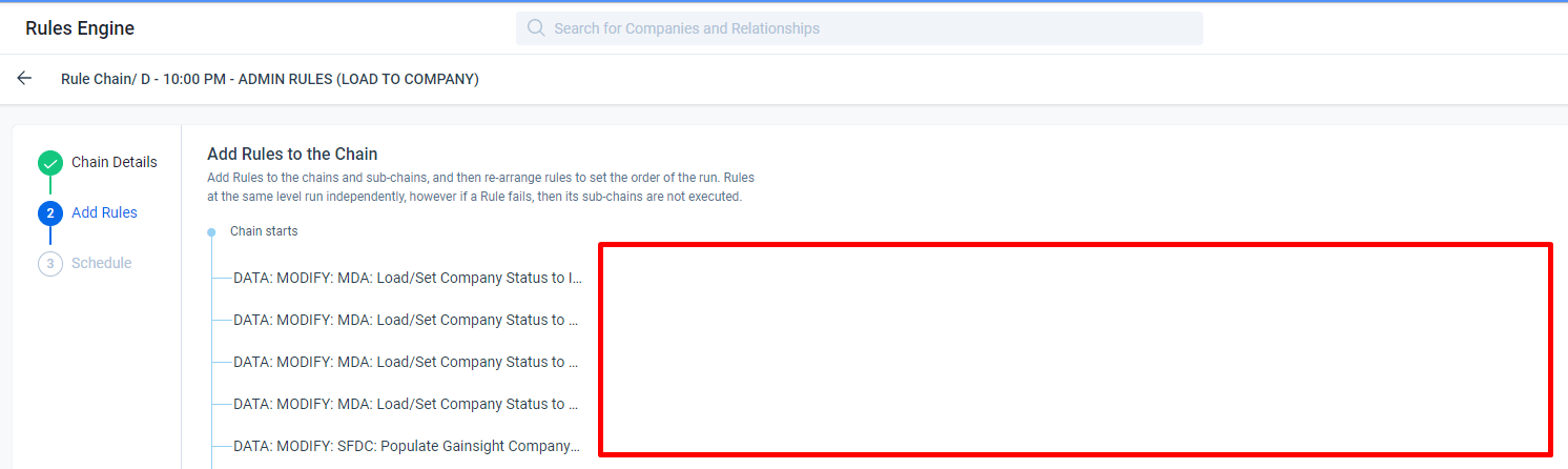
I’m not sure if this is a recent change and it seems that it is, but even if not what possible reason is there to clip the rule names and then have all this blank space next to it?


I use a wide monitor, but this is a window taking up only half my screen. It looks the same on my smaller laptop. This is not a screen resolution problem, this is a design problem.

This kind of design does not seem to indicate the users experience is considered at any point, but instead some arbitrary aesthetic.


@ophirsw I know you’ve seen my various posts on whitespace and I’m sure are thrilled to see another :) I don’t search these things out and I’m not particularly jazzed about writing these but it seems that this issue of gratuitous whitespace at the expense of product usability seems to keep happening. 

Is there a better way we can communicate how inconvenient these changes are? Is there some other method we can employ that will have a substantive impact on the way these changes are considered to better take the user into account before implementing? Not trying to be dramatic, but more and more screens we jump to are getting increasingly irritating to use. 

Thanks :)

35 replies

Padolfi
Contributor ⭐️⭐️⭐️⭐️
December 9, 2024

Hi! Since we’re on this, it would be great to also add room in the templata selector field in JO Programs. 

It gets wider once you select a long name, but not before. We have multiple initiatives, versions, email steps. No amount of correct name coding is helping with this. Advanced JO is already really slow to map and this is making it harder. 


Padolfi
dayn.johnson
VIP ⭐️⭐️⭐️⭐️⭐️
December 9, 2024

Hi! Since we’re on this, it would be great to also add room in the template selector field in JO Programs. 

It gets wider once you select a long name, but not before. We have multiple initiatives, versions, email steps. No amount of correct name coding is helping with this. Advanced JO is already really slow to map and this is making it harder. 

This is so, so accurate. And there are so many posts about it. There are two main issues at play, and already a TON of posts around each issue (see below).

​@Padolfi, the idea I was thinking of that is MOST closely related is the bottom-most one here (having the ability to apply labels or tags). This is one of the biggest issues I’ve felt with the lack of whitespace.

The issue

Because of the limitations in our digital journey assets (both programs and templates), as well as other Horizon elements...

  • One level of subfolders
  • No way to categorize assets with labels/types

… we have to use longer, more descriptive names we can then search for that include all relevant information (program versions, type, audience, etc.) so we know which is which. Because these names are so long, they get truncated by the systemic abundance of white space.

A step forward

Improvements to organizational tools (folders and tags) would make it so we didn’t need to be quite as descriptive in these names, which would then let the names be visible in a smaller selector field. (As well as other benefits, such as cleaner reporting.)


Related ideas

  1. Foldering

    •  
  2. Organizational labels/tags

    •  

Staff CS Content & Comms Manager, 2x Gainsight CS Ops Product Council Member
andybuchanan
Contributor ⭐️⭐️⭐️⭐️
February 28, 2025

Why has this been over 2 years to fix this?

Andy
HollySimmons
Helper ⭐️
March 1, 2025

Similar vein, not being able to specify how many columns wide a field should be on any 360 attributes tab/ or within an attributes widget on Summary. 

We have this functionality with Rich Text fields, but not others. 

If I know a string is going to need 2 columns to be read properly, why not let me make it so. 
 

bradley
bradleyAuthor
Expert ⭐️
March 7, 2025

Why has this been over 2 years to fix this?

2 years and it’s still in “Discovery” T_T

alizee
VIP ⭐️⭐️⭐️⭐️⭐️
March 10, 2025

I reported an issue related to whitespace in November 2024 concerning Calculated Fields in Dynamic JO, where it was impossible to update the value in one of my calculated fields after setting it the first time.


A fix was released last week, which solves my problem with evolving my configuration as I clone this template month after month to address the lunch and learn of the month. However, now I can't see the input type or operator at a zoom level of 100% on a 27” viewport.


We need to do away with these modals. We do not need to see the program layout in parallel to creating or updating calculated fields. Let's use the screen estate wisely so we can configure our programs, data designs, rules, etc., efficiently and comfortably.

Thanks. 

The most expensive part of building is the mistakes. That's true in construction. Not so much in CSOps. So ask questions, make mistakes and learn. All views expressed here are my own.
dayn.johnson
VIP ⭐️⭐️⭐️⭐️⭐️
March 10, 2025

We do not need to see the program layout in parallel to creating or updating calculated fields. Let's use the screen estate wisely so we can configure our programs, data designs, rules, etc., efficiently and comfortably. 

👆💯


There’s soooo much unused space (see the blue lines on ​@alizee’s screenshot). This wasn’t an issue in advanced JO (see the second and third screenshots below). You can actually see the logic and operators. What was the reason for this design choice in Horizon?


Tons of unused screen real estate
Overview of calculated field setup in advanced JO
Deep dive showing operators logic within field editing for calculated fields in advanced JO


Staff CS Content & Comms Manager, 2x Gainsight CS Ops Product Council Member
bradley
bradleyAuthor
Expert ⭐️
March 10, 2025

Or Cockpit views - not showing the full name of the view is unbelievable.


alizee
VIP ⭐️⭐️⭐️⭐️⭐️
March 20, 2025

Another white space issue, that seems new.

My engagement models in the dropdown now show up with … because they’re too long. Meanwhile, there’s a ton of whitespace in the modal.

Please, let’s think responsive design. 


The most expensive part of building is the mistakes. That's true in construction. Not so much in CSOps. So ask questions, make mistakes and learn. All views expressed here are my own.
alizee
VIP ⭐️⭐️⭐️⭐️⭐️
March 24, 2025

Here’s a new one for today (it seems fresh - probably an over the weekend happening):

There’s plenty of whitespace here to absorb those boxes scaling with the contents inside them. Let’s make sure they do. 

The most expensive part of building is the mistakes. That's true in construction. Not so much in CSOps. So ask questions, make mistakes and learn. All views expressed here are my own.