
While the Gainsight Customer Communities platform offers you a great deal of built-in and code-free customization functions, you may want to leverage Custom CSS, HTML, or Javascript to further create a truly unique experience for your users.
If you require direct assistance with this or you would like to explore more complex use-cases for customization or integrations, please reach out to our Professional Services team. They will be able to work with you to create amazing experiences for your end users. You can contact them at insidedproserv@gainsight.com.
Before continuing, please note the following:
- Before you begin adding Custom CSS to your community, we strongly advise that you carefully review this article on Custom CSS Guidelines. This will ensure that you are following our recommended guidelines, which will help you maintain a more organized and systematic approach to styling.
- Custom CSS and Third Party Scripts will need to be maintained by you. Our Support Team is not responsible for creating scripts, maintenance of scripts, or adjusting of existing scripts that may stop working correctly. We recommend to have a developer on-hand to support you.
- We recommend using your sandbox / staging environment to test new Custom CSS before implementing it in your production instance. This will ensure that you do not adversely affect your community users’ experience, as you will have ample time and a safe environment to complete all your testing and manipulation of the code.
Where to add Custom CSS, HTML, and Javascript 🤔
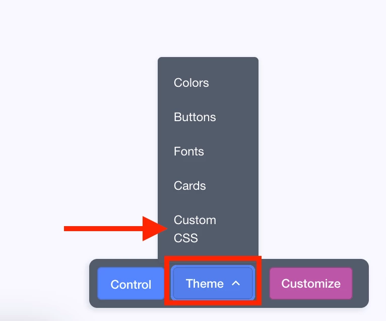
You can add Custom CSS from the front-end of the community. When you are logged in as an administrator, you will see access it via the overlay, after opening the Theme mode, in the bottom-right corner of your screen.
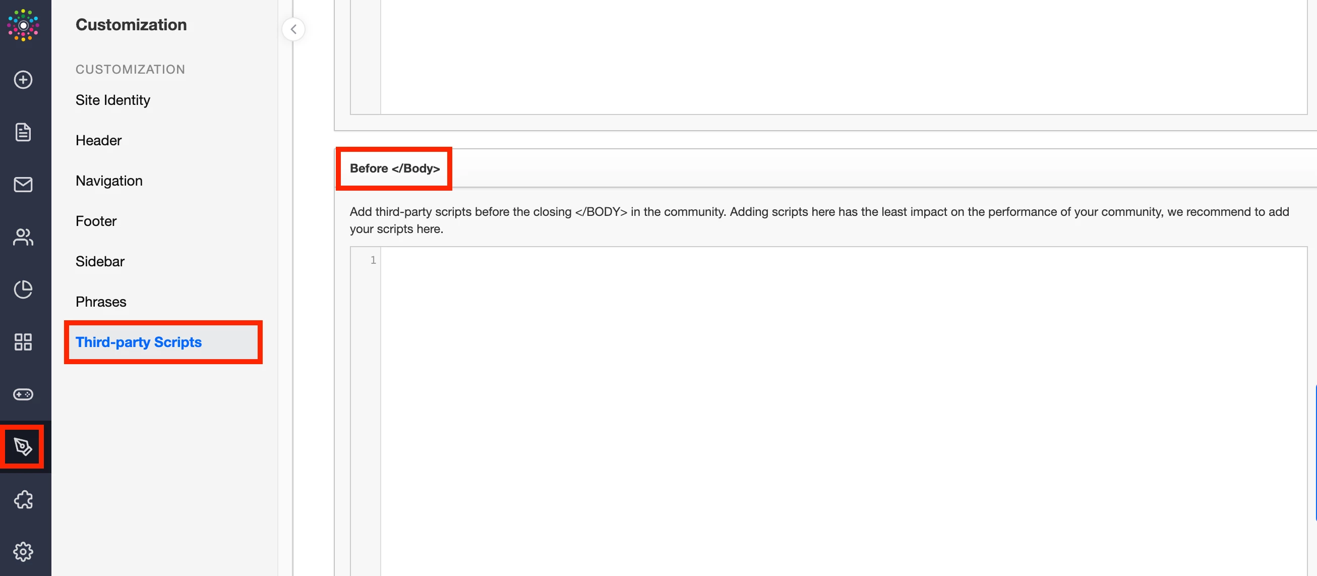
You can add HTML and Javascript in the Control environment. There, you will want to go navigate to Customization → Third Party Scripts. We recommend adding it in the Before </Body> section, as this will have the least impact on your community’s performance.
Now that we know where to add CSS, HTML, and JS, let’s take a look at some specific things you could achieve.
Changing the Avatar color📕📗📘📙
Before a community user adds an avatar in their Profile, their user will be represented by the first letter of their username and by a color from a default palette.To be fully ‘on brand’ you may want to change the color palette that this functionality chooses from or even define a single color for all users. Here are a few things to note before we dive into the code:
- There are a total of 9 variations of the user avatar.
- A random color is assigned to a user every time they sign in.
- The color palette is pulled from the the default Gainsight CC color palette.
Here is the code that will allow you to adjust this:
/*Change Avatar Colors*/
#customcss #root .avatar-variant-1, #customcss #root .avatar-variant-4, #customcss #root .avatar-variant-7 {
  background-color: #454B1B;
}
Note that you can use this snippet to predefine a color for one, a set of, or all of the nine avatar variants. You can simply repeat the entire snippet if you would like to have different colors or include all nine variants in a single snippet if you would like all default avatars to use the same color. The color will be defined by it’s hex code - you can use a tool like this to help you define it.
Using an image for the default Avatar 📸
By default, a user’s avatar will be a circle with a single color, chosen from a set of colors (either default or chosen by you - see the first item in this list, for more information). However, you may want to set your default avatar to be a designated image. Making this change can help you stay on brand and also encourage users to add their own image.
First, you will want to add the following line of code in your Custom CSS section:
/*use image for avatar*/
#customcss #root .default-avatar{
    background-image: url('https://upload.wikimedia.org/wikipedia/commons/thumb/1/12/User_icon_2.svg/2047px-User_icon_2.svg.png');
    background-size: contain;
}
Please Note: You will want to replace the web address - https://upload... - with your own image. Ideally, this will be an image with at least 200x200 dimensions.
Depending on the image type you are using, you may also want to remove the background color of the avatar. To do so, you will want to add the following piece of code to your Custom CSS section:
/*use image for avatar*/

#customcss #root .profilepicture.qa-profile-picture{
	background: none;
}
#customcss #root .default-avatar{
  background:none;
    background-image: url('https://upload.wikimedia.org/wikipedia/commons/thumb/1/12/User_icon_2.svg/2047px-User_icon_2.svg.png');
    background-size: contain;
}
Please Note: If you add this code, you do not need to add the first code snippet.
Custom Groups Module Banner Image 🌈
By default, the Groups module banner will be white and utilize the default font color. However, you can adjust the background to your Groups module banner through the following code. You will add it to your CSS:
/* Groups Module header image */

.group-overview-wrapper-title {
    background-image: url(https://image-url);
    height: 190px;
    background-size: cover;
    align-items: center;
    justify-content: center;
    display: flex;
    margin-bottom: 32px;
    margin-top: 32px;
    color: white;

    /* Full width breakout */
    width: 100vw;
    position: relative;
    left: 50%;
    transform: translateX(-50%);
}
A few things to note:
- You can decide on the height of the overall banner, depending on your image size.
- You need to use the image URL where the image is hosted within the ‘background-image’ code line. You can reach out to our Support Team at ccsupport@gainsight.com if you want it hosted on the Gainsight CC platform, and they can provide you a URL.
- If you would like to align it to the left, center, or right, you will want to adjust this.
- Note that the color is different in the two code snippets - depending on your preference and the image your are using, you can adjust the color of the text. The first snippet actually makes use of the main color, configured via your Theme settings.
- Depending on how much space you’d like at the top or bottom of the image, you can adjust the margins.
Remove any ‘class’ item on the front-end of your community 📝
Custom CSS also gives you the ability to hide (read remove) specific items from the front-end of your community. You may want to do so in order to create a more customized user experience or to bring your community’s visuals more in line with that of your company at large.
To hide a specific element (also referred to as class) you first need to identify it. The simplest way to do so is to:
- Right-click on the webpage and select Inspect.
- At the top-left corner for the new window, there is a mouse cursor icon - select it.
- This will give you the ability to move around the webpage and identify the various items.
- Hover over and click on the item to identify it.
- Then, using some basic code, you can hide that element.
Below you will find an outline on how to hide the + in the ‘Create Topic button. Using this outline, you will be able to hide other elements of your choosing by simply changing the class.
Example: Removing the + sign in the Create Topic button
First, identify the + sign by using the process described above. Your screen should look similar to this:
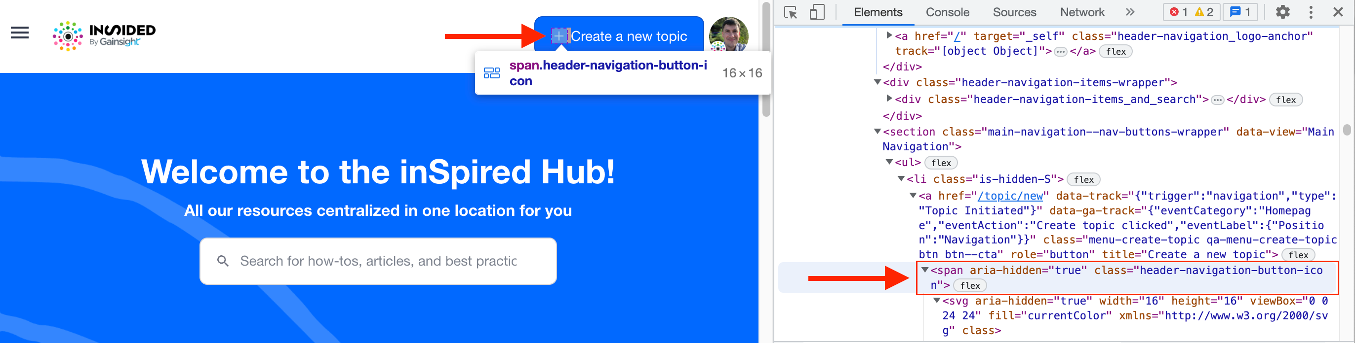
There, you will see that this class is “header-navigation-button-icon”.
Now that we have identified the class, we will want to open the Custom CSS option in the Theme mode. In the pop-up window, you will want to add the following code:
/*hide plus sign in content addition button*/
#customcss #root .header-navigation-button-icon
{
  display: none;
}
The first line simply states what the code snippet does. We recommend including this, in case certain items stop functioning properly down the road, as this will aide in identifying broken code snippets.
The next lines identify which class we are addressing, and then we are telling the system to not display said class. Et voilà! 😁
If the class you are targeting appears multiple times with the same name, for example in a list of items, you can use the following code to hide it:
#customcss #root .form__row:nth-child(11) { display: none; } In this example, we’re hiding the 11th instance of the class “.form__row”.
Using code (in Third-Party Scripts) to hide content for Guest Users 🔍
Depending on the experience you want to create, you can set up specific elements of your community to only display once a user is signed into their community account. This is most easily done by adding Javascript or HTML to your community’s Third Party Scripts (TPS) in Control, found within the Customization settings.
Similar to what we described above with hiding elements via Custom CSS, this process follows a similar first step, in that you will need to identify the class (element) you want to hide. After that, however, the process changes slightly. Instead of adding this within the Theme → Custom CSS in the front-end of your community, you will add this to the Third Party Scripts section in settings, specifically in the Before </Body> section (recommended).
Let’s look at an example to help us build this script - here, we will look at hiding the Leaderboard Widget from guest users.
<script>
    // Hide leaderboard widget from guest users
  if (inSidedData.user.role == 'roles.guest') {

  	$('.qa-widget-leaderboard_points').css("display", "none") }
</script>
As in the Custom CSS example, the first line simply describes what the code snippet does - this is recommended to include with all snippets, as it is extremely helpful to have when trying to identify a piece of code that is not working properly.
Next, we are using an if statement to tell the system when to hide the element - in this case, we are hiding it from guest users.
Finally, we are identifying the class we are hiding, i.e. our leaderboard widget.
You can repurpose this code snippet to hide other items from Guest Users, as long as you identify the element correctly (using the process outlined in the Custom CSS section of this article) and place said element inside the parentheses (after the $-sign and before the .css).
For a more general description of creating dynamic content, you can check out this article.
Customizing the SSO Login Page for a Private Community 🔏
If you are only using the SSO login method for your private community, you may want to hide certain elements on the login page. This can be done through Custom CSS in conjunction with Phrases. The process for this is outlined in this article.
Removing the ‘Share’ button 📤
If you have a private community, you may not want users to be able to share posts from the community - since it doesn’t make much sense and you want to avoid any information potentially getting out. Therefore, you may want to take the extra step and hide the ‘share’ button entirely. You can do so quite easily by adding this simple code snippet to your Custom CSS section via the front-end.
/*remove share button*/
#customcss #root .tooltip--share
{
display: none;
}
Hiding the Reputation Bar ❌
If you wish not to utilize the reputation bar - which counts the amount of likes a user has received - you will need to do two things:
- Reach out to our Support Team, and they will adjust a setting in the back-end of your CC to disable the functionality.
- Add the following code snippet to your Third Party Scripts section, found in the Customization Settings within the Control Environment:
<script>
  //hide Reputation Bar in Profile
  {
   $('.list-item--reputation').css("display", "none")
  }
</script>

<script>
  //hide Reputation Bar in community content
  {
   $('.reputation').css("display", "none")
  }

</script>
Once you complete these two steps, it will no longer be visible.
PLEASE NOTE: If you would like to just change the ‘levels’ of the reputation bar, please reach out to the Support team, and they will be able to make changes to the levels.
Hiding the ‘Quote’ button on content that is closed for comments 🚫
If you have a closed topic, users will not be able to reply, so quoting users or parts of the content does not make much sense. To create a cleaner experience, you can elect to hide the ‘Quote’ button if the topic is closed for comments. The following script will let you do this - simply add it to your Third Party Scripts section in Control.
<script>

if (document.querySelectorAll(".qa-mesg-topic-closed").length) {
   document.querySelectorAll("a.qa-icon-quote.post__action-link").forEach((quoteLink) => {
      quoteLink.style.display = "none"
   })
}

</script>
These are some basic functions you can complete by using basic Custom CSS and adding code in your Third Party Scripts. As a reminder, however, you should reach out to our Professional Services Team at insidedproserv@gainsight.com, if you require additional support or a more complex custom solution. You can check out some of their amazing work by visiting the Gong Community, which makes heavy use of Custom CSS and TPS for a truly amazing and customized user experience.
What are some of the ways you use Custom CSS? Feel free to drop some below and share your favorite ways of using this feature!
-------------


