If you’ve logged in to Gainsight PX recently, you’ve likely seen our new and improved onboarding KC Bot experience!
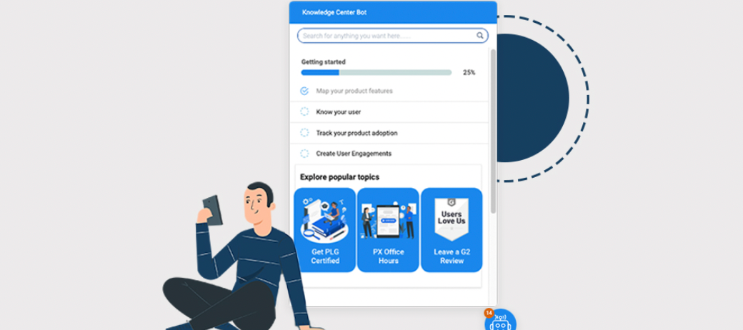
We are thrilled with the positive response and feedback on the newly launched KC bot. One common question we’ve received is how we added imagery and video to the bot using article cards, shown below:
Multi-images in card view
In this article, we would like to share how our team determined our strategy, organised our content, and innovated our KC Bot with an enhanced look and feel.
1. Data-Driven Decisions:
First, we looked at our data to map the user's first mile in Gainsight PX. This helped us understand where users found value and where they needed more direction and helped us consolidate all the needed information in one place.
User experience maps
We then identified where users deviated from the expected user flow using Funnels and Path Analyzer in PX. This helped us see the typical user path and measure our rate of expected action completion.
Insightful Duo : Funnels + Path Analyser
This information helped us determine where we could help optimize the user's first mile in PX.
2. Curate the Checklist & Categories:
Our data helped us determine our product's true ‘aha moments.’ The KC Bot then helped us curate a checklist of items we wanted users to go through and what additional resources were needed to supplement the experience.
Our goals for customers in our new KC Bot differ from PX’s free trial, and each experience has a separate KC Bot, shown below. While both bots have different focus areas for users, each has a similar format and uses the same types of content to create a cohesive experience as trial users become paying customers.
Different bots with goal based checklists for different customer stages.
3. Gathering resources:
After determining what resources were needed, we leveraged existing content to create the additional resource categories and videos now included in the KC Bot. To create these resources, we determined what topics users would benefit from having additional guidance on, then searched for existing walk-throughs or demos from our larger team to include on these topics.
To measure the impact of these resources, we hosted each video on Vimeo to collect view data around the content and to ensure each video has the same branding and controls for a positive user experience.
4. Branding the right way:
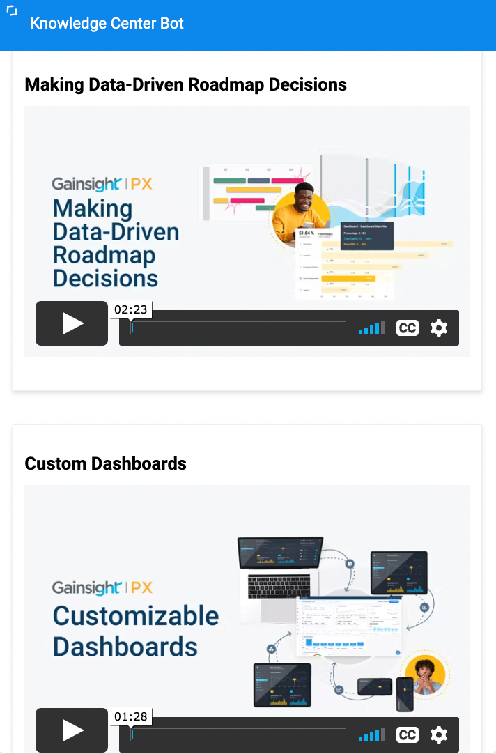
Lastly, we made sure all the content we had gathered - engagements, images, and videos - all reflected our product branding to blend seamlessly with the user experience.
To accomplish this, we used the new guide editor in PX to recreate or enhance existing guide engagements and create any new guides needed to walk users through our happy path in PX. The branding of the KC Bot and images themselves also reflects this updated styling for one cohesive look and feel.
Consistency matters
5. Innovated card view:
KC Bot articles in PX have two available views: the standard article view and the card view. With an article view, a user can navigate to a single article at any time in the KC Bot - clicking in to read the full article content. With card view, you can display the content from within the card directly in the KC Bot and display multiple cards at once to users.
If you have worked on KC articles before - the interface looks like a WordPress blog and appears like a white canvas. You can easily add text in any article, or if switching to code view, you can add code directly into the card or article to create new layouts and designs.
We used this option to add the new ‘Key Resources’ images to our KC Bot, to guide users to three key callouts we wanted to offer, and to embed the video resources in the additional resources categories.
Here is how we did it:
On the main page of our KC Bot, we used an article with a card view and added the code below to align three images in columns within our KC Bot. Each code column includes a hyperlink to the page we wanted to redirect users to and the image's URL. The code puts the images in three columns at the right width to fill the card.
<style>
.column {
float: left;
width: 32%;
padding: 1px;
}
.row. {
width: 100%;
padding: 0px;
}
</style>
<div class="row">
<div class="column">
<a href="https://productschool.teachable.com/p/plg" rel="noopener noreferrer" target="_blank"><img src="ADD YOUR IMAGE1 URL HERE" style="width: 147px; height: 201.776px;" class="fr-fic fr-dii" width="147" height="201.776"></a></div>
<div class="column">
<a href="https://gainsight.zoom.us/webinar/register/WN_XBGoWNyPSWK5fwJc6nPjtw" rel="noopener noreferrer" target="_blank"><img src="ADD YOUR IMAGE2 URL HERE" style="width: 147px; height: 196.373px;" class="fr-fic fr-dii" width="147" height="196.373"></a></div>
<div class="column">
<a href="https://www.g2.com/contributor/px-in-app-engagements?secure%5Bpage_id%5D=px-in-app-engagements&secure%5Brewards%5D=true&secure%5Btoken%5D=08a4748885a34a36089234a3666e1ae9fd816794c352cc3cdc955e055bd12074" rel="noopener noreferrer" target="_blank"><img src="ADD YOUR IMAGE3 URL HERE" style="width: 147px; height: 196.373px;" class="fr-fic fr-dii" width="147" height="196.373"></a></div></div>
Add in the image URLs (src) and hyperlinks for your own content in the above code.
Make sure to choose card view when saving your article, and skip adding an author, date, or links to make the card look cleaner in your KC Bot.
6.Other categories:
We did prioritize what content should go into each category and sourced micro videos for each topic. Add them to the video to add a thumbnail and start embedding them in separate article card views. Adding the videos separately helps us identify content consumption more specifically than adding all images to a single article.
More of this is covered in our recent office hours session. Do check this out to get more insights on this.
Happy PX-ing!!
