Many of you have been wondering: “How does Gainsight use PX?”
It’s a great question given the fact that it is indeed our own product, and many PX users are curious how we do it the Gainsight way. For the next few weeks and months, I’ll be sharing inside looks at what goes behind the veil and how we do things around here!
I first want to preface: Just because Gainsight does things a certain way does not mean that it’s the magic bullet. In fact, some of you have even better and more creative ways of using PX! As a team, we are always in awe of how our customers use our own product and think outside the box! 

For our first unveiling: How does Gainsight use in-app engagements to announce webinars?
Recently, we started running PX Office Hours to serve our customers at scale and enable tech touch as part of our 1:Many strategy. Across the Client Outcomes team (Customer Success in Gainsight lingo), we receive similar questions across our team members. On top of scheduling one-off calls to answer questions and reply to emails, we decided to launch PX Office Hours, where any valid, paying customer can come and ask questions, usually around a given topic.
Here’s an inside look at what we set up this in-app engagement to promote our upcoming webinar!
AUDIENCE:
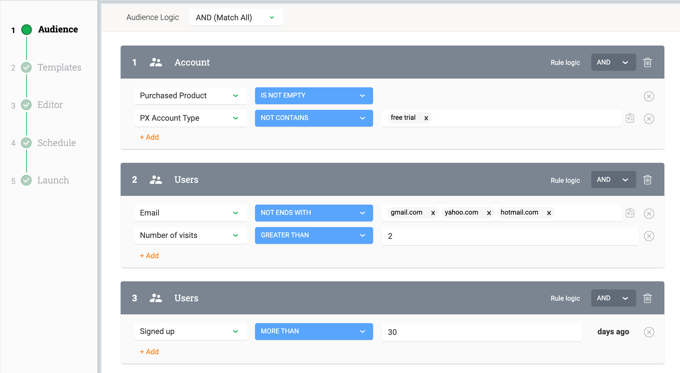
- Audience logic set to “AND (Match All)”
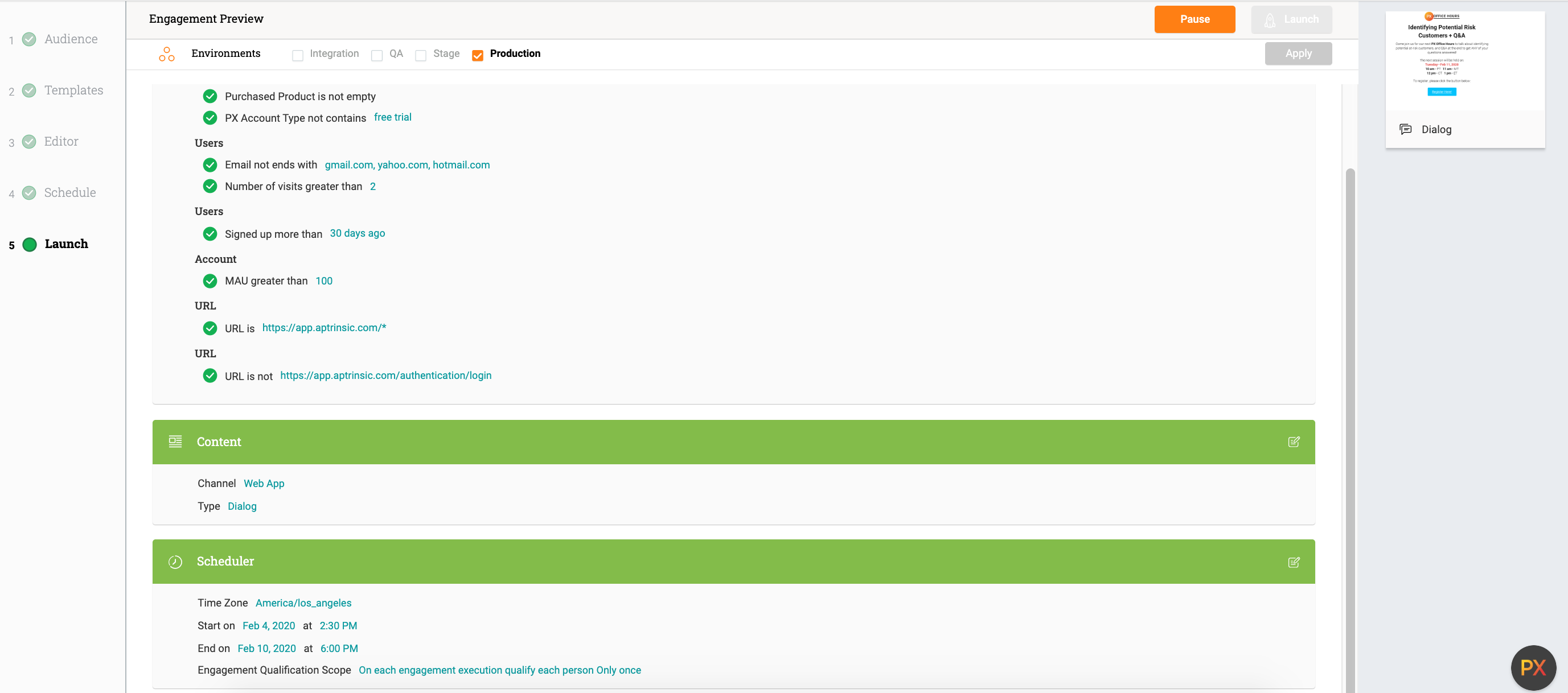
- “Purchased Product” IS NOT EMPTY, AND “PX Account Type” NOT CONTAINS ‘free trial’ → These are custom account attributes, and essentially mean we’re targeting valid, paying PX customers
- Exclude non-business emails AND target users with 2+ visits in our product → This targets users who have at least been in the app and played around with it one time
- Users signed up 30+ days → We wanted to target more mature users who have at least a month’s worth of experience in PX
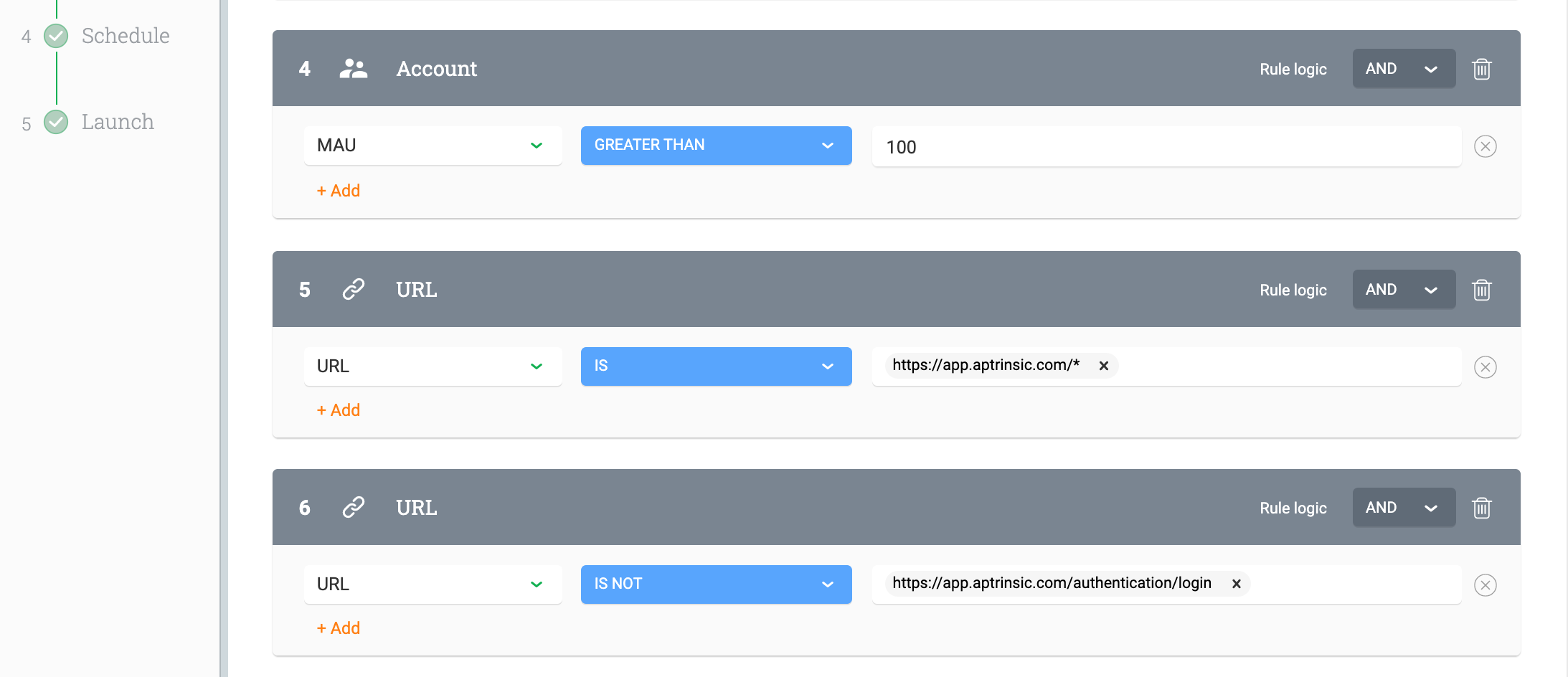
- MAU greater than 100 → This is a custom account attribute. This is meant to narrow down to our valid, paying customers.
- URL rule → We wildcarded the URLs to ensure the announcement happens on any page the user lands on, including the dashboard
EDITOR / CONTENT:
- Personally, I don’t have extensive background with HTML and CSS to make awesome graphics. This is where delegating comes into play.
- Fortunately, we have a UI/UX Designer who is happy to help beautify internal engagements.
- I created the basic text and content of the engagement
- I sent the engagement over to our Designer, explained what this is meant for, gave him a realistic timeline, and made the ask.
- You can say my expectations were blown out of the water
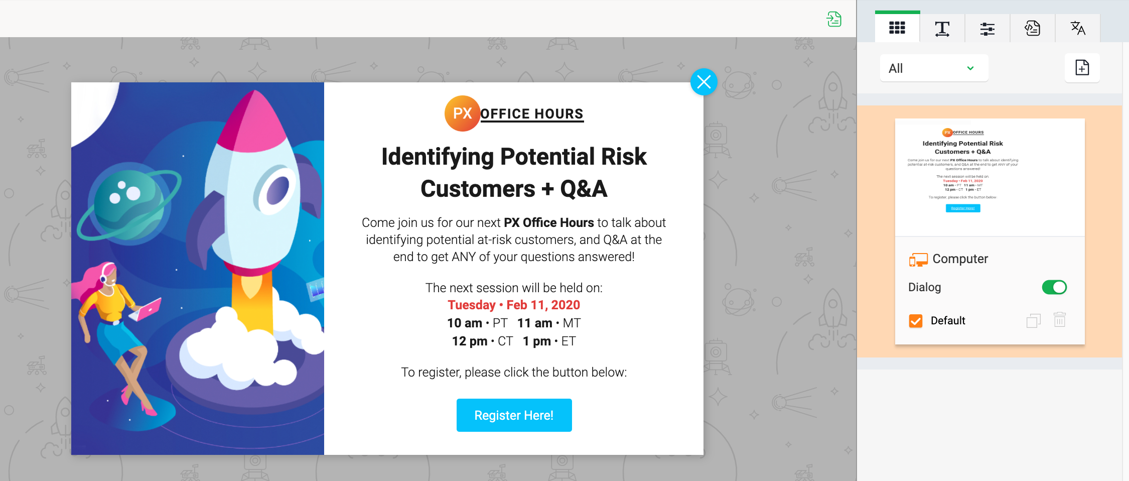
 See our finished content below:
 - On the “Register Here!” button, I linked the button to the GoToWebinar registration link for users to directly sign up.
SCHEDULE:
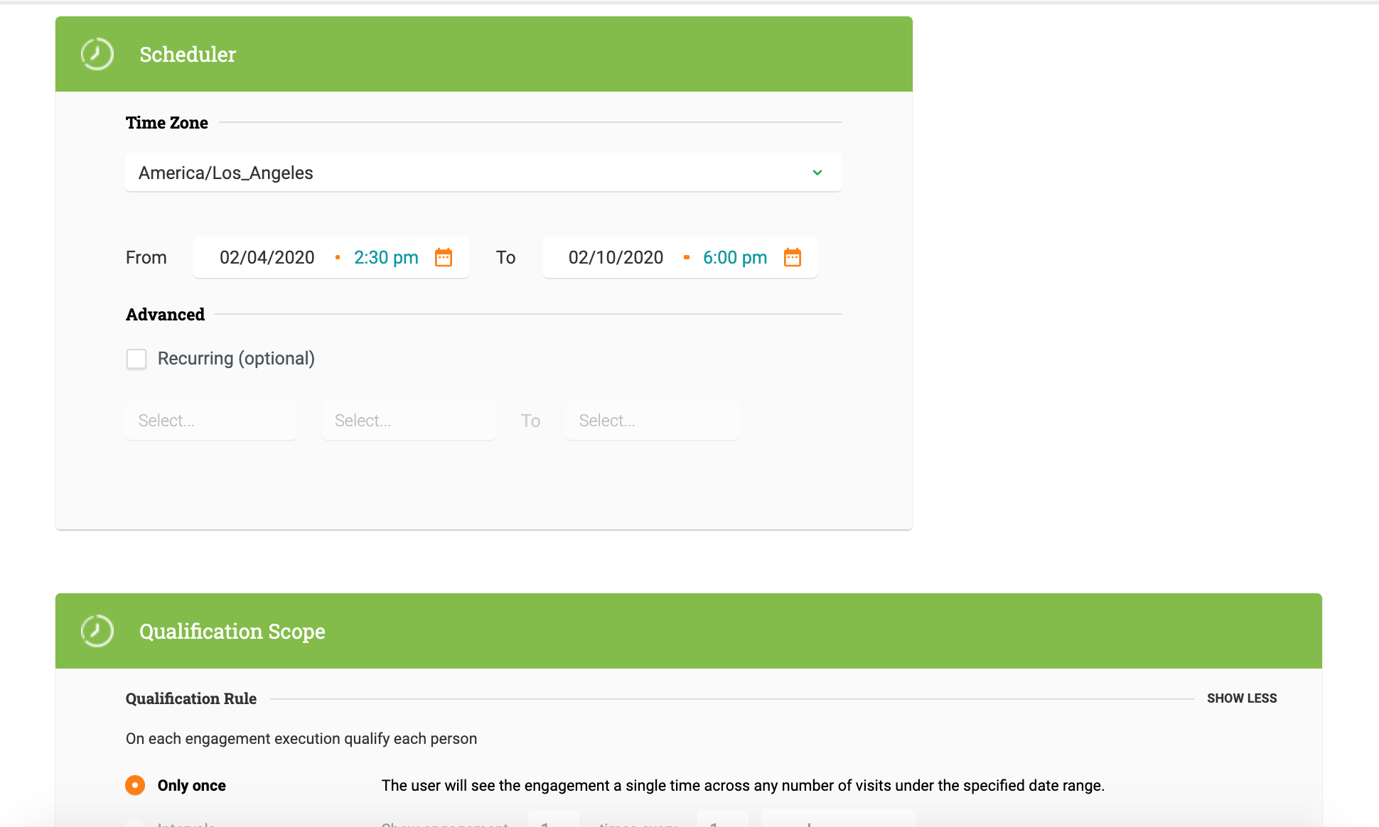
- I set the engagement to launch starting 7 days before the actual PX Office Hour / Webinar. The thought process behind this is to give ample time for users to see the engagement, check their schedule, and register.
- Set to “Only Once” → Showing one time in a week is sufficient. Showing more than that may annoy users, and we don’t want to create a negative user experience.
LAUNCH:
- Review your requirements and settings.
- When ready, hit “Launch”!
_ _ _
Hope you found this insider look to be helpful, and to spark ideas for your next in-app webinar announcement!
