We talk a lot about all the things PX can do - target engagements based on product usage, trigger 1 engagements off of another, track users’ natural paths they take through your product, to name a few. That’s all amazing, and believe me, I could talk about those capabilities for a long time.
But what about the engagement design itself? Once you have your goal, audience, and schedule set, how will you make sure the engagement actually captures your users’ attention? Your engagement can really be your blank canvas upon which to build an experience.
Below are some strategies we and other PX customers have used to make engagements stand out to users.
1 - Incorporate color
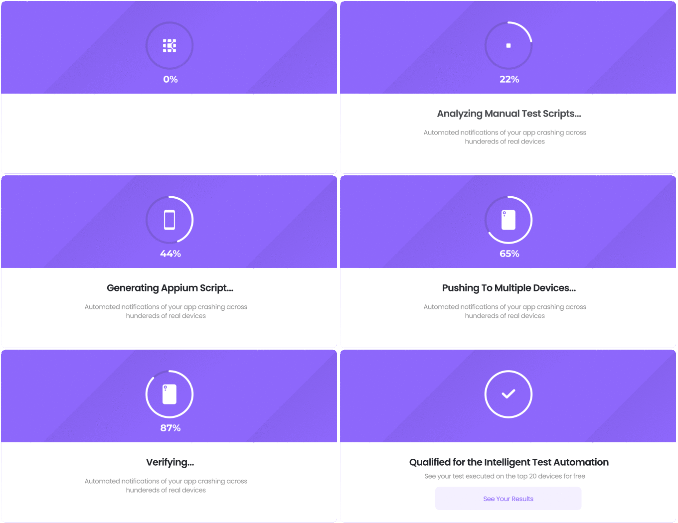
By default, most engagements will have a white background. When you really want a guide to capture a user’s attention, don’t be afraid to incorporate color and graphics! I don’t know about you, but a dark background with white text is far more likely to catch my attention than standard white background and gray/black text. Also, be sure to make your CTA button stand out with a contrasting color! Here are some examples:
Credit: Drew Williams, Kobiton
Credit: Aleh Haiko, PX on PX
2 - Add eye-catching copy
Have you heard of the concept of microcopy? Basically, it refers to very short phrases that contribute to the users’ experience of your brand. For example, AirBnB’s search function says “Explore” instead of a generic “Search”, contributing to the brand’s sense of adventure and travel. Short words and phrases and words that add to your brand can go a long way in enhancing the product experience.
Also, think about the user’s context in that moment. In the example below, instead of launching right into the what of the engagement (ie, features, how to, etc), we took a moment to catch the user’s attention. For this guide, the user is visiting the PX Analytics module for the first time. At that stage in the user journey, they know that they “have data” in PX, but not what to do with it. With some quick, to-the-point copy, we can grab the user’s attention and encourage them to complete the guide.
Credit: Aleh Haiko, PX on PX
Pro tip: When making PX engagements, we highly recommend involving your Marketing and/or Product Marketing teams to help create eye-catching copy.
3 - Create GIFs
It’s no secret that motion captures our attention. Incorporating a GIF makes it that much easier for your users to consume information. Some ideas:
-
Create and add an animated GIF to your engagement to show what a new feature improvement looks like - this can also be used to create hype leading up to a release
Credit: Amanda Rufer (
-
Create a clickable GIF that takes up the entire height and width of your engagement (see below). These can look very native to your UI and create that “delight” moment for your users.

Those are some ideas to start. What about you? How do you make your PX engagements pop?

