About 1 month ago, we launched our first in-app guides. Looking at the engagement analytics, it appears that all goes well as long as users can just click a "Next" button. When they are asked to click a button in the app or take a (simple) action to proceed to the next step, about all of them seem to drop off the tour.

Did anyone experience anything similar? Are there any guidelines or best practices to overcome this?

Hi @Jef Vanlaer 


I am definitely interested to hear other strategies that our PX customers are using to improve Guide completion rates. I know that everyone will benefit from this, so please @PX Community help! :) 


In this particular example, you seem to be calling out “Tooltips” specifically, so let me make a couple suggestions…

  • This one is probably obvious … be sure to include a clear “call to action” in the Tooltip for what you want the user to do next.  For example: “Be sure to click this button next”, “Enter some text in this field to continue”, “Click this link to proceed”, etc.  That will at least encourage the user to do the right thing for the Guide to work well.
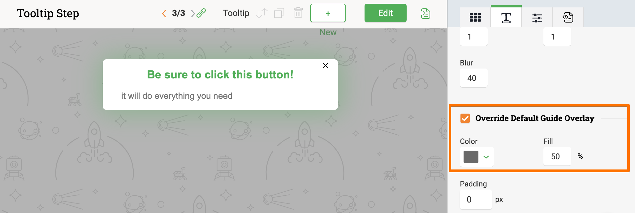
  • This one may be less obvious … be sure to use an “Overlay” in the Tooltip step (or the entire Guide) so that the user is not distracted by everything else around and is focused on exactly what the Guide is cover.
  • This one is not obvious at all … there is no way to easily turn on/off the little “X” in the top right corner that will close the Tooltip.  It is quite possible, maybe even very likely, that some users see this “X” close option and click it out of habit or instinctively … the world could use a few less ad popup windows for sure. :)

Fortunately, PX allows you to override our default PX Engagement CSS styling as well as create your own CSS styles. In this case, you can hide the little “X” in the top right corner so no user can click it.  In this way, the only way to proceed for the user is to click your highlighted button, link, or form field.


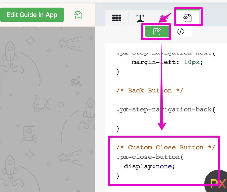
Here is the exact CSS text that you can use to do this:


/* Custom Close Button */
.px-close-button{
  display:none;
}


And here is where you put it in our PX Engagement editor:

And here is the end user result:

I hope this helps!


PS. I think I will create a new “Tip of the Week” for this last one, so thanks for the question @Jef Vanlaer! :)


Hi Link,

Thanks for your reply. I'll share this with the team in order to discuss if we are consistently applying tips 1 and 2, and if applying tip 3 would be useful (probably) and desirable (do we want to force users to go through the guide?).

Kind regards,

Jef


Reply