In that page you will learn how to customize your Product Updates Overview page and discover the most relevant widgets you can use on that page.
Access Customization mode
-
Sign in to a community account with user role Community Manager or Administrator
-
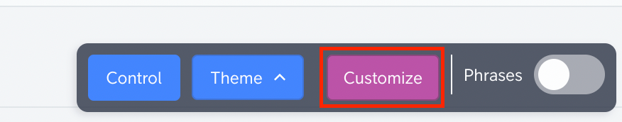
Click the purple Customize button
Publish changes
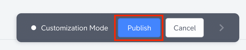
When making changes in the customization mode you will see a live preview as a result of your changes, these changes are not directly visible to your end-users yet. In order to apply the changes to your community (and make them visible to everyone), you’ll need to click the Publish button in the customization mode action bar.
More information about Customization
You can read this article about how to customize the homepage to see the details about the customization mode.
Widget position

There are three positions where a widget can be added:
-
Body (expanding the full-width of the page)
-
Container (expanding two-thirds of the page width)
-
Sidebar* (displayed at the right side)
*sidebar widgets can only be added when a sidebar is configured
Main Widgets for Product Updates Overview page:
Hero Banner
Position: body
An image banner with headline and search bar. Typically shown directly below the navigation to welcome users to the community and let them search for information.
Quick links
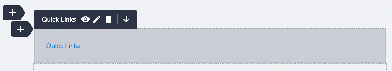
Position: body, container, sidebar
Card styled links. Cards have a title, URL, and description (optional) and can be displayed as plain text or with a visual in the form of an icon/image. Up to 6 quick links will be visible, if you configure more than 6 quick links they can be loaded by triggering a ‘Show more’ button.
Featured topics
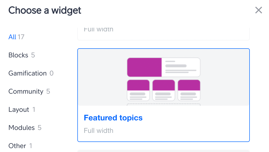
Position: body
Feature topics in card style. Manually choose the topics you want to feature by search or by copy/pasting a topic URL. Feature as many topics as you like and determine how many topics should be shown in a big card. Each topic type has its own card style (e.g. an article will display a feature image and an Product Update will show its product area). We recommend to feature multiple of the same topic types to maintain visual consistency. Optionally, you can add a title above, and a button below the featured topics card.
Filter by Product area
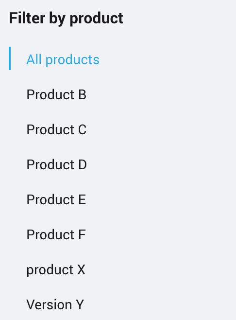
Position: sidebar
Used to filter on product areas defined in Control.