Hi Community,
I could use a bit of help. I’m not sure how to make some edits to our registration page. I assume the colors are from choices on the homepage?
Here’s what I’d like to change:
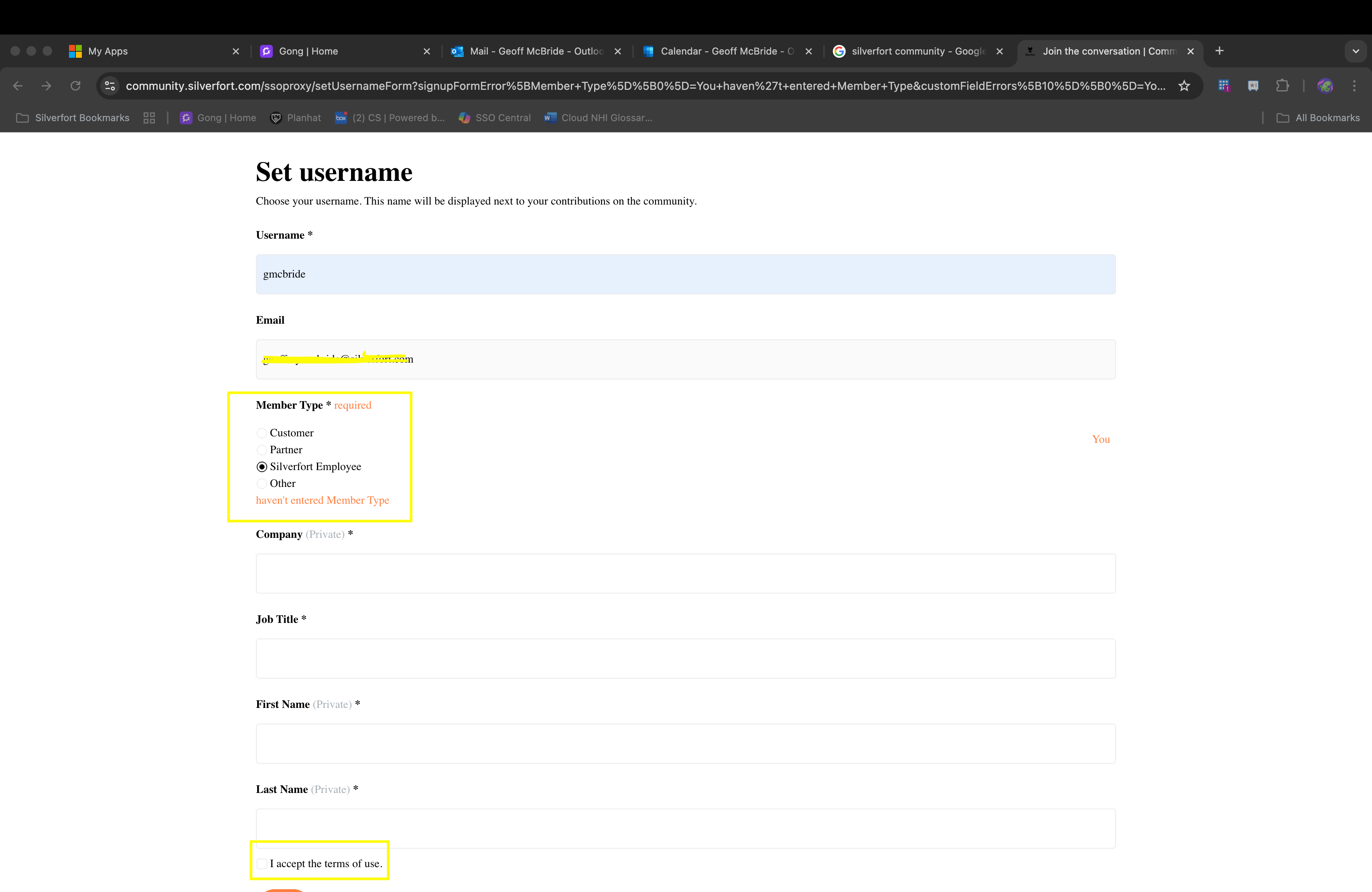
Error Messages are appearing in orange. It’s one of our colors, but we can’t use orange on white. Does anyone know what field that is?
And the check box for terms and conditions is tiny. Can we make it larger and maybe bold?
And just feedback - if you try to join and have missed that terms and conditions box, it clears the whole page, which is annoying. Any way to fix it?
Thank you!