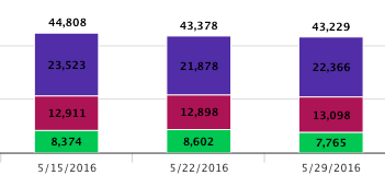
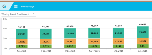
One feedback from CSM's (and something I agree on) is that the new color scheme on graphs make it significantly harder to see data points, especially the dark text magenta background (Attaching screenshots for comparison).
Karl Rumelhart mentioned customized color scheme for graphs during the Product Roadmap showcase at Pulse, is this something that'll be made available to the Early Access customers?
Pre-5.0
5.0
Page 1 / 1
We gotten some of the same feedback. In case, it's especially a little hard to read when the magenta is right next to the red.
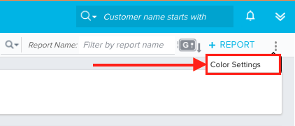
Hi Heather, I actually found "Color Settings" (no documentation yet) from the Report Builder screen.
I switched out the existing color scheme with the hex code from the old instance and restored original color scheme!
I switched out the existing color scheme with the hex code from the old instance and restored original color scheme!
Yea, being able to change the colors is I think part of 4.40... not 5.0. You should be able to change them.
-SD
-SD
AHA! Thanks for sharing!
Modifying the Color Settings directly in the Report Builder is only available in orgs with 5.0 early access. For orgs with 4.40, I believe you have to modify the report colors under Admin > Usage Configuration, and Admin > Retention.
See also Color Settings in Reports for reference.
Sign up
If you ever had a profile with us, there's no need to create another one.
Don't worry if your email address has since changed, or you can't remember your login, just let us know at community@gainsight.com and we'll help you get started from where you left.
Else, please continue with the registration below.
Welcome to the Gainsight Community
Enter your E-mail address. We'll send you an e-mail with instructions to reset your password.


