
Change UX Colors on Timeline Entries so They're Easier to Read

  • October 15, 2020
  • 1 reply
  • 38 views

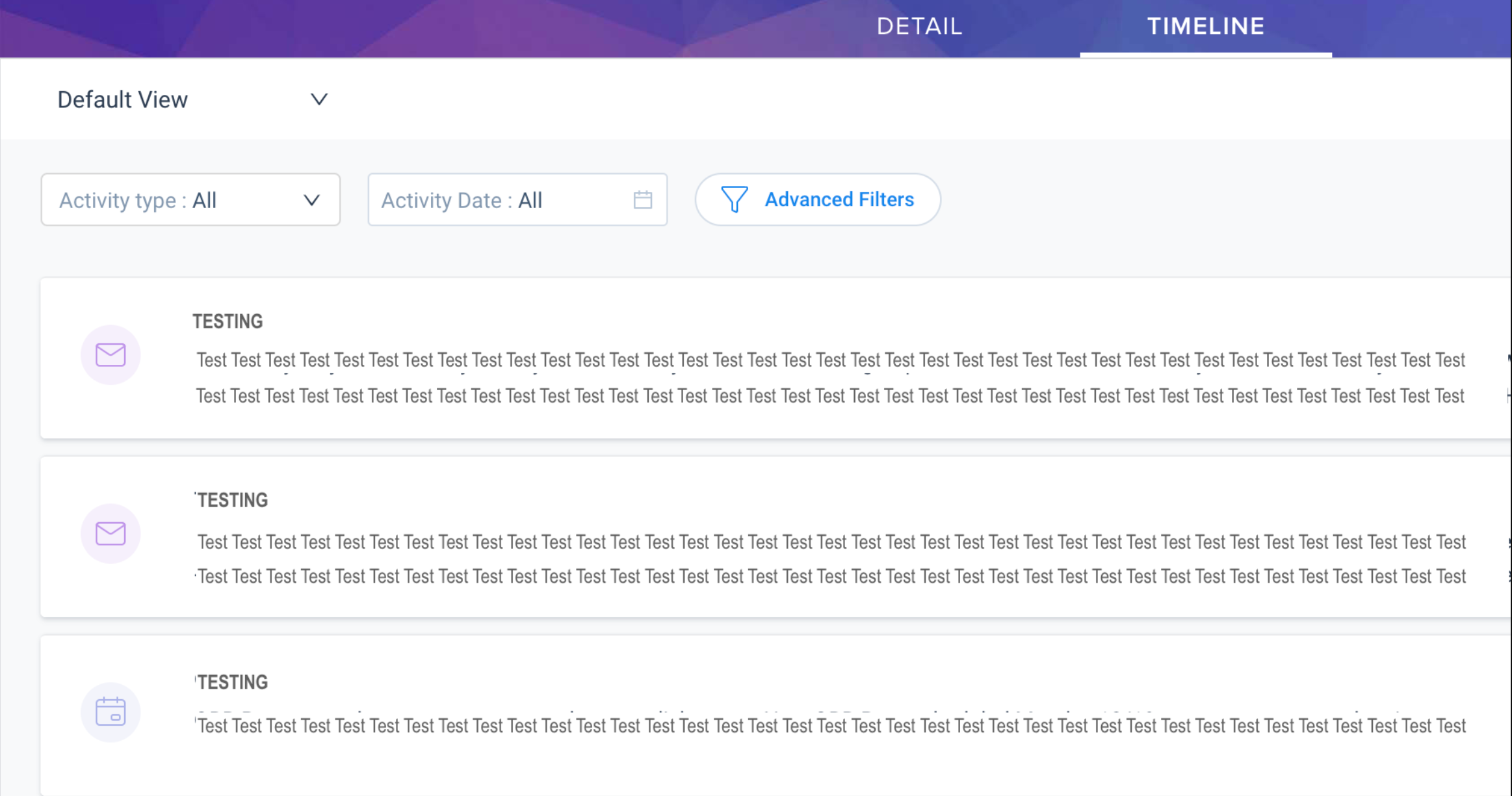
The new user interface has too much whitespace.  It makes the timeline entries look like they run into each other (or it looks like one big expanded timeline entry) and it’s hard to consume. Can you make the Timeline Entry titles or the background a different color so it’s easier to decipher between them?


New UX
Old UX


1 reply

sai_ram
Forum|alt.badge.img+1
  • Expert ⭐️⭐️
  • December 24, 2020

@hkennel Thanks for sharing it here, this is shared with the product team under Horizon Experience.