
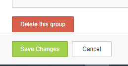
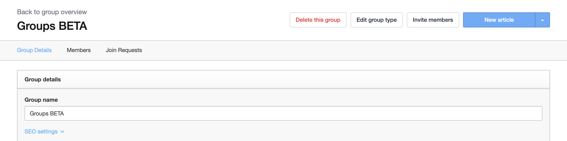
My team and I are terrified each time we go to update a Group with featured topics because the Delete this group button is directly above the save changes button. I’d strongly recommend moving delete this group to the upper right corner or some place less likely to be clicked by mistake. 


Seconding this! Either move it to elsewhere on the page, away from other major click areas, or to controls in the overall “Groups” page.


Thanks both for sharing the feedback. It’s a clear UX issue that we are also looking into internally. I’d definitely loop you in when there are more concrete ideas for improvement. 

I will put this idea to open for now. :)


Updated idea status NewOpen

You could also avoid moving it and simply make it less destructive requiring the end user to confirm the destruction. That’s just good UX. 


Updated idea statusOpenUnder Construction

Updated idea statusUnder ConstructionDelivered

Hey all, thanks for sharing your feedback on UX. I’m happy to share that we’ve delivered this idea by moving the delete button to the header so it’s less likely to be clicked by mistake. :grinning:


Credit to @alex.maks for highlighting this!