

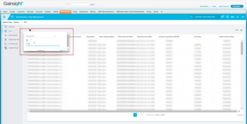
Here, you see that I have plenty of space on the screen yet have to scroll down or be veeeerry careful when I click Apply so as to not click out of the pop up.
Same true here when choosing filters in report builder:

And here when I click into a chart to view the data:
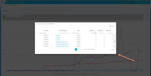
Would love it if these pop up boxes could resize a bit bigger to make the workflow smoother.
Thanks!
