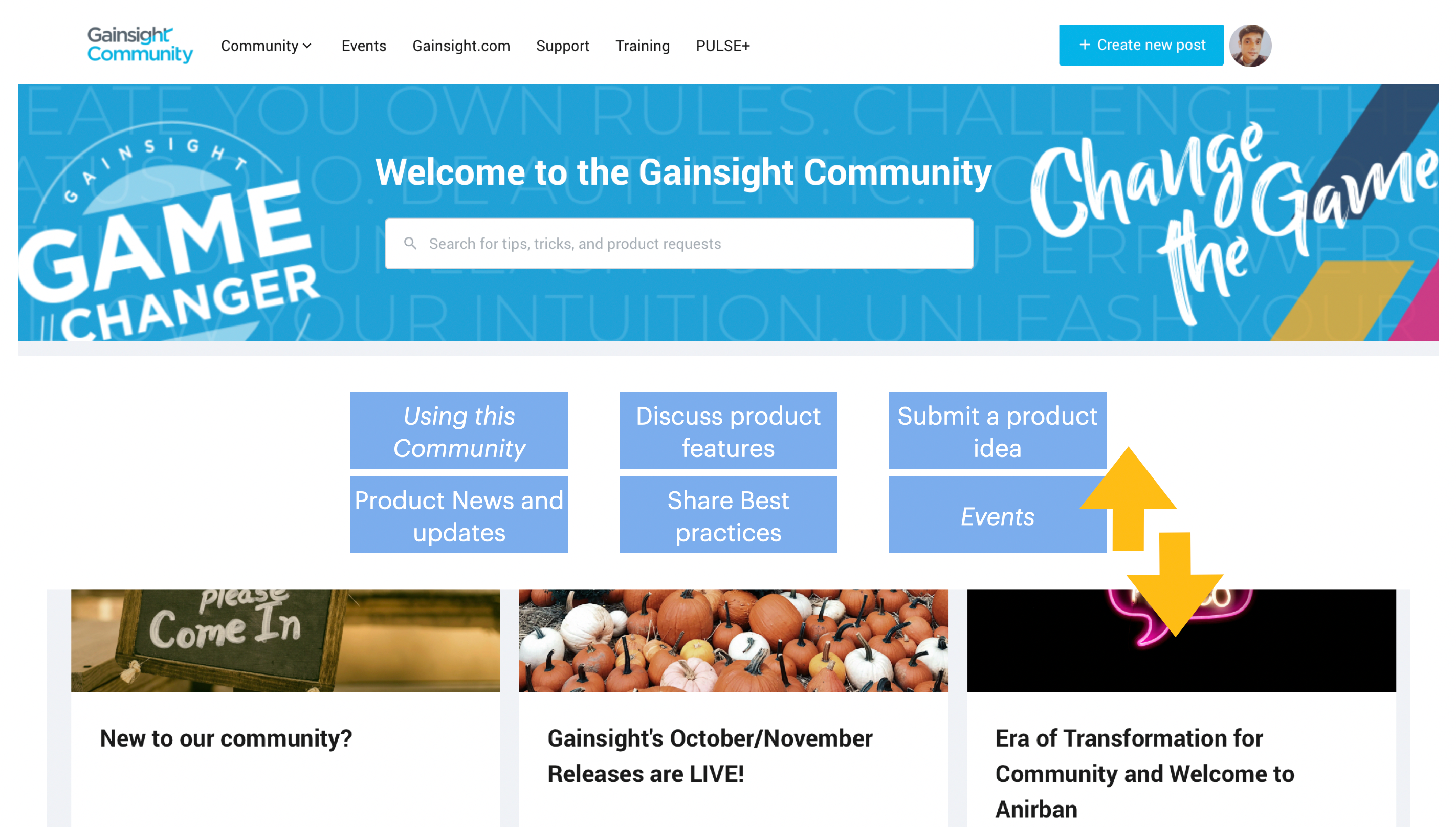
Thinking about the landing page experience and here’s the planned swap

High level usecases are the opening experience (after Search) and then we delve into the standout pieces of content.
The all community activity stream feed would follow right at the end.
This is the general approach to the Community UI that helps the non-advanced users.
Here’s a small exercise if you’d like, to suggest names pf the 6 main landing blocks in the middle (italized ones are the new additions). 🧪
Looking forward for your comments. :)


