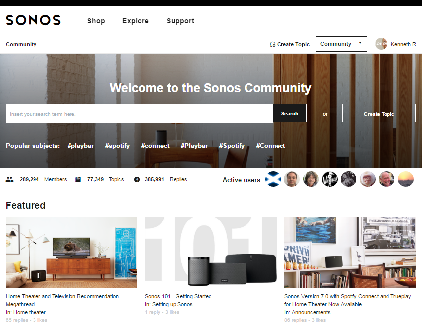
A few days ago our shiny new community designs went live. A big part of the project was transitioning to responsive templates, but we also wanted to align with the latest Sonos visual style as well as implement a number of UX improvements that our users have been asking for since we first went live in August 2015. Some of the requests we incorporated into the designs were around making better use of space on each page, having more useful 'active since last visit' and 'search results' overviews, making it easier to see which topics are unread (the titles are now bold) and much more. We also love having the ability to 'feature' topics on the homepage in a beautiful visual way. We think it's a big improvement.
http://en.community.sonos.com/
https://de.community.sonos.com/
A big thank you to everyone on the inSided team who worked with us to make it happen!
Sign up
If you ever had a profile with us, there's no need to create another one.
Don't worry if your email address has since changed, or you can't remember your login, just let us know at community@gainsight.com and we'll help you get started from where you left.
Else, please continue with the registration below.
Welcome to the Gainsight Community
Enter your E-mail address. We'll send you an e-mail with instructions to reset your password.

