Solved
Healthscore Trending Report
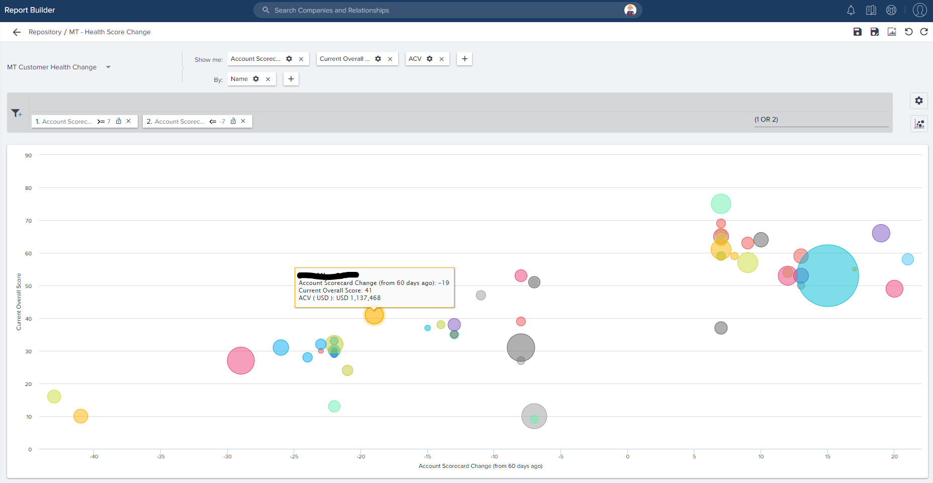
I want to create a report that shows me overall healthscore by account over time. I can see it one account at a time but I need to produce the data for all accounts in one report.
Best answer by shantan_reddy
You can get this using the new reporting, and data designer. Pivoting is available in the new reports.
Filtering for a monthly snapshot on scorecard history object, and pivoting on date should do the trick.
Regards,
Shantan
Sign up
If you ever had a profile with us, there's no need to create another one.
Don't worry if your email address has since changed, or you can't remember your login, just let us know at community@gainsight.com and we'll help you get started from where you left.
Else, please continue with the registration below.
Welcome to the Gainsight Community
Enter your E-mail address. We'll send you an e-mail with instructions to reset your password.

