Noticed some more colors in your community? That’s right, we updated the default avatar set. We also implemented a feature in control that allows you to approve user posts before they are submitted to your community. Check what else is new:
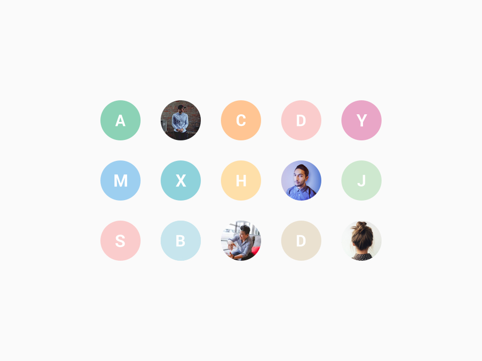
New default avatars
Gone are the days of long streams filled with grey avatars. From now on each user that does not provide an avatar will get a new default avatar. This avatar consist of a random pastel color from our carefully crafted color-scheme and the first letter of the username.
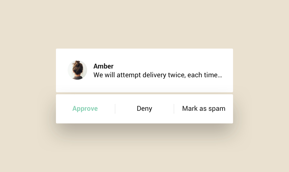
Pending posts (pre-moderation)
Under heavy spam attack or want to check incoming posts? Use ‘Pending posts’ to manually review topics and replies from users that have never submitted a post before. When this feature is enabled, a moderator must approve or deny a topic or post from a user before it will be published in the community. Read How To Enable Moderator Approval Of Posts By New Users to learn more.
Improvements 🤒
- Layout of featured topics in home- and category pages. If you have less than 3 featured topics they will fill up the width of your container.
- Position of the idea status filter on ideation categories.
- Spacing between badges on profile pages
Fixed 🐛
- Issue where the create topic button was shown twice when resizing your browser
- Singular/plural translation issue in profile cards
- Fallback for OG:Image when image dimension is too small
We value your feedback. If you have ideas or suggestions for improvements let us know in the comments below 👇
Sign up
If you ever had a profile with us, there's no need to create another one.
Don't worry if your email address has since changed, or you can't remember your login, just let us know at community@gainsight.com and we'll help you get started from where you left.
Else, please continue with the registration below.
Welcome to the Gainsight Community
Enter your E-mail address. We'll send you an e-mail with instructions to reset your password.


