
Last Updated On: June 27, 2025
At Gainsight, we strongly believe that it is important to ensure all our users can access and interact with our platform. As part of our commitment to inclusivity, we're working to enhance the accessibility of our Customer Communities platform by aligning with accessibility best practices like the European Accessibility Act (EAA).
Alignment with the European Accessibility Act (EAA)
The EAA aims to make digital services accessible to all, with specific guidelines to improve digital inclusivity. Our project is aligned with these objectives, as we've targeted the Web Content Accessibility Guidelines (WCAG) 2.2 AA, which form the basis for many of the EAA's requirements. By adhering to these standards, we meet current legal obligations and prepare for future enhancements mandated by the EAA.
Lighthouse, an open-source automated tool to help improve the quality of web pages, has been at the forefront of our efforts, providing a comprehensive assessment of web pages through various checks. These evaluations help us ensure compliance with accessibility standards and offer actionable insights to enhance the user experience. Lighthouse shows that we are on track to raise our accessibility scores from an average of 60-70 to 90 across most pages by the end of 2024. Going forward, we are aiming for a score of 100 by April 2025.
To maintain our high accessibility standards and prevent future regressions, we've automated our accessibility checks using Lighthouse. This proactive approach allows us to continuously monitor our platforms, ensuring they comply with the latest guidelines and standards.
Summary of Upcoming Key Changes
To make our accessibility improvements more relatable, here's a condensed overview of key changes we will implement over the next few months, derived from the WCAG 2.2 AA guidelines and Lighthouse checks:
- Keyboard-Friendly Navigation. Optimize key navigation elements to be user-friendly and intuitive and ensure that they are accessible without a mouse, supporting users who rely solely on keyboards.
- Screen-Reader Support: Meaningful Text Descriptions. Add descriptive text to buttons and links so they clearly convey their purpose, helping people who rely on screen readers.
- Screen-Reader Support: Consistent Structure. Ensure the logical organization of lists, headings, and navigation elements, making it easier for people to navigate through our content.
- Screen-Reader Support: Multimedia Accessibility. Add enhanced image descriptions (alt text) to ensure all visual content is understandable through audio assistance technology.
- Language Support. Verify that language settings are accurate, allowing for a smooth transition when our platform is configured with multiple languages.
- Impaired vision: Use readable Font Sizes. Adjust target sizes for interactive elements to make them easier to engage with on devices of all sizes.
- Impaired vision: Color contrast. Adjust the color contrast of text and buttons, making reading easier on devices of all sizes.
Our commitment to accessibility is ongoing. We are dedicated to continually improving the inclusivity of Gainsight Customer Communities by leveraging industry-leading tools and ensuring alignment with the European Accessibility Act.
For more information on visual guide for accessibility enhancements, refer to the Accessibility Enhancements: Demos article.
Update June 27, 2025
Improving Page Structure for Easier Navigation: Gainsight has made important updates to the structure of our community pages to make them easier to navigate, especially for people who use screen readers or keyboards, in addition to a mouse.
What is improved:
- Clear Sections on the Page: Added better labels behind the scenes so that assistive tools can clearly understand where the main content, footer, and navigation menus are located.
- Simplified Layout: On some pages, such as forums and settings, we have removed extra headings and navigation sections that were causing confusion for screen reader users.
- Smarter Navigation: When there is more than one menu on a page, each one now has a clear name, so users know exactly where they are and what they are selecting.
Making Badges and Status Labels Easier to Read: Gainsight has also improved how status labels and badges (such as In Progress or Resolved) appear across Ideas, Topics, and Questions in the community.
What is improved:
- Better Defaults for New Communities: When a new community is set up, Gainsight now suggests color options for badges that are easier to read, even for users with low vision.
- Control Stays with You: Community managers still have full control over badge names and colors; they can be customized as needed. Gainsight has provided accessible starting points, but it is up to each community to keep their badges and labels accessible if they make changes.
Update April 16, 2025
- Content Module Accessibility Improvements:
- Spoiler Widget: Redesigned to work better with screen readers and keyboard navigation.
Business Use Case: Users who rely on assistive technologies can now easily identify content without needing a mouse or visual cues
- Curated Content in Knowledge Base: Improved heading structure and navigation flow.
Business Use Case: Simplifies reading and scanning content, especially for users navigating using the keyboard.
- Dropdown Menu in Replies: Enhanced to ensure smoother keyboard navigation and clearer screen reader support.
Business Use Case: Improves access to in-thread options for all users.
- Spoiler Widget: Redesigned to work better with screen readers and keyboard navigation.
- UI Navigation Enhancements:
- Back to Top Button: Now recognized as an interactive element, improving accessibility on all devices.
Business Use Case: Makes navigating long pages easier for users with assistive tools.
- Skip to Content Button: This button now correctly receives focus and functions with keyboard navigation.
Business Use Case: Allows users to bypass repetitive page elements quickly.
- Interactive Button Accessibility: Updated to be screen reader-friendly with meaningful descriptions.
Business Use Case: Ensures all users can understand and interact with engagement tools such as the Like, Vote, and Reply buttons, and Views Count, across all content types.
Note: Screen reader support is provided only for the English language.
- Back to Top Button: Now recognized as an interactive element, improving accessibility on all devices.
Note:
- For more information on custom CSS guidelines, refer to the Custom CSS Guidelines for Customer Communities article.
Update 29th Jan 2025 (to help answer some of the questions we’ve received)
To provide more context on recent changes, we have already made a number of enhancements that are applied to all communities, such as:
- Enhanced clickable areas (such as buttons and links) to ensure they are easier to use, especially on touch devices.
- Organized headings for a clearer and more logical flow, helping users navigate pages more easily.
- Improved screen reader compatibility to provide aria-attributes, helping users understand content.
- Improved keyboard navigation to ease the in-page journeys.
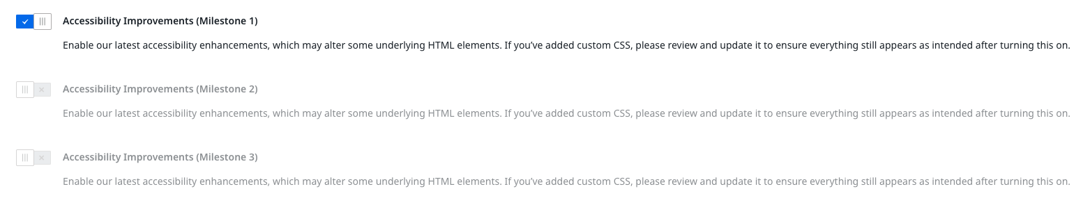
Once the Open Beta toggle is enabled, updates and enhancements to the following are also enabled (for developers: the details of these changes relating to specific CSS selectors are provided in the file attached to this article):
- HTML heading tags in all widgets
- Slightly changed structure of Banner widget
- Logo in Mega Menu widget
- Updates to Groups
The Open Beta is designed to allow customers to test these changes before they are rolled out to all communities in February. After that, there will be two further phases of Open Beta as we continue to roll out these changes incrementally.


