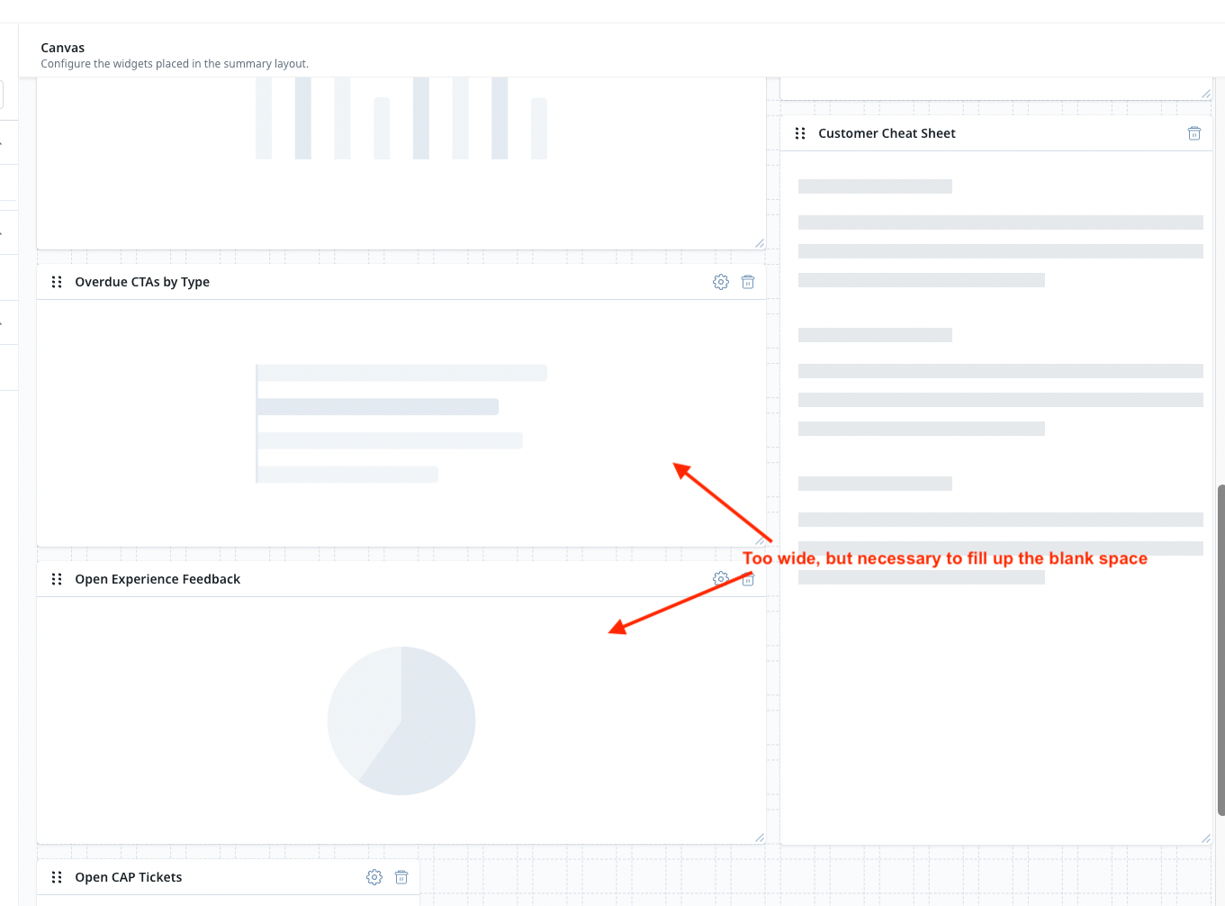
It’s really tough sometimes trying to make C360 layouts align. Report Widgets are limited to how far they can shrink, which makes it impossible to put two Report Widgets side by side with the Customer Cheat Sheet (also shrinks to a fixed width) next to it. So the layout always ends up having some white space and or reports that are unnecessarily wide.
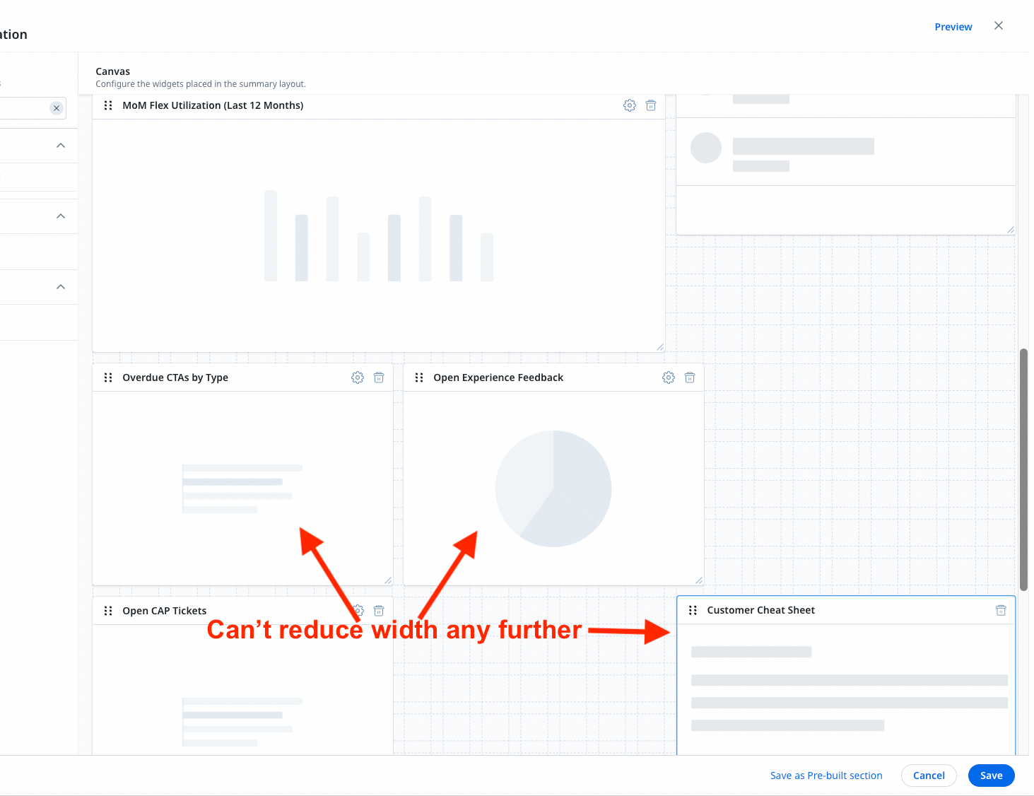
Interesting that dashboards don’t have this restriction.
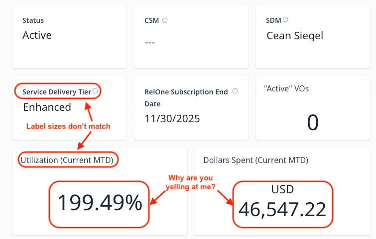
Also, give us the flexibility to control font size in the Widget Labels as well as what the widget content displays so we can introduce a little uniformity.
Also, I don’t need my C360 yelling at me when I expand the view.
I ran into a very similar problem when updating the C360 to include the Customer Cheat Sheet.
This issue is incredibly frustrating and really should be friendlier to use.
I’ve also run into this issue many times. It can be awkward trying to size a C360 layout to look good and be functional, without having to compensate for the lack of widget flexibility.
Agree. It definitely makes it hard to use the space as efficiently as possible when you are limited in sizing.
This is a common frustration for our team. Greater flexibility in display and spacing behavior would be fantastic!
+1 This is especially frustrating with the AI cheat sheet. To my mind, that widget should be the same height as the Timeline widget, but is just slightly longer than Timeline, which makes it hard to organically fit it on the C360.