

darkknight
Expert ⭐️
March 16, 2021
New Idea

Horizon Analytics feedback

  • March 16, 2021
  • 38 replies
  • 792 views

Not sure the best way to give feedback on Horizon Analytics since I don’t believe it is technically still in Beta… so will start this thread to capture as I am kicking the tires on it.


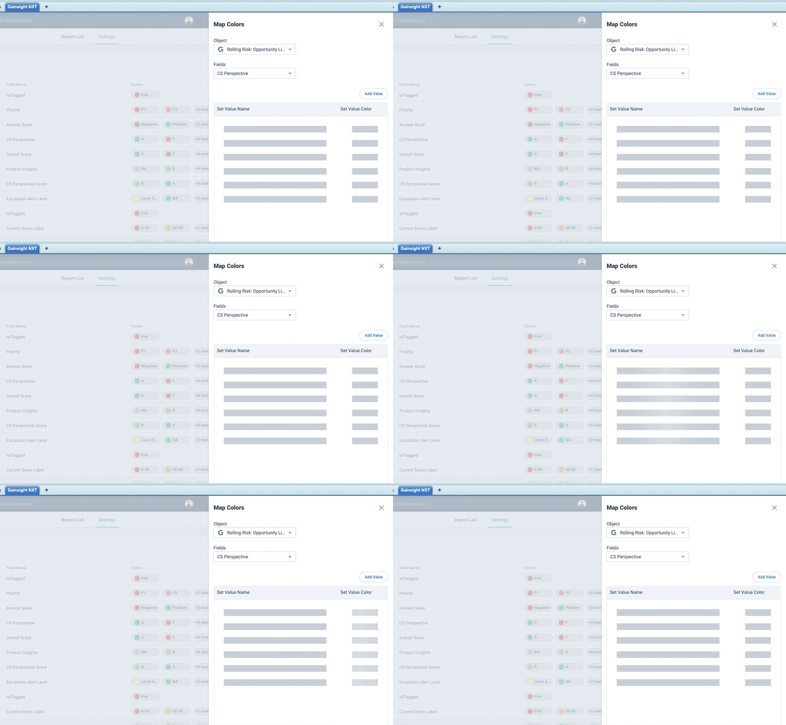
  1. When I try to access Custom Colors in the new UI, I open an existing entry and the data never loads (this was done in an Incognito browser window, so it’s not cache)
  2. When drilling down into a report from a dashboard, the “Analyze Report” button should not
    appear
    for users that do not have access to Report Builder. 
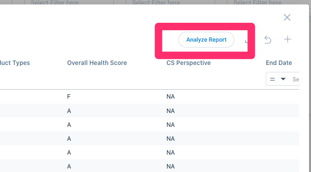

    When a non-privileged user clicks that button, they get a “403 Access Denied/Forbidden” error.  This will result in numerous tickets sent to admin teams saying there is a problem or requesting access.  This should be disabled for all users that do not have access to Report Builder.
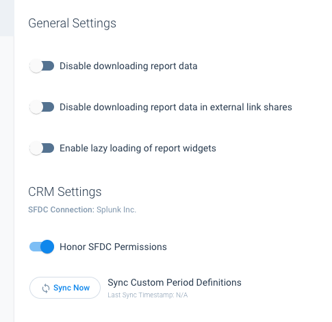
    Here are my current report builder settings: 


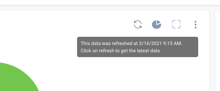
  3. The text that accompanies the refresh button on charts/graphs is misleading.  The example below indicates that the data was refreshed and that if you click on refresh you’ll get the latest data - but this particular graph pulls from a data table that only gets refreshed once per day.  The language here should be modified to remove the confusion.
  4. I have a chart that appears to have an unexpected item in the legend in the new UI, but it doesn’t have that in the old UI (hard to see bc of the custom colors, but there is a cream color there, the same color that matches the N/A value)
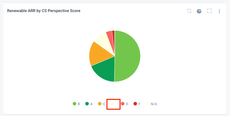
    NEW UI
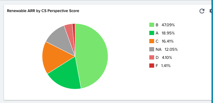
    OLD UI
  5. Regarding the “You did some modifications to the dashboard. Do you want us to remember them”
    • It is more grammatically accurate to say “You made some modifications to the dashboard.” 
    • It does not respect the pinned navigator - the message gets cut off:
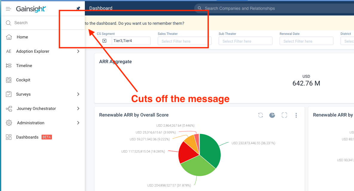
       
  1. Clearing a filter takes two steps now instead of one:
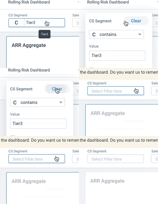
    New UI
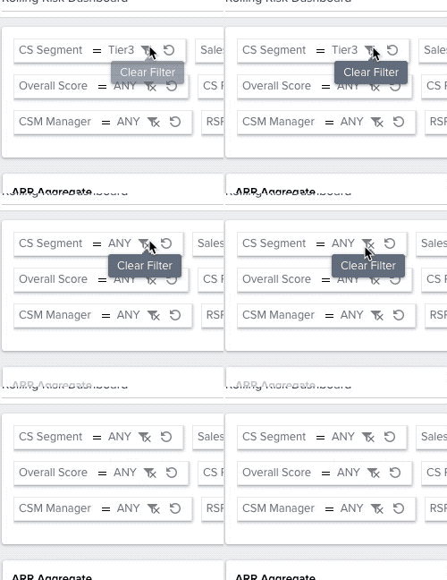
     
    OLD UI
    1.  The date filter is a bit awkward in the new UI… you have to scroll to the right in order to add a second date for a custom Between statement… would be better to have the date fields stacked vertically without the need to scroll:
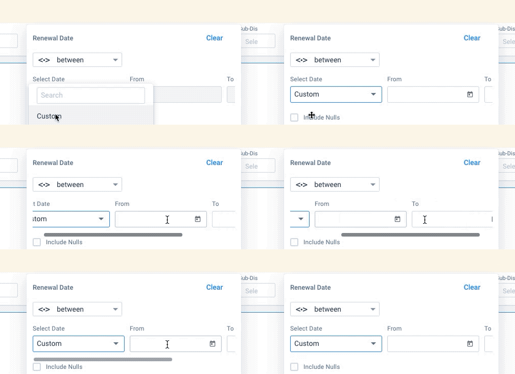
      NEW UI
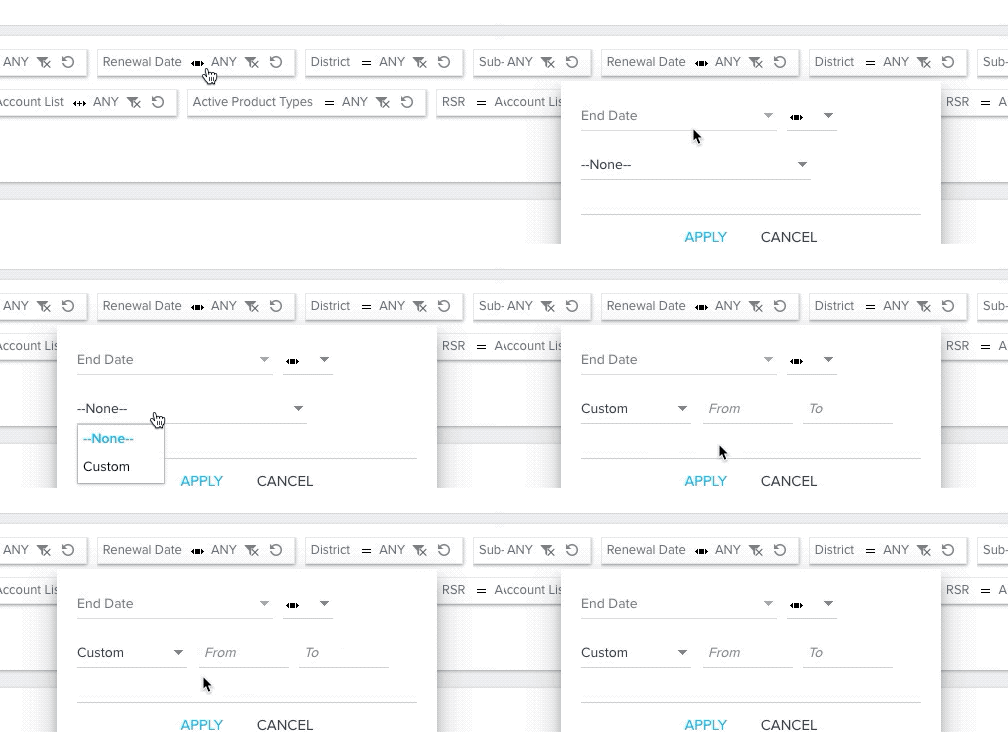
      OLD UI


  1. When sharing dashboards, I am only able to pick a NXT-direct domain to share - what if the dashboard has SFDC reports on it?  We need to be able to share a link that is displayable via SFDC:
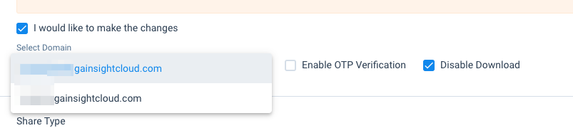
     

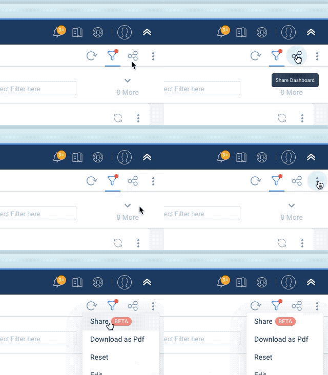
  2. Are there supposed to be two sharing options?
     

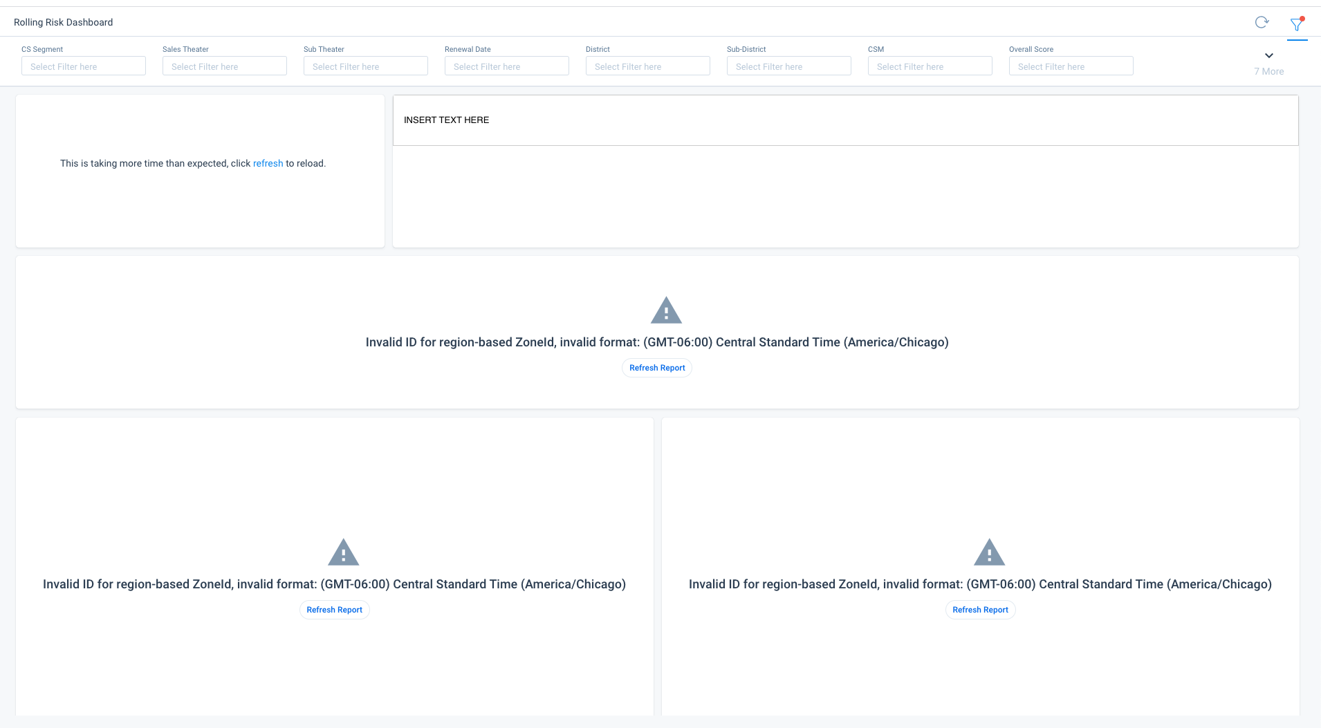
  3. When I share a dashboard via LINK, I get these errors when clicking through:
     
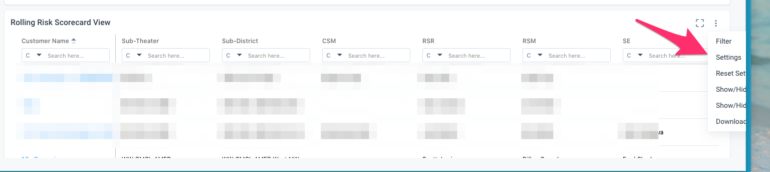
  4. Selecting the three dots on a report on the far right side of the window sometimes cuts off the options I can only see the full list when I expand the browser to Full Screen - this doesn’t happen all the time, only sporadically...
     

38 replies

darkknight
Expert ⭐️
March 19, 2021

@rakesh When I have bar chart labels turned on, and I click on one of the legend items to only show the specific legend item, all the labels remain:


Jeff Kirkpatrick
darkknight
Expert ⭐️
March 19, 2021

@rakesh Why are charts that used to have no trouble displaying in the current UI now suddenly producing message “Unable to display the chart. The data is too granular for the visualization. Add more filters or try other visualization options.”?

This doesn’t seem to make sense… if it could load before, why can’t it load now? (Examples below)

This is problematic because frequently we have reports that are intentionally not filtered down very far so that Dashboard Filters can be applied to reduce the volume displayed.  Now, I have no way of making changes to those reports in Report Builder unless I temporarily add a bogus filter to reduce the data enough to make the changes, then I have to remember to remove the temporary filter.  It’s increases the amount of effort to tweak reports that live on dashboards and a big departure from the current UI experience

If the OLD UI could do it, the NEW UI should be able to do it too.

NEW UI - SAME FILTER LOGIC AS OLD UI
OLD UI - SAME FILTER LOGIC AS NEW UI


Jeff Kirkpatrick
darkknight
Expert ⭐️
March 19, 2021

When I have Advanced Logic on report filters, and I go to add another filter, it incorrectly sets the logic. See example below.  The “J” was outside the last set of brackets.  When I attempted to add a new filter, it automatically inserted “J” AND “K” into the last set of brackets, when they should have remained outside the last set of brackets:


Jeff Kirkpatrick
Gainsight Employee ⭐️
March 24, 2021

@darkknight Regarding point number 10, When I share a dashboard via LINK, I get these errors when clicking through

Can you please confirm the timezone of the user (sender) ?

darkknight
Expert ⭐️
March 24, 2021

@asrivastav Central US

Jeff Kirkpatrick
bradley
Expert ⭐️
April 23, 2021

Can I also ask that on the drill down for a given report, the total records is shown without needing a “click here” button?


I’m not sure why that’s needed. The number of records should load when you do a drill down anyways, and if you change something impacting the number of records that should refresh dynamically too.

bradley
Expert ⭐️
April 23, 2021

Another request:

In the field label rotation, allow for an effective 180 degree rotation, so 90 degrees +/-


Currently you can rotate 90 “clockwise”, but I would like the option to also rotate 90 “anti-clockwise” from the starting position.

bradley
Expert ⭐️
April 23, 2021

Is it supposed to do this? The visualization looks truncated if the legend is removed.


edit: On investigation, this same thing happens regardless of the horizontal and/or vertical alignment of the legend.

rakesh
Gainsight Employee ⭐️
Lets put your data to work!
April 28, 2021

Can I also ask that on the drill down for a given report, the total records is shown without needing a “click here” button?


I’m not sure why that’s needed. The number of records should load when you do a drill down anyways, and if you change something impacting the number of records that should refresh dynamically too.


I am afraid that this is something that we would not be able to do with the new way of doing things. Providing this upfront means us doubling the number of report runs (Which is already Millions of report runs every day/week). If the number of records is under 200 (or the page limit), we can do it without clicks and dynamically.

rakesh
Gainsight Employee ⭐️
Lets put your data to work!
April 28, 2021

Is it supposed to do this? The visualization looks truncated if the legend is removed.


edit: On investigation, this same thing happens regardless of the horizontal and/or vertical alignment of the legend.

This looks like a bug. I’ll redirect it to the team accordingly.