
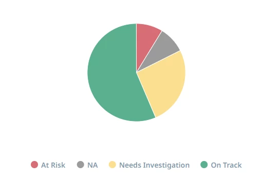
In reports today you can add labels for charts to show what value the corresponding color applies to, such as in the below example:
What you don’t have, is an easy way to state what field is being referenced. You can add things to the description, make big clunky report/widget names (examples here and here of why this isn’t a great solution).
This is a good example of why this can be a problem - when reporting on data involving health score measures, the scheme for any measure from the same scorecard would be the same. So just looking at this, you have no idea which measure these pertain to. You don’t even get the information when you mouseover the label itself or the corresponding slice of pie.
e.g. (but smaller text)
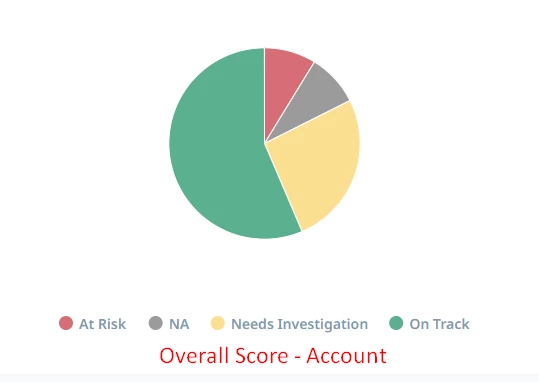
It would be helpful to be able to add the “axis” field label in some way, preferably without needing to mouseover, but that could work - just to help make reporting that much clearer to end users.