
Hi in-app builders! 👋
A core part of PX design is imagining the user’s moment; what they’ll need, when they’ll need it, and how to deliver it without breaking their flow. Badges are one subtle, effective way to do that.
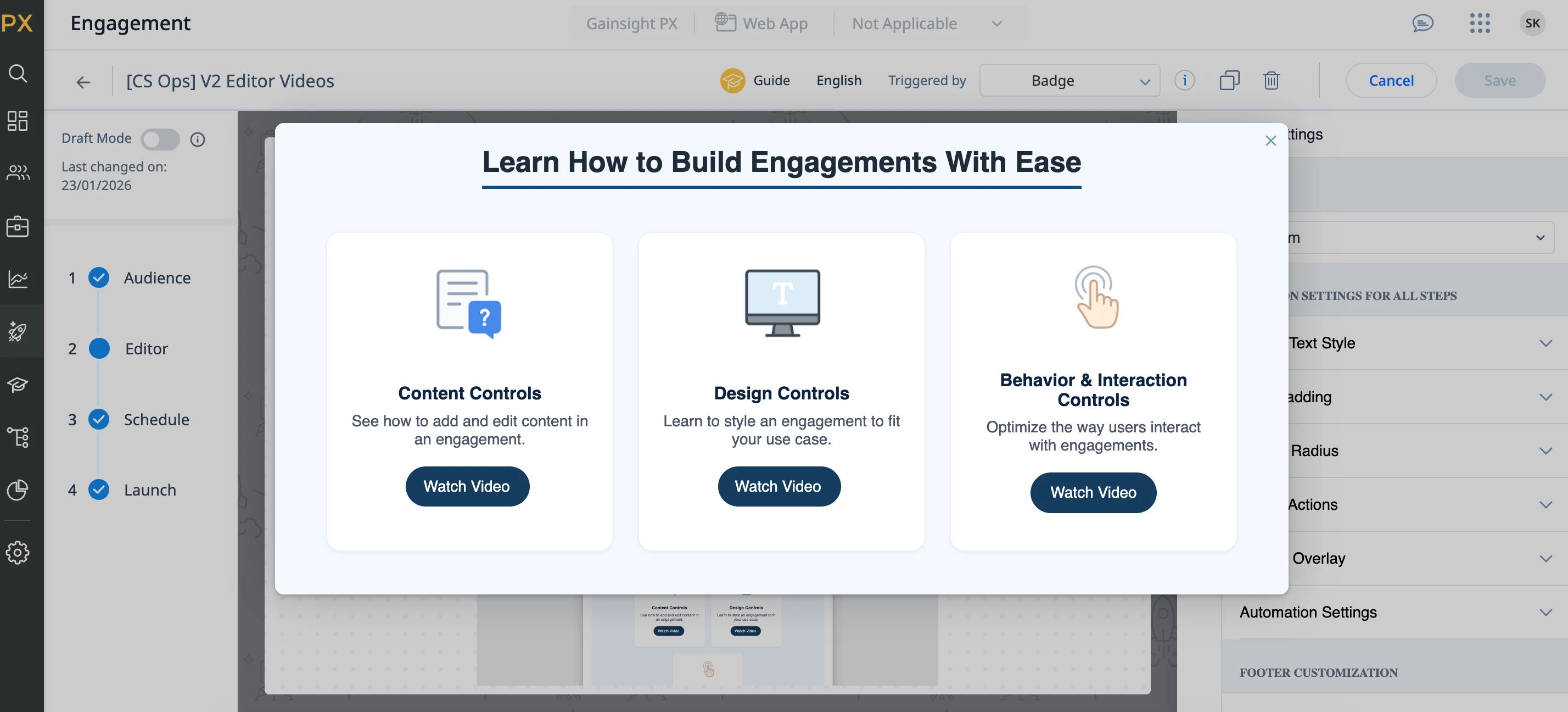
For our own PX users, I built a badge-triggered hub that lives inside the Engagement Editor and surfaces short, actionable videos and tips so builders can learn fast and get back to designing.
Why a badge?
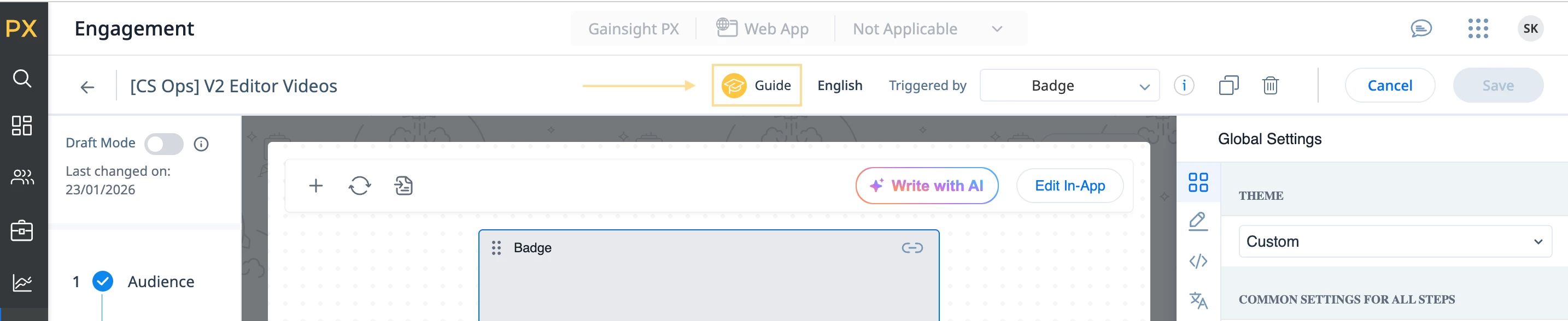
Instead of a full walkthrough, I added a small badge on the Engagement Editor page. It’s always there, makes it obvious that extra help is available, but it stays out of the way when it’s not needed.
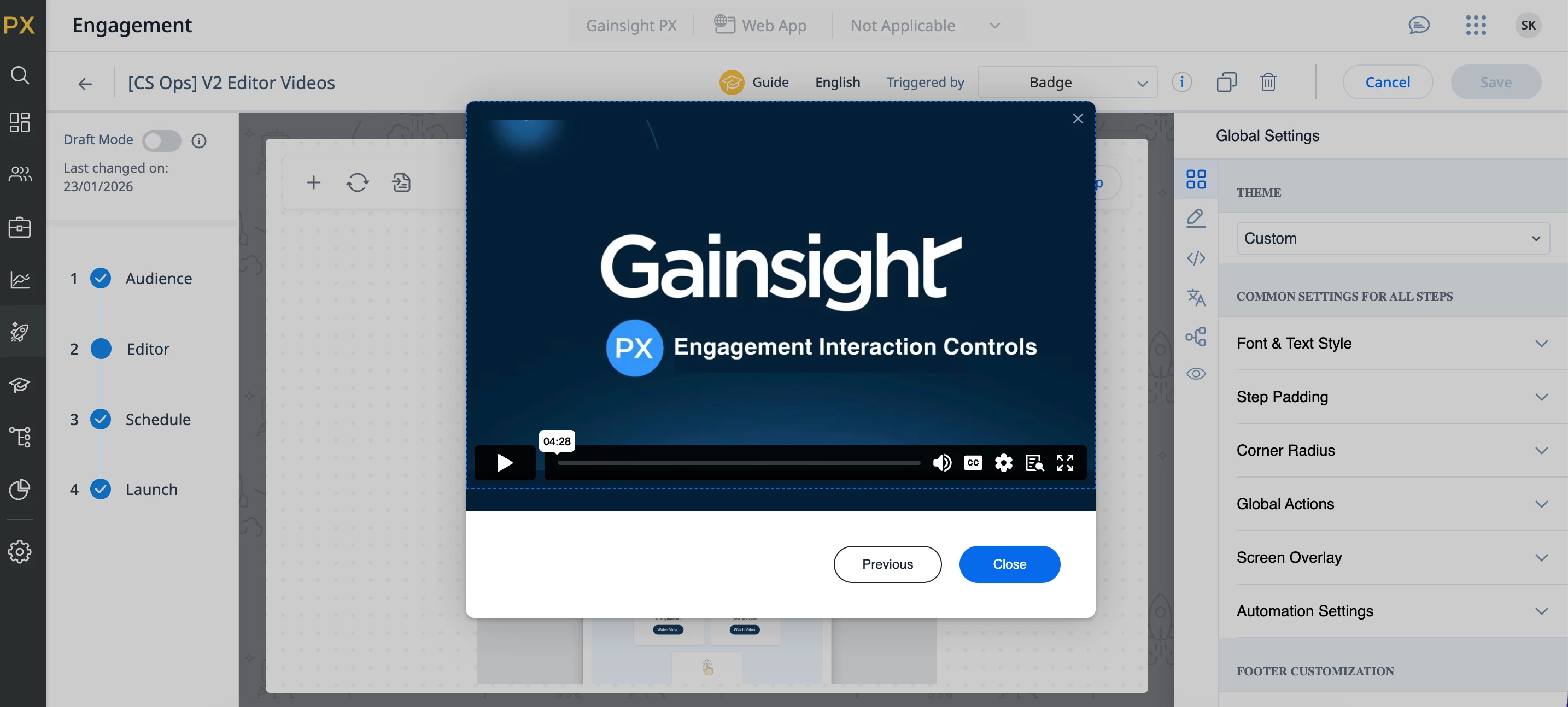
When the badge is clicked, users see a simple menu with three “choose your path” options. They pick the topic they care about, watch a short video, then either close out or jump back to the hub or watch another.
🧠 How it’s set up
Triggered by: Badge
Total steps: 4
-
Step 1: Main “hub” page (three tiles)
-
Steps 2–4: One video per topic
-
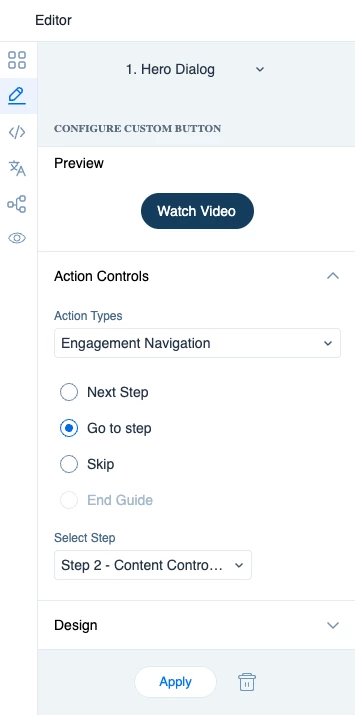
Buttons: Configure your buttons to direct users to the associated video step
🤖 Custom code (and how AI helped)
I don’t have a super strong HTML/CSS background, but I wanted the hub step to feel more like a mini landing page than a standard template. I shared that vision with ChatGPT and it helped me generate a code which I directly into PX’s code editor. From there, I was able to tweak things to my liking.
If you want to build something similar, I’m sharing the hub-step code below. Feel free to copy and customize!
CSS (paste under Step)
/* –––– ☮ Video Card Section –––– */

.video-card-container {
  display: flex;
  justify-content: center;
  gap: 24px;
  flex-wrap: wrap;
  margin: 24px auto;
  padding: 16px;
}

.video-card {
  background: #fff;
  border-radius: 12px;
  box-shadow: 0 1px 4px rgba(0,0,0,0.08);
  text-align: center;
  width: 260px;
  padding: 24px 16px;
  transition: box-shadow 0.2s ease, transform 0.2s ease;
}

.video-card:hover {
  box-shadow: 0 4px 10px rgba(0,0,0,0.12);
  transform: translateY(-2px);
}

.video-card-icon {
  width: 56px;
  height: 56px;
  margin-bottom: 12px;
}

.video-card h3 {
  font-size: 16px;
  font-weight: 600;
  color: #0d2240;
  margin-bottom: 8px;
}

.video-card p {
  font-size: 14px;
  color: #4a5568;
  margin-bottom: 16px;
}

.video-btn {
  background-color: #f3f9ff;
  color: white;
  border: none;
  border-radius: 6px;
  padding: 10px 18px;
  font-size: 14px;
  cursor: pointer;
  transition: background-color 0.2s ease;
}

.video-btn:hover {
  background-color: #0044a6;
}
HTML
<div style="text-align: center; margin-bottom: 10px;">
  <div style="display: inline-block; border-bottom: 3px solid #0f4c81; padding-bottom: 6px; margin-bottom: 0;">
    <span style="font-size: 26px; font-weight: 600; color: #1e2a39;">
      Engagement Heading Here
    </span>
  </div>
</div>

<div class="video-card-container">

  <div class="video-card" style="text-align: center;">
    <img
      src="https://via.placeholder.com/81x81"
      alt="Icon"
      class="video-card-icon"
      width="81"
      height="81"
      style="width: 81px; height: 81px;"
    />
    <h3>Title 1</h3>
    <p>Insert text here.</p>

    <p style="margin-top: 12px; font-size: 14px; color: #4a5568;">
      [Insert button here]
    </p>
  </div>

  <div class="video-card" style="text-align: center;">
    <img
      src="https://via.placeholder.com/81x81"
      alt="Icon"
      class="video-card-icon"
      width="81"
      height="81"
      style="width: 81px; height: 81px;"
    />
    <h3>Title 2</h3>
    <p>Insert text here.</p>

    <p style="margin-top: 12px; font-size: 14px; color: #4a5568;">
      [Insert button here]
    </p>
  </div>

  <div class="video-card" style="text-align: center;">
    <img
      src="https://via.placeholder.com/81x81"
      alt="Icon"
      class="video-card-icon"
      width="81"
      height="81"
      style="width: 81px; height: 81px;"
    />
    <h3>Title 3</h3>
    <p>Insert text here.</p>

    <p style="margin-top: 12px; font-size: 14px; color: #4a5568;">
      [Insert button here]
    </p>
  </div>

</div>
Happy building! Feel free to drop any questions or ideas in the comments.