This is a quick one, but it can add some nice polish to your Guides :)
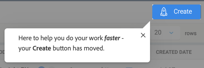
In PX, you may want to visually highlight a UI element with an overlay. However, if your element is circular or rounded on the edges, this can result in some “leftover” pixels on the corners of the element:

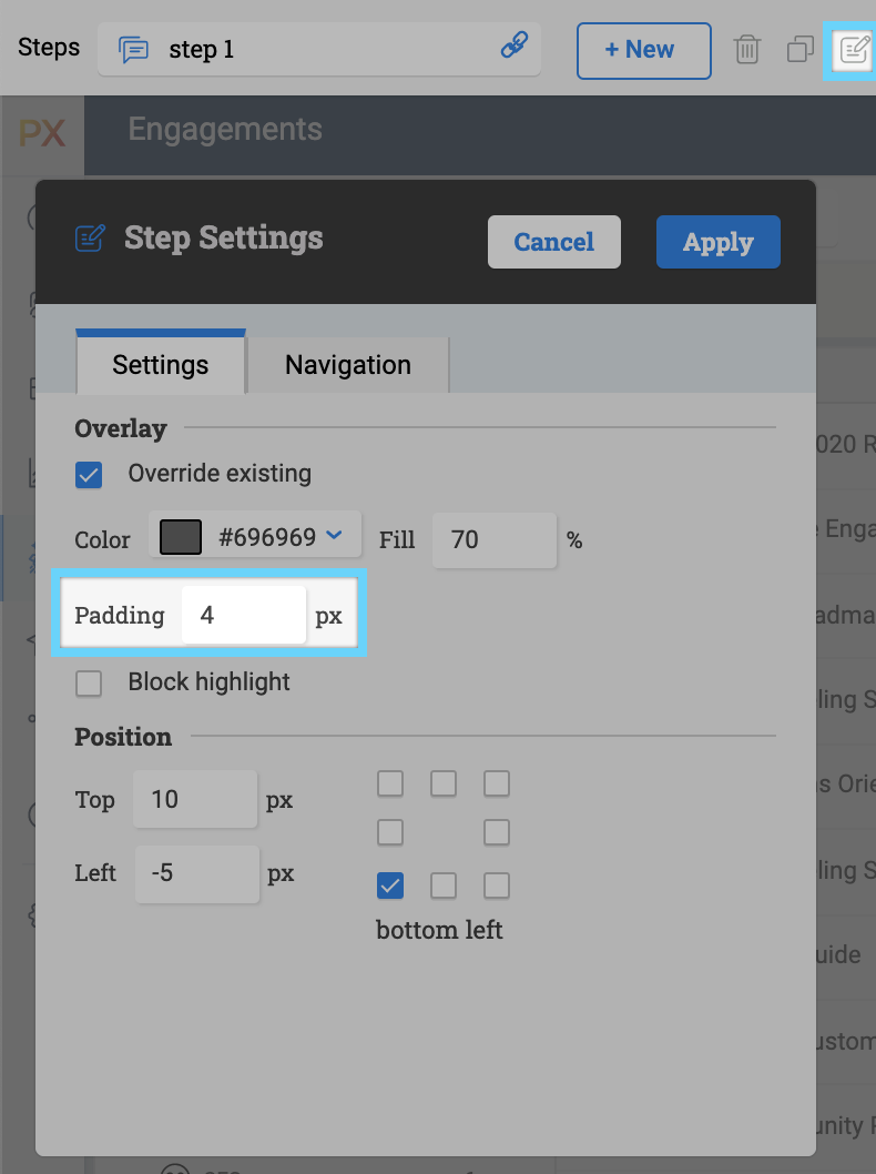
There’s a quick remedy for this. All you have to do is add a few pixels of padding in the Guide step settings.

By adding 4px of Padding, the overlay looks more polished and intentional. You can adjust the position of the tooltip itself to be aligned with the padding you just added.

That’s all this time!

