We are delighted to release in Beta the new Community overview page :)
A couple of months ago, we released a new overview page for the Knowledge Base. We are now releasing a similar feature for the community module in Beta.
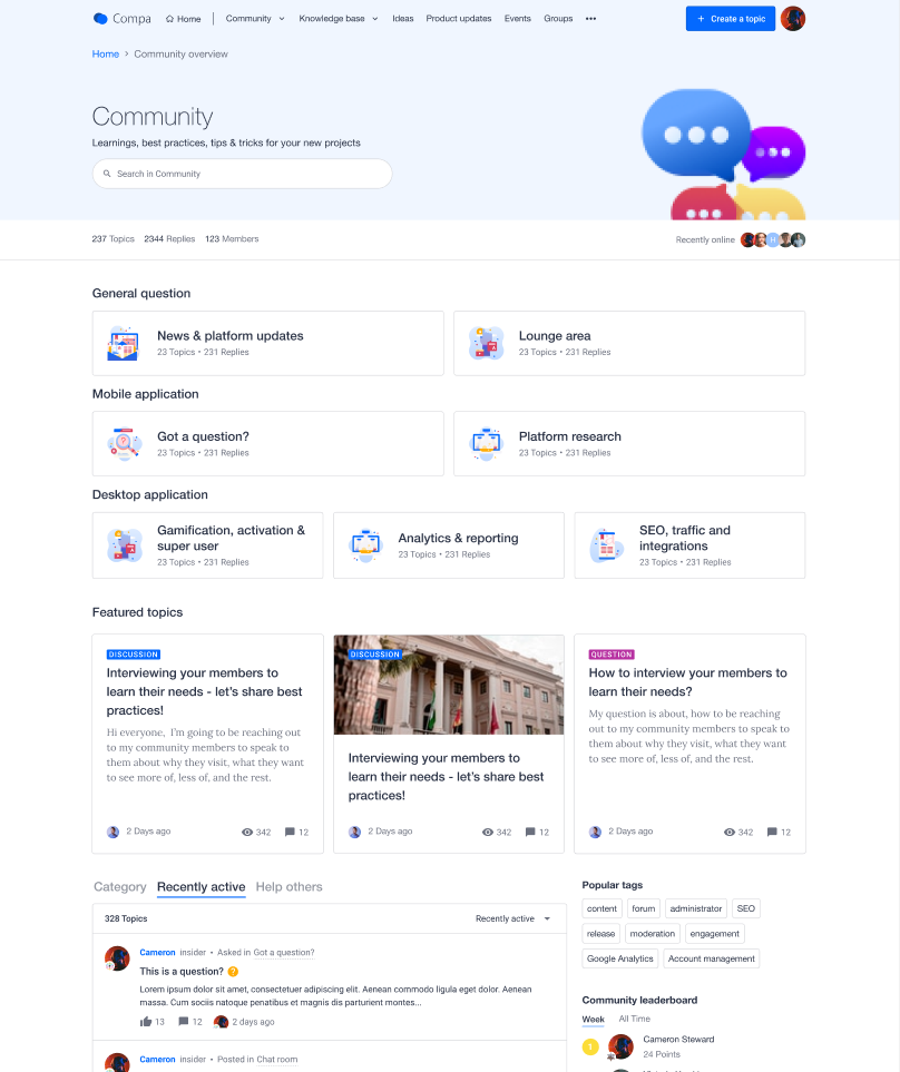
Our objective is to provide a page for end-users to explore all the community content. By using the community overview page, you can free some space on the homepage to be used as a "Customer Hub" landing page, making it easier for your end-users to explore all the resources available. Read on to see what we mean by "Customer Hub." .
What's new?
Customizable Community overview page
The main news is that this page now exists! And you can configure the look and feel of widgets displayed on the Community overview page. The rest of your theme will apply automatically.
Link added to Mega Menu
The link to the Community overview page will be accessible from the Mega Menu in the Community dropdown.
Side note: In parallel to the Community overview beta, we will run A/B tests around the discoverability of the overview pages in the Mega Menu. More to come on that topic soon :)
What is a Customer Hub?
A Customer Hub is a platform that serves as a destination for all customer communication, CS resources, and peer-to-peer best practices and knowledge exchange. It's the epicenter of your Digital Customer Success strategy. Through a Customer Hub, customers and users can access onboarding, adoption, and support content to help them reach and realize value faster throughout their customer journey. A Customer Hub enhances the customer experience by driving engagement, speeding up time to value, and fostering community.
Why do you need a Customer Hub?
Users often have trouble finding the right content at the right time. In addition, the typical split across multiple platforms (LMS, Support platform, Knowledge Base, Community…) creates confusion and friction in the community customers experience. Finally, there's a clear need to integrate CS and CRM tooling and data with a customer-facing portal to centralize information about the customer journey to understand better and improve the customer experience.
Whether users are looking to share an idea, access training, or are just checking out a new product release, we want to offer them a single, centralized space to go: the "Customer Hub." We see a "Customer Hub" as the primary tool to help them achieve their goals and guide them to find the right content.
How can I test the Community overview page?
Check out this article to learn how to set up and test the page:
Based on the number of InSided modules you use we recommend a different use for the community overview. The below article highlights best practices to structure your Community overview based on your use case:
Note: We enabled the feature on both your production and staging environments.
As this feature is in beta, please share all the feedback you may have on this feature!
Are you happy to use this feature in its current status? If not, why?
Are you seeing things you would like to improve?
Page 1 / 2
Sounds interesting, @Marion Frecaut, even though I have a few questions
Could you please elaborate a bit more on difference between homepage and community overview page?
Usually homepage serves as community overview with quick links, key projects navigation and news.
Probably I am missing something, but would be great to hear your feedback!
Still need to look closely at this one. It seems like this may be a good move for some communities, but not all.
If you're making full use of InSided's modules and have a clear and distinct strategy for each of them this is a good way to split visitors by community area, as opposed to product areas. It may serve well community managers working on big and complex communities as it simplifies navigation 'at a glance'.
However if your community has a single use case (or two) and you arent using the Knowledge Base, Ideation, etc, this may be a little too much and something that your community home page can solve without the need of adding an extra layer to the entire community ecosystem.
Just my 2cents.
I'll have a closer look these days to understand the new overview a little better and see if it's a good addition for our community (or not).
@Gabolino I think you are absolutely 100% spot on with your analysis. Unless we are missing something I feel exactly the same way as you!
Hello @Gabolino@SmartlyGreg thanks for your for raising this very interesting point. @Kseniya I feel the below can help answer your question as well.
Indeed based on the number of InSided modules you use we recommend a different use for the community overview:
If you are using only the community module:
Your homepage should be used for highlighting content (e.g. featured topic widgets) and showing engaging content like user activity (e.g. “recently active” content stream).
Your community overview page should be used to showcase all the categories in the community module. Kind of like a "Table of content" at the beginning of a book.
If you are using multiple InSided modules OR you want to use the InSided platform as Hub to redirect your users to various tools outside on InSided (KB, LMS):
Your homepage should be used to present all the resources available across the modules and tools. The homepage should welcome users, explain the value they find. The homepage should also guide them to find the right content at the right time
Your community overview page should gather all the community related content. It should be as engaging as possible. Users should have that “community feel”, that this is the area where they can speak up and connect with others. The goal should be to display activity feeds, promote interesting content (that stimulates engagement), and show many call-to-actions.
I also recommend having a look at the best practices article by @Julian to see more in details how we recommend setting up the pages
Thanks again for raising this. I will update the above product update to make it more explicit.
Do let me know your thoughts on this :)
I'd also add the the URLs / naming "Community Home" and "Community Overview" can lead to confusion. For most mortals out there Home and Overview may sound like the same thing, so if I'm using the Overview Page then I need to make sure Community Home (the current home page) has a different name (maybe forum) to avoid misunderstandings.
Just adding another 2cents to the previous ones which makes a total of 4cents
Thanks, @Marion Frecaut! It makes sense now
You gave me an idea of trying this page as community projects overview, programs we run VS sections in community e.g KB etc./tools outside inSided.
I can’t put all of the community programs on the homepage and sometimes I feel like it lacks visibility. I have them in General information now, but maybe it’s better to put them in this type of page.
I will test it and provide you with the feedback.
Appreciate additional comments, @Gabolino!
@Marion Frecaut is there a reason this isn’t something that can be turned on/off?
We’re interested in exploring if a fit, but this has us concerned as there’s no way to remove it if we find it doesn’t work for our members:
@Marion Frecaut is there a reason this isn’t something that can be turned on/off?
We’re interested in exploring if a fit, but this has us concerned as there’s no way to remove it if we find it doesn’t work for our members:
I noticed that too and I do think it's odd you can't enable and disable depending on needs.
I'd also like to add another question to yours if you don't mind me :)
What if the community overview is not a fit for our community? Can we keep it permanently turned off? The message is worded in a way that seems to indicate we need to adopt this feature.
This is definitely interesting, though I think it would be more flexible to simply have the ability to create new pages and use the URL/slug that you want. Then use the modules just as this page and the homepage do. Then it’s not so rigid.
Maybe somebody wants community.company.co then put the topics on /forum, then put articles on /articles then put product updates on /changelog (or whatever).
I understand that you’re basing this on the 5 parts of the platform (community, kb, updates, ideas, groups) but my hunch is that most people would prefer a page builder with the ability for custom slugs, and a mega menu with custom dropdowns. I feel like this would solve SO many issues that currently exist, in terms of how to set up a community with inSided :)
@nicksimard Thank you for your feedback and addition, this is something that’s on our radar and aligns with our vision of offering more flexibility in setting up your community as a customer hub. Can you give us some examples of what custom pages you would like to build? I.e. titles, use cases, etc.?
Stupid question alert, but that’s OK - you’re used to me asking these by now!
The topic above outlines the new ‘Community Overview’ page design. We can see what this looks like before enabling it for all users. This frees up space for the forum homepage, which is now different. See the Inspired homepage to see this.
HOWEVER, I can’t find an option to enable or test the new homepage features… Is this feature not available yet? If we go with the new Community Overview page, we want this to be in combination with the homepage changes. Am I missing something here?
@Gabolino @Scott Baldwin @SmartlyGreg Thanks so much for your insights in this. For your use cases (so when you’re only/mainly using the community), we see the dedicated community page used best as a page for more advanced users. This will allow you to optimize the homepage for visitors or new users, and use the community landing page for advanced users that would like to navigate all categories and browse all content.
As it is a first release, we will of course be iterating on this to improve more use cases, better discoverability, and possibly even being able turning the new community homepage off. As our customers are adopting the new community homepage, we will be sharing some best practices on how our customers are using the dedicated homepage and community homepage alongside each other.
We very much welcome your feedback on this beta, so let us know how you’d use it and where you may struggle.
Hi @Sebastian, can you help me confirm if my landing page question (above) is a non issue? Are the features on the Inspired landing page all currently available? Perhaps with some custom CSS on what might be quick links?
@timcavey Good question, as one might assume that the new homepage features some new widgets as well. All the elements used on the current inSpired homepage are widgets that you can already use. For the horizontal banners, we used the HTML Widget and for the quick links, we used the Quick Links Widget, which offers this functionality out of the box. If you need a hand, please feel free to reach out to support@insided.com!
@Scott Baldwin @Gabolino to add to what @Sebastian was kind enough to reply while I was on holiday.
Ultimately, We aim to have the community overview for all our customers. The main reason being consistency. All our modules have a dedicated landing page, and not the community module. We feel like the page can bring value to all the the use cases we see.
As right now this Community is in beta, we are really looking so as much feedback as possible. So if you enabled the page for end users and changed your mind, you can reach out to me (or our support team) and I will disable the page for end users. And I would be very interested to understand the reasons why you would want to stop using the page.
I any case, don't let that stop you from testing the feature :)
@timcavey thanks for that question. In the coming weeks and months we are aiming to provide new widgets to allow you to build the coolest homepages! This is a WIP and I will make sure to reach out to you once we have testable widgets :)
Thanks for the clarification @Marion Frecaut . I can't see us needing this overview page for the time being. We believe it'll cause more harm than good at the moment. Plus we would need resources (both design and dev) before we could even entertain the idea of adding this to our community ecosystem.
I imagine this will not happen any time soon. But I imagine you will give us plenty of notice before pushing this page to all communities.
Hello @Gabolino thanks a lot for your transparency and feedback. Can I ask what is the harm you could see happening with using the page now?
Indeed you are correct, we are not planning to push the page soon to all communities. We want to offer more customization options on the homepage as I mentioned and gather feedback during this beta to make sure the feature is ready and the time is right. And of course you will be warned well in advance.
No worries. I mentioned above what the main issues are, but perhaps it’s better if I give you a bit more context:
More than a feature/functionality, this is a strategic move. This is clear when you’re describing above the ‘customer hub’ concept.
From a strategic/purpose view point, not all communities need this. What a community needs should be informed by the type of community and, more importantly, the stage of that community. Please see some good insights about types of community by Feverbee and community lifecycle by community roundtable - not saying these are the best, just want to add more context.
If we all agree that communities need different functionalities depending on the stage they’re in, then surely a change such as this should be something that community builders can turn on and off depending on needs. Same goes for your ideation, knowledge base and product updates modules, they don’t fit all communities - often for all the right reasons.
The community overview can be useful, but only if your community is at a level of maturity where this can help with navigation. We’re only using the ‘community’ functionality at the moment (no ideation, no knowledge base or product updates) and the community home is doing a great job at keeping everything in one page. We’re at a stage in our community maturity where we don’t have enough layers to justify a new overview.
The community overview seems suitable for more mature communities or communities that have several layers to them and therefore need this hub concept to make navigation easier.
For early communities (or communities that can thrive without the need of this extra layer due to their strategic needs or purpose) this overview will most likely add unnecessary complexity, specially if all I want is my members to land on the home where all the action is talking place.
I’m also curious about how you got to the conclusion about the need for this community overview for all your clients regardless of the type of community and level of maturity. If InSided is promoting flexibility then it makes sense to let community builders add functionality as if / when required.
Besides all the above, I would love to see a thorough UX analysis showing how the overview improves community performance. What KPIs do you have in mind when it comes to the impact this page will have and do you have any evidence of this overview improving community success?
I like the idea of the customer hub, but as explained above it doesn’t make strategic sense for us at the moment. Perhaps in the future (in a few years) but only if it fits with out strategic needs.
Hope this helps.
Hello everyone, some feedback after having integrated the community overview to my communities, as I do enjoy this module architecture:
I'd also add the the URLs / naming "Community Home" and "Community Overview" can lead to confusion. For most mortals out there Home and Overview may sound like the same thing, so if I'm using the Overview Page then I need to make sure Community Home (the current home page) has a different name (maybe forum) to avoid misunderstandings.
Just adding another 2cents to the previous ones which makes a total of 4cents
→ I’m of the same mind, I think calling it Community overview is confusing and could refer to the homepage (as it used to). For that reason, I prefer using the terminology Forum overview, which I know is not recommended for SEO purposes. The way we’ve designed and built together our communities, users, superusers and even I understand the Community as being the whole website and all those features (ideation module, groups, knowledge base). The forum is one of those features.
→ For the Community/Forum overview, I would like a different/better integration of the leaderboard and especially the badges widget, as it’s a central feature to the forum. I don’t want to have it simply on the side as it would end up looking too much like the homepage, and I’ve decided not to use the container 2:1 widget in order to have a distinct aesthetic on the overview.
Thanks you @Gabolino for sharing in details you thought process. That is great feedback! We will take this as input for our work on the coming weeks :)
I like this update, or least I like it in this point. I have to test it more. Community homepage is for us a hub, to display what the community is all about (discussions, content/articles, gamification, groups, members and so on) and then there is separate forum front page.
Might be interesting for some to learn about what Klaviyo did on their community. They have used this page to show more about their Super Users: https://community.klaviyo.com/community
Hello, you mentioned above that you were planning an on/off switch for the community overview page. Is that available now? How can I turn this off? Thanks!
This feature is still in Beta, hence currently enabling this is not something that can be reverted, as the message for this setting points out:
However, I think I saw somewhere a configuration that we can make which could revert this change after all. Let me discuss with our support team and get back to you.
If you ever had a profile with us, there's no need to create another one. Don't worry if your email address has since changed, or you can't remember your login, just let us know at community@gainsight.com and we'll help you get started from where you left.
Else, please continue with the registration below.