Merchandizing the home page of a community effectively is an important part of exposing content to new and existing members and driving engagement with content and deeper sections of the community.
I’m finding the current homepage capabilities to be rather limited. In short, I’d like to see more flexibility in where a component/widget can be placed in the page and more flexibility to differentiate the layout of widgets (this would also help avoid the problem of most inSided sites looking the same).
For example, today full width you can use:
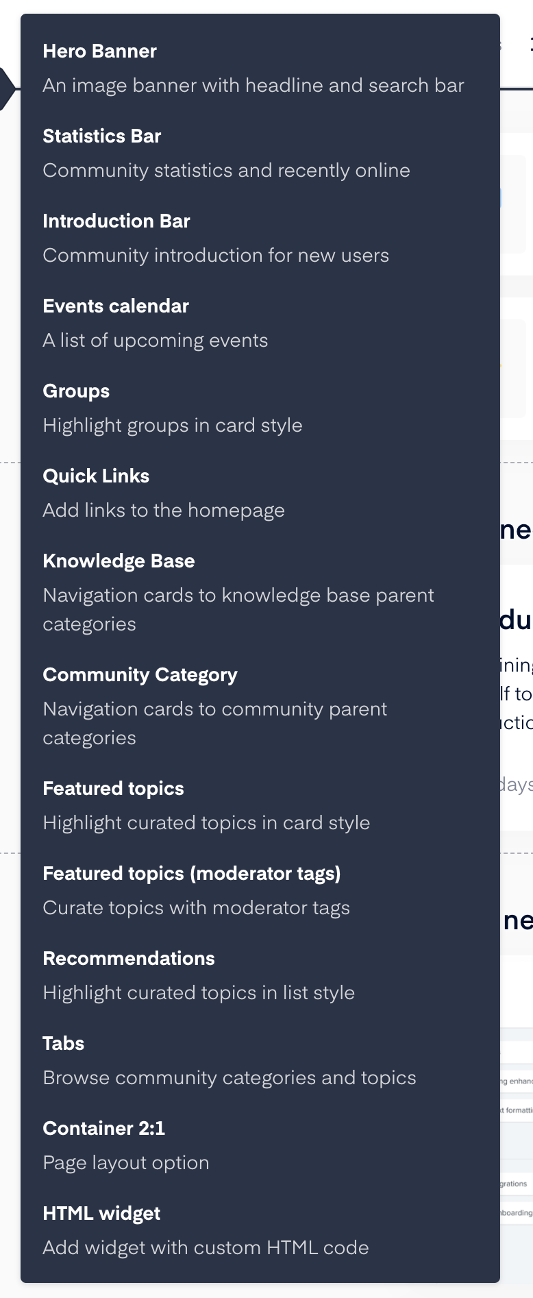
But many of these items can’t be used in a 2:1 container the you are restricted as to what can be used in a particular column in the 2:1 column structure
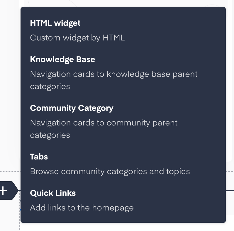
In the 2:1 left column you can use these:
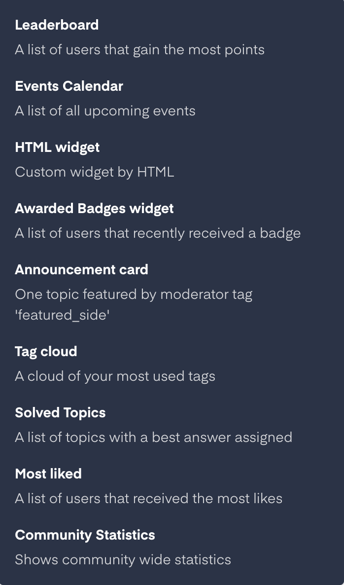
And in the 2:1 right column you can use these:
It would be great if modules worked interchangeably at Full width, 2 column, 3 column and could be placed where needed vs. where dictated.
Here’s some examples:
- display a list of events in a 2:1 container not just full-width or in the sidebar
- show a list of groups in a sidebar
- allow categories to be displayed as cards, not just parent categories
- tabbed content -- determine a set of tabs you want displayed and the content within each tab
- display three columns with X latest badges, X leaderboard, and an HTML widget with a callout and CTA
- allow for a heading or headings and introductory text above the 2:1 Container