Gainsight Go Search Results Below the Fold
This is a silly usability thing, but I wanted to offer it up to Lila & the documentation team regardless :-)
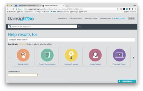
When I search in Gainsight Go, my 13" MacBook screen crops off the page so that I can't actually see any of the results. Could the items at the top of the page be more space-efficient? I'd love to not have to scroll before seeing if I have any results at all, or before clicking directly to one of the top results, assuming that the search has pointed me towards what I'm looking for. See screenshot below.
I'd also say that it's only now that I'm really [i]looking at the top of the page, after doing plenty of searching in the new Gainsight Go platform, that I realized what the giant icons across the top are [i]for. Super-useful, but my eye might have more readily understood them if there was a Funnel icon, or some visual clue to their [i]purpose, not just strong visual clues of their [i]meaning.
When I search in Gainsight Go, my 13" MacBook screen crops off the page so that I can't actually see any of the results. Could the items at the top of the page be more space-efficient? I'd love to not have to scroll before seeing if I have any results at all, or before clicking directly to one of the top results, assuming that the search has pointed me towards what I'm looking for. See screenshot below.
I'd also say that it's only now that I'm really [i]looking at the top of the page, after doing plenty of searching in the new Gainsight Go platform, that I realized what the giant icons across the top are [i]for. Super-useful, but my eye might have more readily understood them if there was a Funnel icon, or some visual clue to their [i]purpose, not just strong visual clues of their [i]meaning.