

alb
Contributor ⭐️⭐️⭐️⭐️
April 13, 2020

What happened to "vs previous timeframe" in active user widget?

  • April 13, 2020
  • 3 replies
  • 98 views

Y’all changed a vital chart, and actually removed important information and did not replace it.

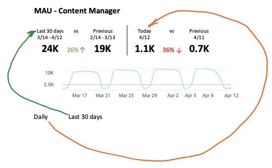
This is a monthly chart.  You used to show how this chart looked vs. the previous equal timeframe.  That is now gone.  I’m not sure I care about these new values, and they’re organized oddly.  Aside from missing data, I have to think far more than I should every time I look at this thing.
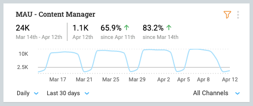


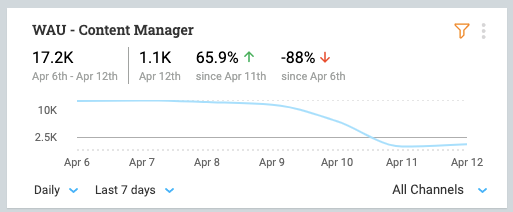
Sunday is down 88% since last Monday?  Well no kidding.  Show me change vs. equal day of week.  Show me change vs. previous 7 days.
 

GIve me something like this.


    3 replies

    mickey
    Gainsight Employee ⭐️
    Gainsight Employee ⭐️
    April 13, 2020

    Thank you @alb will certainly make adjustments.

    In Daily we should simplify for sure.


    If you’re using 30 days, it might make sense to use monthly:

    On weekly and monthly scopes the goal is to show the entire trend date range (last 8 or 12 weeks) and then to surface the:

    • total active[less informative]
    • recent monthly[amount]
    • renent trend [it is like showing 30 days vs last 30 days]
    • recent monthly trend vs the first period

    We’re considering to move the 2 middle to the right side


    mickey
    Gainsight Employee ⭐️
    Gainsight Employee ⭐️
    April 16, 2020

    @alb 

    We’ve added the global trend back, we will have another iteration where we offer different view options (compact, full)


    Contributor ⭐️⭐️
    April 23, 2020

    @alb

    We’ve added the global trend back, we will have another iteration where we offer different view options (compact, full)


    Thanks @mickey , That switch between compact/full would be really good to have. I have a hard time explaining the different percentages to team members and management, who are not frequent PX users.