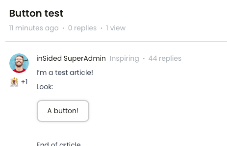
Not sure if this is possible because afaik you can't add HTML of CSS in an Article. Is there an easy-ish way to add CTA-buttons in de text of an Article? I think it would look clean and it would be more in line with our regular .com site...
You can make it look like it’s possible with a little bit of trickery :)
I’ve added the following CSS to my custom-css, which makes any of the red callouts, on a specific article (36), in a specific category (42) look like a sort of button.
/* add a button to a specific topic's cta */ body.category-42.topic-36 .callout-red{ background-color: white; border: 2px solid #CCC; padding: 0; border-radius: 10px; display:inline-block; box-shadow: 0 0 5px -1px rgba(0,0,0,0.2); } body.category-42.topic-36 .callout-red a { text-decoration: none; padding: 10px 20px; display: inline-block; }
Please adopt the style to your community, so that they look like your buttons! This really is meant as a proof of concept.
So the standard heading-sizes in InSided is H1, H2 and H3. So when creating an article I thought maybe we could assign one heading as a “Button heading”. Lets choose “H6”, since we never use or have used the H6-heading.
Create the content of the article. The button in my case reads “Click here” and I have hyperlinked it using the “insert link” button:
Go to the HTML-editor, and change the “Click me” paragraph from “<p><a href=yourlink>Click here</a></p>” to “<h6><a href=yourlink>Click here</h6>”:
Now we have an article that looks something like this:
Now I add this styling in the custom-CSS panel, and directly towards the H6, and H6 Anchor tag - the styling is our brand styling, so you might want to change som colors and stuff:
I used your method to try it out and it looks great on desktop. But on mobile it changes to a normal text url. Any ideas? I know how to tweak stuff but making it responsive proof.. I dunno.
I checked the article you linked and looked at the console, and from what I can see you have a media query “(min width: 1025px) on this code - when the screen gets a width that is smaller than that - the code dissappears.
(at the top)
Can you see if you have this media query in the code? I would just remove it, since the CTA-button doesn’t need adjustment for screen sizes 😊
I checked the article you linked and looked at the console, and from what I can see you have a media query “(min width: 1025px) on this code - when the screen gets a width that is smaller than that - the code dissappears.
(at the top)
Can you see if you have this media query in the code? I would just remove it, since the CTA-button doesn’t need adjustment for screen sizes 😊
You’re a legend. 🙂
It was some code to change the featured topics on mobile I think. It's gone now. And the button works. Thanks!
Now I add this styling in the custom-CSS panel, and directly towards the H6, and H6 Anchor tag - the styling is our brand styling, so you might want to change som colors and stuff:
If you already have a profile on Gainsight Community or Gainsight University, there's no need to create another one. If your email address has changed or you can't remember your login, email community@gainsight.com.
Otherwise, continue with the registration below.