Contributor ⭐️⭐️⭐️
August 27, 2020
Solved

Community Hero Banner

  • August 27, 2020
  • 15 replies
  • 534 views

Hi guys, 

I have a question, we are working on re-branding our ranking structure which is going well and my next project is to redesign our homepage banner. However, the problem that I am having is that I can’t see any option to upload a version of the Hero banner for Mobile and another version for desktop.

When you think about how small the banner is on mobile there is very little room for creativity here. Is there not a way or a function which allows you to show mobile users 1 banner and desktop or tablet users another? 

thanks, 

Emil  

Best answer by SmartlyGreg

@Julian in the meantime I’ve added a bit of custom CSS to fix the mobile issue. ( @Suvi Lehtovaara maybe no longer relevant for you with your new hero image, hopefully that wasn’t why you changed...)
 

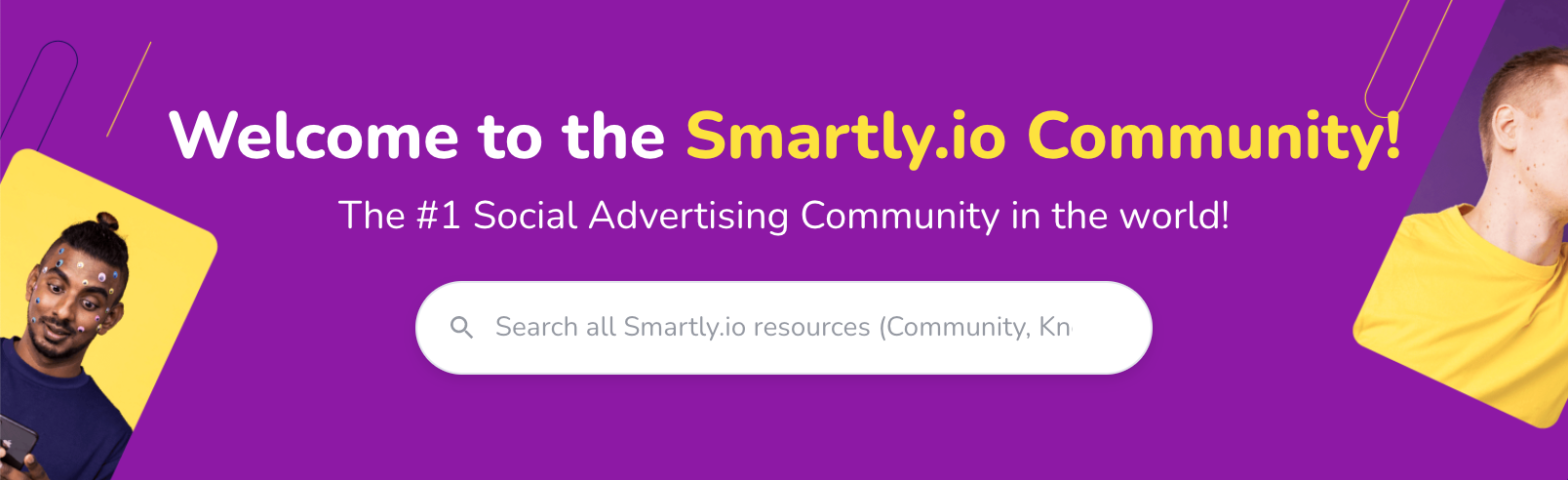
We use an image with a gap in the center for the search bar and title:


Which works great on full width screens:


But then gets messed up by default on mobile:


So with this small custom CSS code:

.brand-hero {
background-repeat: no-repeat;
background-position: center;
background-color: #8D19A5;
}
.custom-hero-banner {
max-height: 12vw;
min-height:250px;
}

(Note: Background colour matches our image to ensure text is legible even before the image loads)


We ensure the experience stays consistent throughout screen sizes, like mobile:


Or tablet:


15 replies

Julian
Gainsight Employee ⭐️⭐️⭐️
December 20, 2021

HI Greg,

thanks for flagging this to me - I must have overlooked it the last time I was mentioned here. :(

Such an idea already exists, actually:

So yeah I would be thankful if you could upvote that. Needless to say we know about this limitation and want to improve it as well. I think there might be even a solution to do this via css, but I am not sure where I saw it. If I stumble over it, I will absolutely share it with you here!

I follow my nose, it always knows
SmartlyGreg
Helper ⭐️⭐️⭐️
December 20, 2021

Thanks @Julian ! Upvoted!

SmartlyGreg
Helper ⭐️⭐️⭐️
January 19, 2022

@Julian in the meantime I’ve added a bit of custom CSS to fix the mobile issue. ( @Suvi Lehtovaara maybe no longer relevant for you with your new hero image, hopefully that wasn’t why you changed...)
 

We use an image with a gap in the center for the search bar and title:


Which works great on full width screens:


But then gets messed up by default on mobile:


So with this small custom CSS code:

.brand-hero {
background-repeat: no-repeat;
background-position: center;
background-color: #8D19A5;
}
.custom-hero-banner {
max-height: 12vw;
min-height:250px;
}

(Note: Background colour matches our image to ensure text is legible even before the image loads)


We ensure the experience stays consistent throughout screen sizes, like mobile:


Or tablet:


Julian
Gainsight Employee ⭐️⭐️⭐️
January 19, 2022

Wow, that looks amazing, Greg! Thanks a lot for sharing this here, this surely will be helpful for others in the future! :grin: Going to try this out right now on a community which could also benefit from it...

I follow my nose, it always knows
SmartlyGreg
Helper ⭐️⭐️⭐️
January 20, 2022

@Julian let me know if it works as planned.
I’ve made a few other small adjustments to get the 2 colour title and add a tagline in there as well, but the CSS I shared should do the trick for the image issue described in this topic.