

Yoeri
Gainsight Employee ⭐️⭐️⭐️
April 21, 2020
Release

New topic list view

  • April 21, 2020
  • 26 replies
  • 870 views
New topic list view

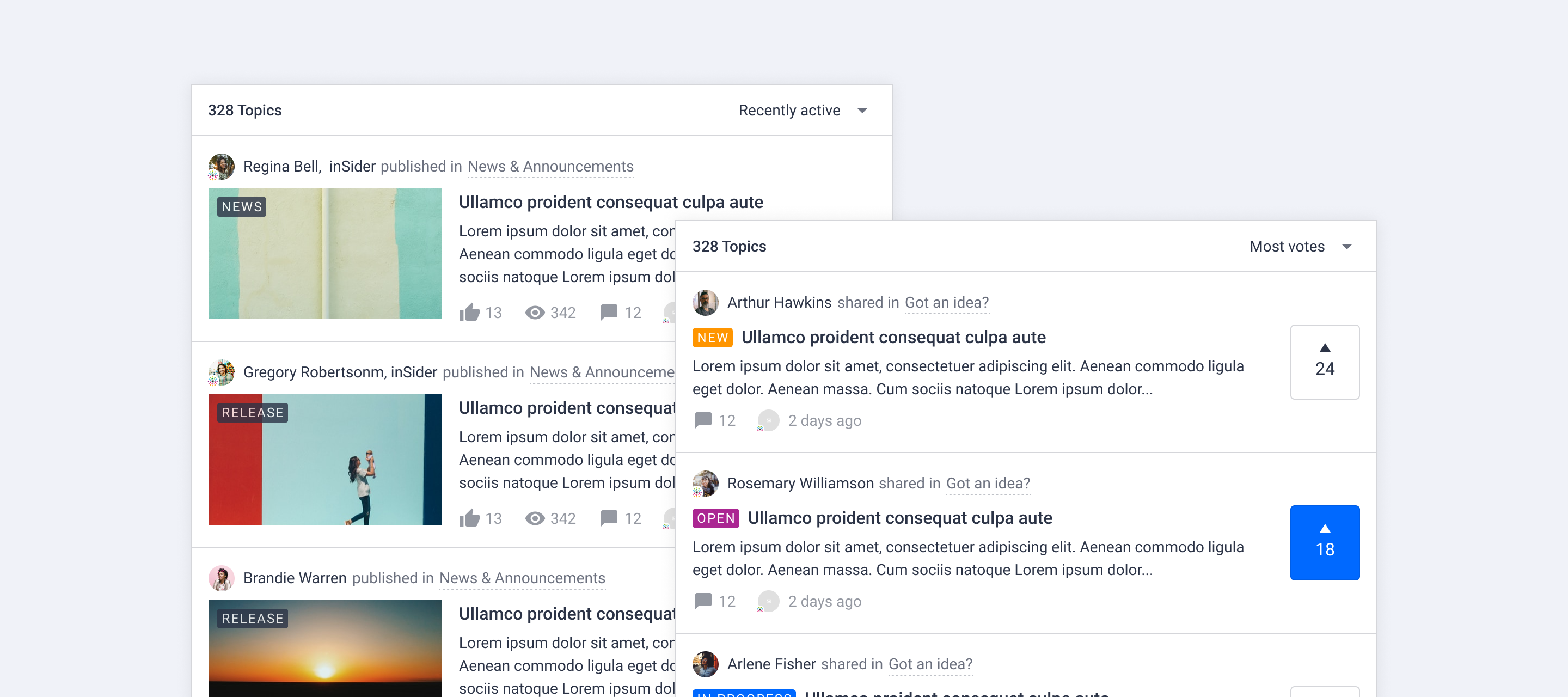
The way we display a list of topics has been improved. Today we rolled out changes with the goal to make the user experience more consistent across the platform, distinguish different content types visually and make content easier to scan.

New topic list view

We made some general changes to all topics cards and some specific changes for ideas and articles. Click Learn more! below to see a visual overview of the new topic card design:
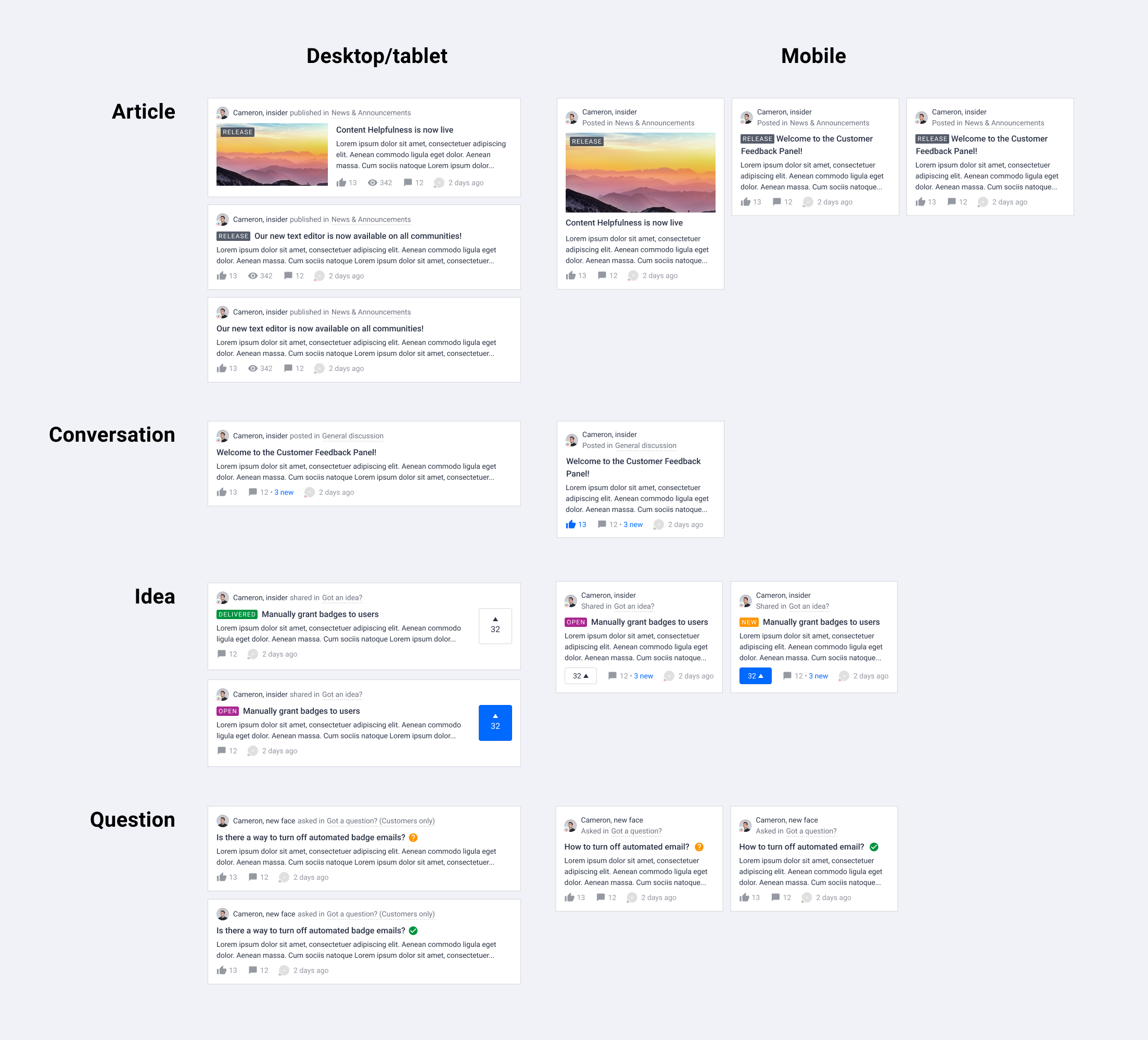


General layout changes

  • Smaller author avatar

  • Change the color of user name from brand color to text color (will be overwritten by rank username styling)

  • Display category info next to author, parent category is now shown

  • Distinguish the content types using different verbs next to author information

  • Amount of views are only displayed on desktop for articles

  • Subtle hover effect for metadata

Upgraded article card in topic list

  • Remove border around image and content

  • Show content right below the title

  • Show label on image if there is a featured image

Upgraded idea card in topic list

  • Highlight the vote action as well as the amount of votes

  • Improve idea status visibility using status label

We hope you like the new changes like we do, if you have feedback let us know in the comments below! We are working on more visual improvements and a new way to change generic styles (colors, cards, fonts, buttons, lists) in your platform. Stay tuned for more!

26 replies

bjoern_schulze
Helper ⭐️⭐️⭐️
April 21, 2020

In the footer, where the meta items are, there is an inconsistency with font-sizes and font-families.

Red: 14px, system font

Green (expectation): 16px (default), custom font-family (in inSided’s case it’s Proxima)

Yoeri
YoeriAuthor
Gainsight Employee ⭐️⭐️⭐️
April 21, 2020

You’re fast! 🚀

System font should indeed inherit the font-family. The font-size at 16px is something we did custom for inSpired bacuse our font-family has a small height by itself :)

Group Product Manager, Customer Communities
Contributor ⭐️⭐️
April 21, 2020

Since changing the lay-out, the colour of the labels has changed to black unless you hover over them. Is there a way to change this? Right now it clashes with the rest of our styling.

bjoern_schulze
Helper ⭐️⭐️⭐️
April 21, 2020

The meta items don’t align perfectly. The like button (icon and number) should be about 1-2 pixel higher to be on the same line as the other icons and values. 

Monique
Helper ⭐️
April 21, 2020

I have to say I'm really not that thrilled about this… Our community normally looks very clean, but now it became a bit messy with all the colours, stripes and other stuff. Not what you wanted to achieve.Like Bjoern mentioned, not all meta items are aligned…


Yoeri
YoeriAuthor
Gainsight Employee ⭐️⭐️⭐️
April 21, 2020

Since changing the lay-out, the colour of the labels has changed to black unless you hover over them. Is there a way to change this? Right now it clashes with the rest of our styling.

The colors should be updated to your brand primary color :)

I have to say I'm really not that thrilled about this… Our community normally looks very clean, but now it became a bit messy with all the colours, stripes and other stuff. 

Sorry to hear that 😞 Anything in particular you really dislike? We are looking into the alignment issues of the meta items.

Group Product Manager, Customer Communities
Contributor ⭐️⭐️
April 21, 2020

@Yoeri Thanks!

Another issue I’ve noticed is that when you enable phrases and click on ‘edit’ to change the text after a member’s name and rank, you are being sent to the article, instead of being able to edit the phrase.

If I’m really quick (and my connection happens to be a bit slow), I can sometimes stop the page from loading, in which case I can edit the phrase. But this shouldn’t be how it works.


Other than that I also think the overall lay-out is a bit less clean.

For example:

  • Since everything is now stacked horizontally instead of vertically; a combination of a long username, rank and category name, leads to the text being cut off.
  • This might be connected to the meta items mentioned by @bjoern_schulze , but the question marks and ‘resolved’ symbols next to a topic title do not align with said title.
  • I personally dislike the topic preview text taking so much space horizontally. I see how this leaves room for topics using the idea card, but without the extra image it looks worse the shorter the topic title is.
Yoeri
YoeriAuthor
Gainsight Employee ⭐️⭐️⭐️
April 21, 2020

Thanks for sharing your feedback Yannick! When in phrase mode you should not go to topic pages when you actually want to change phrases, we’ll look into that. 

The meta items needs some minor alignment, that is indeed related to Bjoern his feedback. Do you have an example of “long username, rank and category name, leads to the text being cut off.” 

Group Product Manager, Customer Communities
Contributor ⭐️⭐️
April 21, 2020

Thanks for sharing your feedback Yannick! When in phrase mode you should not go to topic pages when you actually want to change phrases, we’ll look into that. 

The meta items needs some minor alignment, that is indeed related to Bjoern his feedback. Do you have an example of “long username, rank and category name, leads to the text being cut off.” 

Here you go. :slight_smile:

By the way, I realize that this is an extreme case, as I don’t see many custom ranks actually being that long. I just thought I should mention it.


Yoeri
YoeriAuthor
Gainsight Employee ⭐️⭐️⭐️
April 21, 2020

That’s a good example, thanks for mentioning. That’s a very long rank title indeed :wink:

Group Product Manager, Customer Communities