

Yoeri
Gainsight Employee ⭐️⭐️⭐️
April 21, 2020
Release

New topic list view

  • April 21, 2020
  • 26 replies
  • 870 views
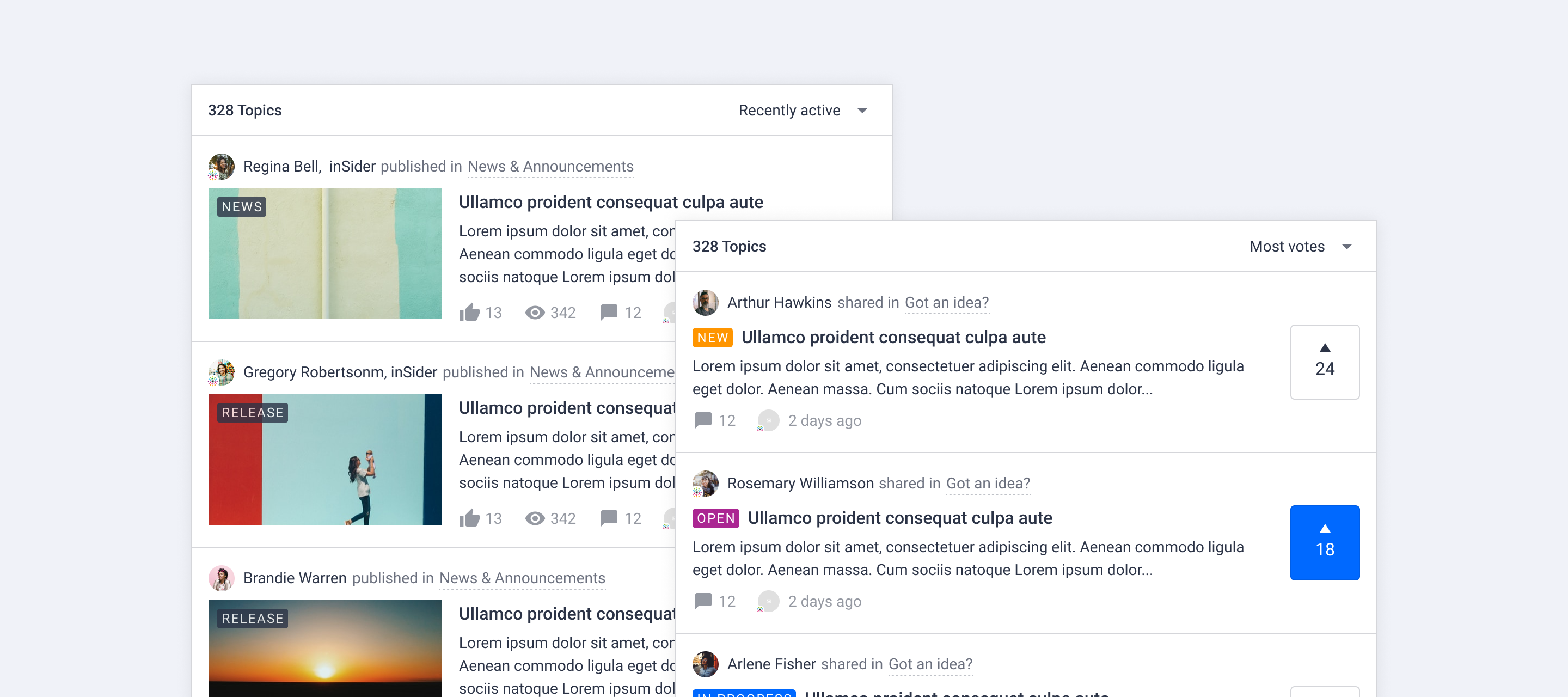
New topic list view

The way we display a list of topics has been improved. Today we rolled out changes with the goal to make the user experience more consistent across the platform, distinguish different content types visually and make content easier to scan.

New topic list view

We made some general changes to all topics cards and some specific changes for ideas and articles. Click Learn more! below to see a visual overview of the new topic card design:
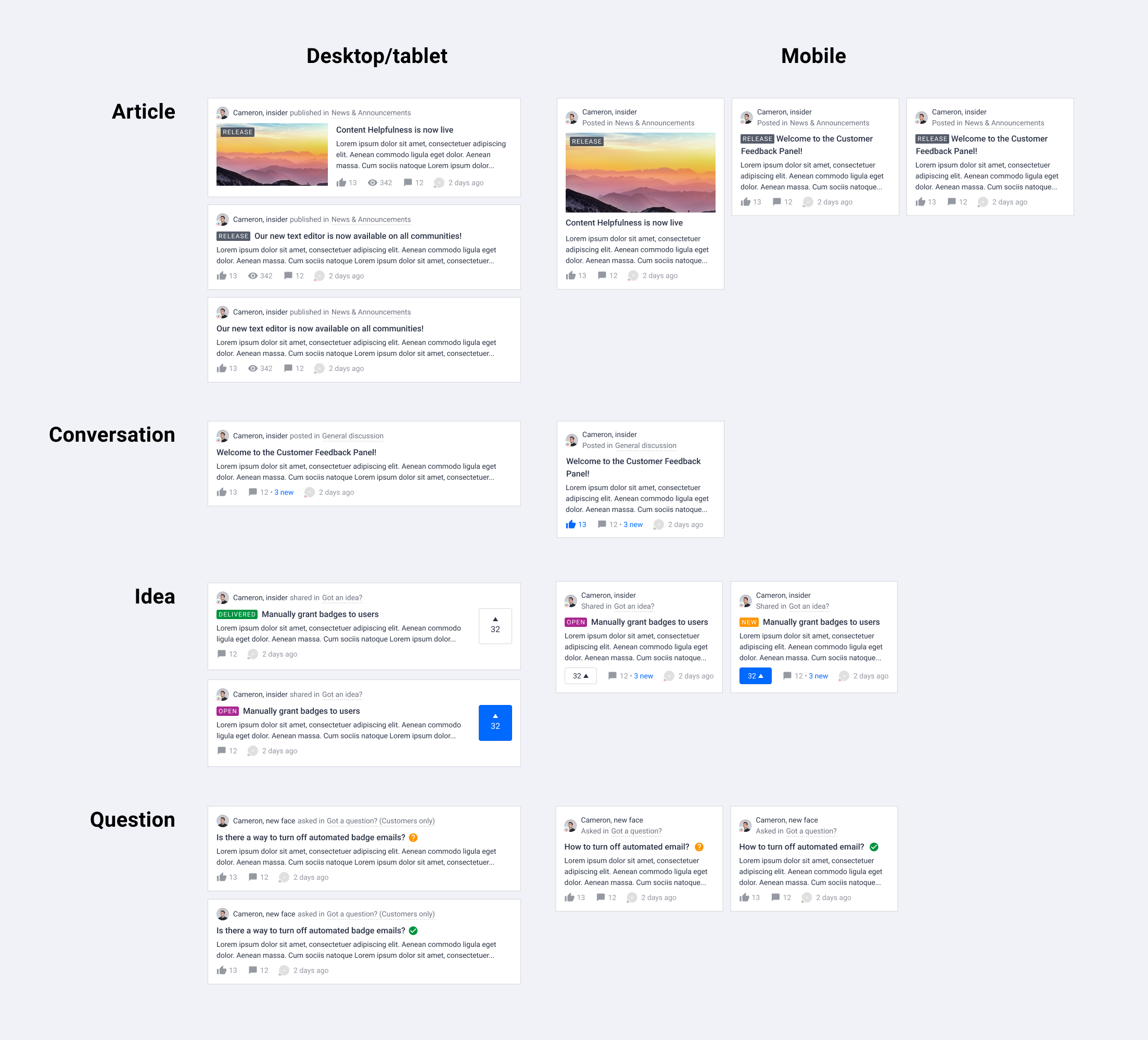


General layout changes

  • Smaller author avatar

  • Change the color of user name from brand color to text color (will be overwritten by rank username styling)

  • Display category info next to author, parent category is now shown

  • Distinguish the content types using different verbs next to author information

  • Amount of views are only displayed on desktop for articles

  • Subtle hover effect for metadata

Upgraded article card in topic list

  • Remove border around image and content

  • Show content right below the title

  • Show label on image if there is a featured image

Upgraded idea card in topic list

  • Highlight the vote action as well as the amount of votes

  • Improve idea status visibility using status label

We hope you like the new changes like we do, if you have feedback let us know in the comments below! We are working on more visual improvements and a new way to change generic styles (colors, cards, fonts, buttons, lists) in your platform. Stay tuned for more!

26 replies

banthonisz
Contributor ⭐️⭐️⭐️
April 21, 2020

Hey! 

I feel like the new vote buttons on the ideas aren’t clear unto what they do. I definitely preferred the old style, but appreciate the counter etc. showing. Is there anyway to roll back to the old version? I’m launching tomorrow and there’s now just a bunch of tiles with 0 and a lil carrot icon on them. If you’ve not used Insided before, I don’t think it’s very clear, especially in a launch state.


Thank you!

Yoeri
YoeriAuthor
Gainsight Employee ⭐️⭐️⭐️
April 22, 2020

Hey Ben, Thanks for the feedback! I’ll PM you 📨

Group Product Manager, Customer Communities
bjoern_schulze
Helper ⭐️⭐️⭐️
April 22, 2020

Users are reporting that on favorite/overview the favorite button has disappeared. They have to invest more effort now to unfollow topics, because they need to open every topic in order to find and click the button.

Yoeri
YoeriAuthor
Gainsight Employee ⭐️⭐️⭐️
April 22, 2020

Good catch, thanks for reporting

Group Product Manager, Customer Communities
bjoern_schulze
Helper ⭐️⭐️⭐️
April 22, 2020

I have some questions regarding the topic header:

1 - User name
2 - User title
3 - Meta text and Category title
4 - Dotted line

With the changes in the topic header the user title (2) has gotten a much more prominent role compared to before. Can you give some insights as to why the user title is getting this attention compared to the user name (1) and the Category title (3)? Why is the user title linked to the topic and not linked to the user profile? Did you consider having the user icon shown instead?
→ Personally, I’d like to have the user title scraped completely here. For me it is enough to have this information in the profile hover card and it also doesn’t make sense to link it to the topic. In its place I’d like to see the user icon instead because in our community we are using the user icon to highlight the user ranks (employee/moderator, power user).

The category title (3) is using the metadata color, even though it is a clickable link. Why did you decide to choose the metadata color instead of the branded color that is usually used for highlighting links in inSided? You are also introducing a new design element, the dotted line (4). Are there plans to use this element elsewhere too in the future to keep it consistent?
→ My expectation for styling of the category title would be to have a consistency with the breadcrumb (as it serves a similar function). So my suggestion is: Either the category title in the new topic list view should follow the current breadcrumb styling (no dotted line, branded color for highlighting links) or the breadcrumb should follow the newly introduced styling.

I quickly threw together how I would like to see the topic header:

In my opinion this solution is cleaner, gets rid of unnecessary information (so is also taking up less space and therefore is less dominant) and is consistent to the overall styling.

thomasg
Contributor ⭐️⭐️
April 22, 2020

Hi everyone, I'm afraid I have to agree with some colleagues here. I'm not a big fan of the new topic list view designs. Personally, I think it looks more confusing and very bruised. Furthermore, the design approach makes it look rather old to me. Do you plan to give customers the opportunity to decide on one design?

Yoeri
YoeriAuthor
Gainsight Employee ⭐️⭐️⭐️
April 22, 2020

Hey, I wanted to let you know that we’ve seen and discussed al the incoming feedback. Later today we’ll provide an update on our plans on how to move forward with this! Meanwhile, keep sharing your feedback - we’ll take it into account! :)

Group Product Manager, Customer Communities
Suvi Lehtovaara
Helper ⭐️⭐️
April 22, 2020

Could it be possible to make the color difference between read and unread topics more clear? Or am I able to adjust this myself? This is a challenge especially when there’s a new topic with no comments, as “ N new comments” line is missing

Here’s an example (the two first topics are unread, the last one is read)

Our users are asking if the title in “read” topics could perhaps be in a lighter shade of gray…?

https://yhteiso.elisa.fi/
bjoern_schulze
Helper ⭐️⭐️⭐️
April 22, 2020

I have some questions and suggestions for article images, titles and excerpts:

Article images: In the screenshots the article image on desktop has an aspect ratio of 16:9, on mobile it is close to 16:9, but a bit different.
The actual aspect ratio on mobile now is close to 21:9 (tested on Samsung Galaxy S10). Why the discrepancy between preview and live? Will you fix this and use the expected 16:9 (i.e. the same aspect ratio as for desktop)? 


Article labels: The smaller the article images in the topic list view, the more dominant the article labels are, especially when the labels contain more than 10 characters. Are there plans to review this and maybe move the article label or change the styling to make it less dominant?

Titles: I suggest to have a maximum length for the displayed title - like you do for the excerpts. Because sometimes (inexperienced) users still put their whole question into the title. Without limits, the title can easily get 6 or more lines long.

Excerpts: In the screenshots you showed that for articles with an article image there will be three lines of text excerpts on desktop as well as mobile. But the live behaviour is different, only two lines are shown on desktop and mobile. Is this expected?

Yoeri
YoeriAuthor
Gainsight Employee ⭐️⭐️⭐️
April 22, 2020

Hey all,

We realised we made a sensitive UI change in the community. Changing a layout you have been using for years is challenging (and difficult to keep everybody satisfied).

We shared our plans, designs, and research on the community. Prior to the release, we announced a release date. But we acknowledge this was not sufficient: It’s hard to assess changes from a piece of text and a static design – a real-life example where you could see and test changes was lacking. Once rolled out we saw that not all changes worked out the way we expected them to be.

We’re grateful for our community (you) and the feedback you provided so far! It’s great to build better products together with you. 

I’ll try to keep it shorter now and provide an update on our plans moving forward.


UI Changes

The new list view is here to stay! We’ll make the following changes based on your feedback:

  • Make cards more spacious by increasing paddings and bringing big avatars back on desktop/tablet view

  • Make labels and idea status smaller, and move them to the end of title, so that titles can be aligned vertically and easier to scan (this also applies to articles with featured images)

  • Remove rank title styling to make everything easier on the eye

  • Use border color for the dotted line below the category name to make this element more calm

  • Add 4px radius to images in article cards to make them less harsh and consistent with rounded avatars and buttonss

  • Re-enable ‘unsubscribe’ functionality on the user’s subscription/favorite page 

  • Improve aligment of icons

Here’s a view of the new listview when the UI changes have been implemented.

Click to view details


We decided to keep the new ideation ‘vote/upvote’ button as it provides a better layout for quick scan. We also believe that this style represents a common UX pattern for upvoting, which is used by other popular platforms like HackerNews, Reddit and ProductHunt.


We’ll investigate the following feedback:

  • ‘phrases’ mode not working on topic list view

  • maximum length for displayed titles

The changes mentioned in this update will be rolled out automatically to the list view in the coming days. We’ll keep on iterating on the feedback we get along the way!  Updates on this matter will be shared here on inSpired.

Group Product Manager, Customer Communities